webkit-text-size-adjust is essential for web development to expand the coverage of your websites by maintaining consistent readability across different screen sizes.
Overview
What is webkit-text-size-adjust
webkit-text-size-adjust is a CSS property that is used to maintain text scalability across different viewports.
webkit-text-size-adjust Functions
- Prevent Layout Breakage
- Control Text Scaling Range
- Device-specific scaling
- Improve Reading Experience
In this tutorial, you will learn about a CSS property, webkit-text-size-adjust that is specially designed to manage how text elements are rendered on different viewports.
What is webkit-text-size-adjust ?
The webkit-text-size-adjust is a CSS property that is used to maintain text scalability across different viewports. This property allows a website to be viewed on numerous devices without distorting the web page’s layout, even when the user zooms in or different devices have different screen configurations.
The -webkit is used to target older versions of Google Chrome and Safari that are based on the Webkit rendering engine. Moreover, this keyword is also used to use webkit-specific features before they are standardised. Non-WebKit browsers can use the standard text-size-adjust property.
Read More: How to Create Browser Specific CSS Code
The property enhances the responsiveness of the application especially when they are viewed on mobile devices, preventing the page layout from often breaking due to text-resizing.
Functions of webkit-text-size-adjust
There are several functions of webkit-text-size-adjust in web development, primarily being how text is viewed on different user’s devices in case of different configurations of device’s zoom and font sizes.
Here are some of the functions of webkit-text-size-adjust below:
- Prevent Layout Breakage: It prevents the breaking of page layout that is often caused as a result of text-resizing, zooming in and out, and more.
.container {

    webkit-text-size-adjust: 100%; /* Maintain original text size */

  }
- Control Text Scaling Range: It can control the range of text scaling so that text does not resize beyond the intended limits.
- Device-specific scaling: It also allows device-specific scaling that controls the scaling feature for a specific device. For example, disabling the text adjustments for iPhones as they can automatically do the adjustments for certain reasons.
- Improve Reading Experience: It enhances the overall reading experience on a mobile device with the help of certain adjustments that enlarge the text on smaller viewports.
p {

    webkit-text-size-adjust: 120%; /* Increases text size by 20% */

  }
Using webkit-text-size-adjust
The primary purpose of using the webkit-text-size-adjust is to maintain consistency of the text elements of the application across all the devices. It modifies the default behavior of the browser to enhance readability by disabling auto-scaling and specifying how much the text should scale.
It must also be kept in mind that excessive use of anything might ruin your web design. For instance, automatic text scaling may break your layout; however, disabling it completely may cause accessibility issues for differenty abled users.
The syntax for the following CSS property is as follows:
body {

    webkit-text-size-adjust: {value} ;

  }
The {value} here can take values such as:
- None: Disables automatic scaling entirely.
- Auto: Enables the browser’s default text scaling.
- <percentage>: Scales text size by a specific percentage, such as 125%.
Consider a practical demonstration.
body {

    font-size: 16px;

  }
In the above code, a font size of 16px is assigned to all the elements inside the body tag. So, when the website is viewed on a mobile device, the device may enlarge the text accordingly.
body {

    font-size: 16px;

    webkit-text-size-adjust: 100%; /* Maintains consistent text size */

  }
However, after applying the webkit-text-size-adjust code above, you can maintain consistent text size across all the devices.
Browser Compatibility with webkit-text-size-adjust
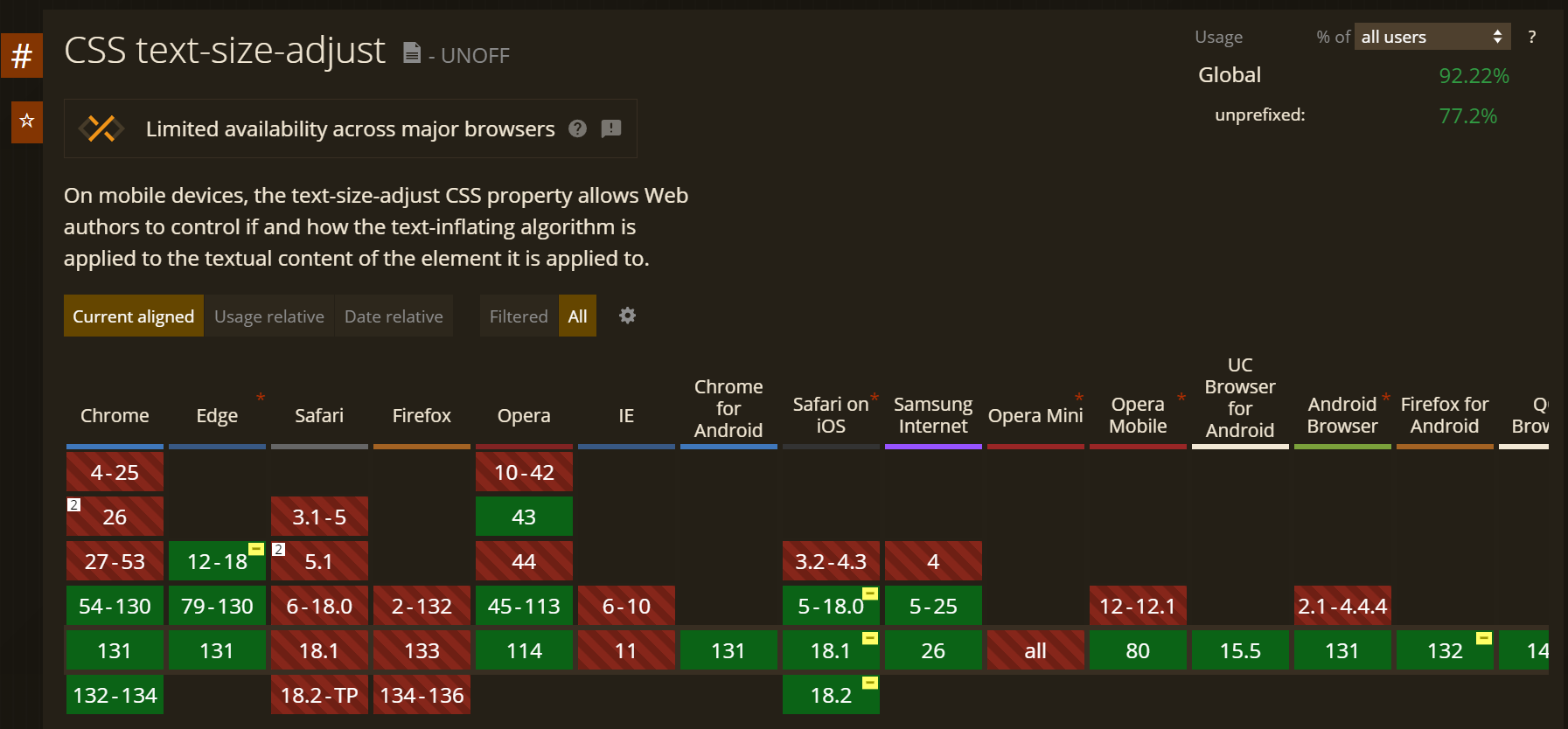
The webkit-text-size-adjust CSS code is supported by all webkit-based browsers. These include Safari, iOS Safari, and older versions of Google Chrome. The newer version of Chrome has shifted to the Blink engine; however, there is still partial compatibility with Webkit.
Read More: Understanding Browser Compatibility Matrix
Other webkit browsers include Samsung browsers and Opera browsers. The other browsers that don’t support webkit properties don’t utilize the webkit-text-size-adjust and instead use the standard text-size-adjust property. These include Firefox, Internet Explorer, Microsoft Edge, and newer versions of Google Chrome.
Here is the detailed compatibility chart for the text-size-adjust CSS property.
webkit-text-size-adjust vs text-size-adjust
The text-size-adjust and webkit-text-size-adjust are both CSS properties that have a similar purpose which is to control the text scalability when it is viewed on different viewports or devices with different font settings and zoom configurations. Though they share a similar intent they both differ in compatibility and scope. The former is a standard CSS property used in modern web browsers; however, the latter is a vendor-prefixed property designed for WebKit-based browsers (e.g., Safari, older versions of Chrome).
Here are certain differences between webkit-text-size-adjust and text-size-adjust.
| Feature | webkit-text-size-adjust | text-size-adjust |
|---|---|---|
| Browser Support | Supported only in WebKit-based browsers (e.g., Safari, older Chrome versions, iOS Safari). | Supported in most modern browsers, including Firefox, Edge, and newer Chrome versions. |
| Syntax | webkit-text-size-adjust: {value}; (requires the -webkit- prefix) | text-size-adjust: {value}; |
| Use Case | It acts as a fallback for older versions of browsers. | It can be utilized only in modern web browsers. |
| Standardization | It is Non Standardized; therefore -webkit vendor prefix is used. | Standardized by the W3C |
| Example | body { webkit-text-size-adjust: none; } | body { text-size-adjust: 100%; } |
Best Practices for using webkit-text-size-adjust
Writing scripts that work is one thing, but writing efficient code that functions well in every situation is another.
Here are a few efficient practices that you should incorporate while using the webkit-text-size-adjust CSS property:
1. Always combine the text-size-adjust and webkit-text-size-adjust CSS properties. This ensures consistent behaviour across all devices and browsers because a lot of older browsers don’t support the former CSS property, thus the latter one gets active automatically in that case.
body {

    text-size-adjust: 100%;        /* Standard property */

    webkit-text-size-adjust: 100%; /* WebKit-specific fallback */

  }
2. In the CSS syntax of the property, one should avoid using ‘none’ as a value unless it is necessary because it disables the text scaling entirely, which creates accessibility issues. One may use the ‘none’ in case of other elements, such as buttons which, upon scaling, break the page layout.
3. For consistent designs, one may also prefer using percentage values rather than using static values. This resizes the web elements proportionally, maintaining a consistent design and avoiding abrupt changes upon scaling.
4. There are high chance that text elements may produce unintended outcomes. Therefore, one must thoroughly test their application on a combination of different devices and browsers before rolling out their product to the users.
5. Another good practice is to leverage media queries while writing CSS code for your web application as you can adjust text size dynamically in different settings for different viewports. It ensures better results as you gain more control over responsive designs.
Why Test Websites on Real Browsers and Devices?
It has become a worldwide norm to thoroughly test your product before launching it to users in real-user conditions, as this effectively captures defects. It also ensures a good user experience, protects your reputation, and addresses other important factors.
Although testing on real devices is a good option, setting up a lab with several devices can be very costly. Therefore, the best alternative without impacting the overall efficiency of the test is to rely upon real device cloud testing.
Testing on a real device cloud provides you access to unlimited devices in one place without having to buy numerous physical devices. This not only provides maximized coverage for testing but also significantly reduces costs.
BrowserStack Live is a one-stop solution providing real devices on the cloud and cross-browser testing capabilities. Testing your application on BrowserStack gives you an edge by performing parallel testing on multiple devices and operating systems in the cloud, from older versions to the latest ones.
Conclusion
The CSS property webkit-text-size-adjust is used to control how text elements scale in different browsers with different font and zoom configurations. It is useful in maintaining consistency in the design of your application.
The CSS property is backed by a -WebKit keyword, which means it is not a standard CSS property and is only supported in WebKit-based browsers. Other browsers that are not based on the WebKit engine utilize the standard text-size-adjust CSS property.
One of the important practices for efficient code is to utilize both the CSS properties text-size-adjust and webkit-text-size-adjust, as the latter act as a fallback when the application is viewed upon WebKit browsers such as Safari, and older versions of Chrome.


