Web design has evolved beyond fixed desktop dimensions to accommodate various screen sizes, from smartphones to large monitors.
Ensuring a seamless user experience across devices requires careful control over how web pages are displayed, which is where the viewport meta tag comes in.
This article explores viewport settings, their role in responsive web design, and how they help maintain consistency across different screen sizes.
What is Viewport?
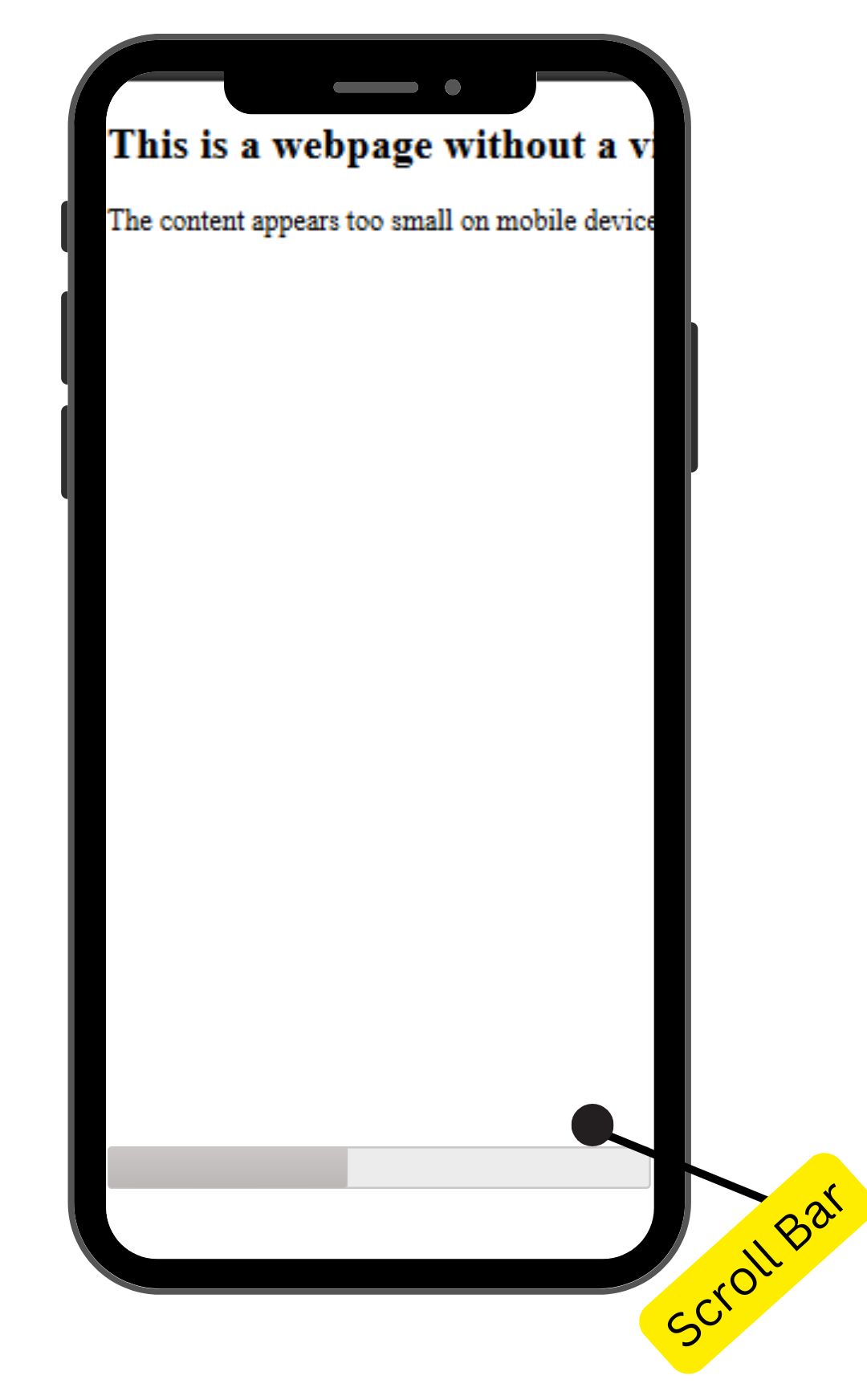
A viewport refers to the visible area on the screen where the web content is displayed. Note that it may or may not be the same size as the rendered page. In the latter scenario, the browser provides a scrollbar to access all the content.
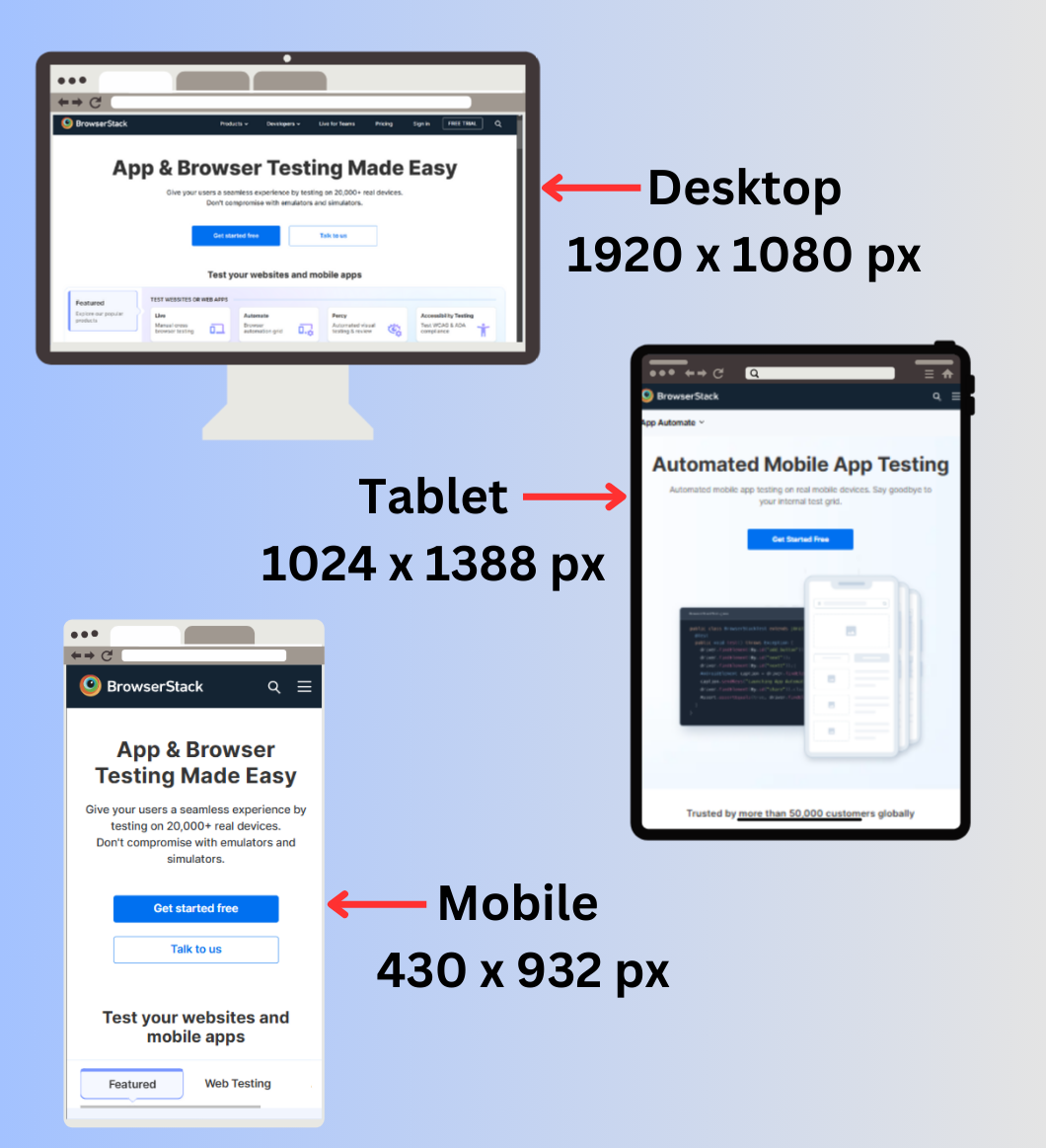
Viewport sizes vary between screen sizes. The viewport of a small device, such as a phone or a tablet, is smaller than that of a large device, such as a desktop.
Also Read: How to create a Responsive Website
Importance and Role of Viewport in Responsive Web Design
In the past, websites were designed for fixed desktop dimensions, making them difficult to navigate on smaller screens.
Viewport settings have become essential in responsive web design, ensuring content adapts seamlessly across devices.
- Earlier websites were designed for fixed desktop sizes, making them difficult to view on smaller screens. Users had to scroll sideways and zoom in to access content without viewport settings.
- With advancements in viewport settings, developers now use media queries to create responsive layouts that adapt to different screen sizes, ensuring a seamless viewing experience.
- Proper viewport configurations prevent layout disruptions, content overflow, and unstable UI elements, maintaining device consistency.
- Viewport settings improve loading efficiency by prioritizing the rendering of visible elements, enhancing overall website performance.
- Google prioritizes mobile responsive websites in search rankings, as they provide a better user experience without unnecessary zooming or scaling issues.
What is the Viewport meta tag?
A viewport meta tag is an HTML tag usually specified at the start of the document. It allows developers to control the width, scale, and zoom behavior of the viewport, ensuring the website’s responsiveness.
The basic syntax of the viewport meta tag is:-
<meta name="viewport" content="width=device-width, initial-scale=1">
- The width attribute here takes a value of the minimum viewport size in units such as px,vw, and device width (the physical size of the device screen).
- The initial scale attribute takes a value to control the initial zoom value. Here the value is 1, which means no zooming.
Key Viewport Attributes for Responsive Design
The viewport meta tag is crucial in ensuring responsiveness in web applications. The tag can contain several attributes, each serving a specific purpose required for responsive design.
Here are the key viewport attributes for responsive design:-
Width
The width attribute defines the application’s viewport width. The most common value it takes is the “device-width,” which assumes the device’s full width. By default, mobile browsers set a width of 980px, causing the website to zoom out.
<meta name="viewport" content="width=device-width">
Height
The height attribute is not generally used because most browsers adjust the layout dynamically, however, it can be specified for a few web application elements that require precise height control.
<meta name="viewport" content="width=device-width, height=device-height">
Initial-scale
The initial-scale attribute controls the zooming of the webpage when it loads. A value of ‘1’ means no zooming, and a value less than ‘1’ refers to zooming out.
<meta name="viewport" content="width=device-width, initial-scale=1">
Minimum-scale
The minimum-scale attribute sets the smallest zoom level, which can be manually adjusted. A value of ‘1’ means that users can’t zoom out beyond 100%; however, a value less than ‘1’ means that users can zoom out. This attribute is defined to ensure the unintended shrinking of elements.
<meta name="viewport" content="width=device-width, initial-scale=1, minimum-scale=1">
Read More: How to Create Responsive Designs with CSS
Maximum-scale
The maximum-scale attribute sets the largest zoom level that can be manually adjusted. A value of ‘1’ defines that users can’t zoom in beyond default layout. However, a value greater than ‘1’ allows zooming in up to the specified level.
<meta name="viewport" content="width=device-width, initial-scale=1, maximum-scale=2">
User-scalable
The user-scalable attribute determines whether the user can zoom in or out on the webpage. If the value is set as ‘no’, the user is unable to zoom in or out the webpage. If set to yes, zooming is enabled.
<meta name="viewport" content="width=device-width, initial-scale=1, user-scalable=no">
Interactive-widget
In small devices, such as mobile phones, a keyboard is displayed on the screen whenever a user interacts with an input field. The ‘interactive-widget’ attribute prevents any disruption in the layout during this time.
The default value causes the keyboard to cover the input field, giving a poor user experience. However, a value such as ‘resizes-content’ automatically resizes the UI element so the input field is visible when typing, providing a clean interface.
<meta name="viewport" content="interactive-widget=resizes-content">
Read More: How to test Responsive Images
Examples of Usage of Viewport
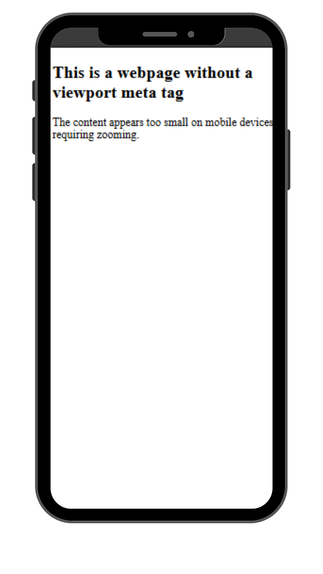
For instance, since a mobile phone considers a default viewport width of 980px, here’s how a website will appear without the viewport tag.
<!DOCTYPE html>

<html lang="en">

<head>

    <meta charset="UTF-8">


    <title>Without Viewport Meta Tag</title>

</head>

<body>

    <h2>This is a webpage without a viewport meta tag</h2>

    <p>The content appears too small on mobile devices, requiring zooming.</p>

</body>

</html>
In the above example, without the viewport tag, the webpage appears zoomed out upon loading on a mobile device.
However, here’s how it looks upon inserting the viewport tag in the HTML document.
<meta name="viewport" content="width=device-width, initial-scale=1">
How to Set the Viewport Responsive Web Design
Responsive web design is an essential aspect of modern web development. However, several parameters must be considered, essentially viewport settings and media queries, to achieve this.
Here’s how to set the viewport for responsive web design:-
1. In an HTML document, the Viewport tag is placed inside the <Head> section because it is a suitable place to store the metadata that defines how the website should render on different screen sizes. This is the basic configuration to set the viewport.
<head>

    <meta charset="UTF-8">

    <meta name="viewport" content="width=device-width, initial-scale=1">

    <title>Webpage title</title>

</head>
2. Using media queries to target different layouts for different screen sizes to leverage viewport settings. Media query is a technique used to modify the behavior and appearance of a website based on the user’s viewport size.
body {

    font-size: 16px; /* Default font size */

    margin: 10px;

}

@media (max-width: 600px) {

    body {

        font-size: 14px; /* Smaller text on smaller screens */

    }

}

@media (min-width: 1024px) {

    body {

        font-size: 18px; /* Larger text on bigger screens */

    }

}
Impact of Viewport Settings on User Experience
Viewport configuration is an essential parameter to enhance user experience and responsiveness of the website. Here are the useful impacts of viewport settings:
- It helps maintain a responsive web design, ensuring the webpage adapts seamlessly to different screen sizes. Without such settings, the user has to pinch to zoom and scroll to access the content property, which is frustrating.
- Viewport settings also maintain layout scaling, providing a user-friendly experience.
- Another benefit that acts on the backend is that Google prioritizes websites with proper responsiveness and ranks them higher on the search results. Therefore, proper viewport settings must meet the Google SEO criteria.
- Proper viewport settings also ensure consistency in web design across all devices.
Also Read: Why Responsive Design Testing is Important
Challenges of using Viewport for Responsive Web Design
Viewport settings serve a lot of useful purposes. However, they come along with several challenges that one should handle properly for a visually appealing design:-
- Older browser versions don’t generally support viewport settings, which can lead to unexpected behavior that disrupts the layout.
- One should carefully plan and execute several viewport dimensions to create a responsive design using media queries.
- In several browsers, texts are scaled automatically, which can often break layouts. To avoid such issues, set maximum-scale=1 or user-scalable=no, as they can impact accessibility.
Best Practices to Implement Viewport Settings
Properly implementing viewport settings ensures a user-friendly experience and a seamless responsive design. However, there are several techniques one must keep in mind to enhance the effectiveness of the codebase:-
- Use all the necessary attributes of the viewport tag not to miss any aspect that may prevent smooth user experience.
- Allow users to zoom in and out on the website as it offers them better accessibility.
- One must use dynamic units for dimensions such as vw, rem, em, %, etc., instead of static units such as pixels. This ensures consistency in text, images, and other elements in responsive surroundings.
- One should leverage CSS media queries to set different layouts for different viewport widths. This provides better website adaptability on different screens.
- Always test your websites on multiple devices to ensure they work as intended.
Importance of Testing Viewport Settings on Real Devices and Browsers
Viewport settings are also subject to browser compatibility. Many older browser versions lack support for the viewport tag and its attributes, which causes the layout to shift as intended.
Therefore, one must thoroughly test their product before rolling it out to real-world users.
With BrowserStack Live, you can harness several key benefits:
- Test in Real User Conditions: Experience your website as real users do, ensuring accurate rendering on various devices on the real device cloud.
- Accelerated Debugging: Quickly identify and fix issues, saving time during development.
- Enhanced User Experience: Optimize images for faster loading and flawless display across all platforms.
- Seamless Integration: Easily incorporate testing into your existing workflow, maintaining efficiency and productivity.
- Comprehensive Coverage: Access a vast array of real devices and browsers, ensuring your site is robust and universally compatible.
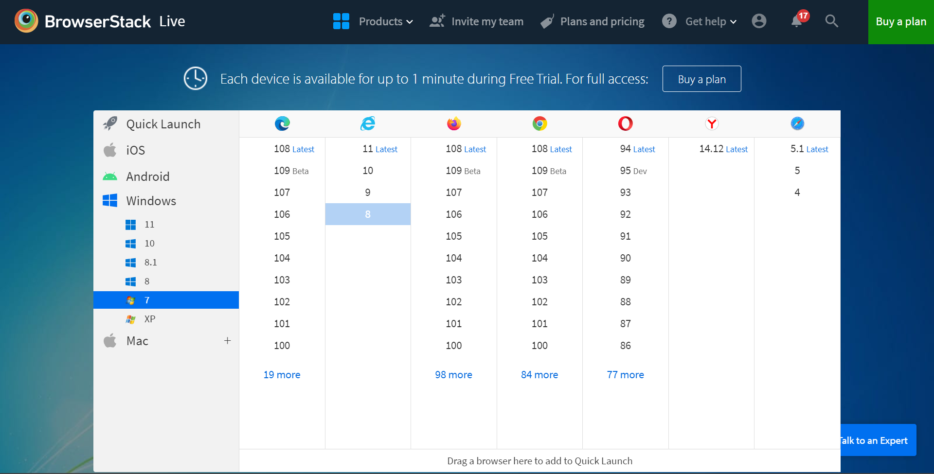
Step 1: Open BrowserStack Live and select the operating system and web browser combination you want to test.
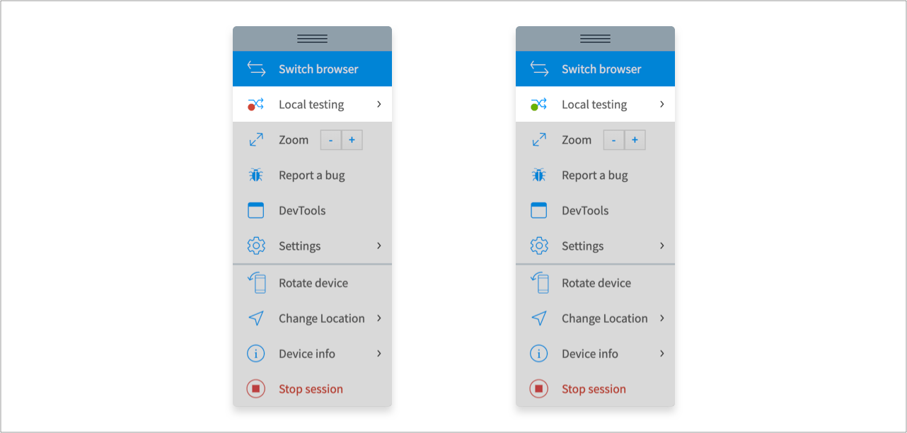
Step 2: Enable local testing by starting a session on BrowserStack Live and look for the green indicator on the ‘Local Testing’ icon in the toolbar tray.
Read More: Overcoming Challenges of Local Testing
If the icon is red, look for the BrowserStack local app, download it, and launch a live session from the toolbar.
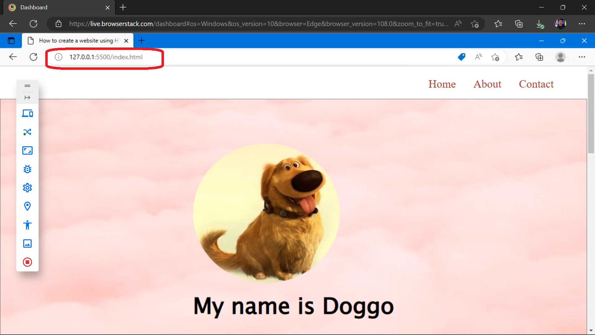
Step 3: Enter your website’s local host URL, and your website will be displayed on the Live Session.
Useful Resources for Responsive Design
Understanding Responsive Design
- Responsive Web Design: What is it and How to Use it?
- Why is Responsive Design and Testing Important?
- A Beginner’s Guide to Mobile Responsive Design
- Responsive Web Design Trends
- What is Multi-Page Responsive Website
- Adaptive vs Responsive Design: Which one to choose?
- What are Responsive Apps?
- What is Bootstrap Responsive & How to use it?
- What is Responsive CSS vs Reactive CSS?
Implementing Responsive Design
- How to make an App Responsive
- How to make React Native App Responsive?
- How to make a Responsive App in Android Studio?
- How to create a Responsive Website
- How to make Flutter App Responsive
- How to make images responsive
- How to create Responsive Web Design for E-Commerce Platforms
- How to test Responsive Images
- How to make React App Responsive using react-responsive?
- How to use React-Responsive for Responsive Design?
- How to Create Responsive Designs with CSS
- How to Define and Use Responsive CSS Sizes for Dynamic Web Layouts
- How to make Angular Project Responsive?
- How to Create Responsive Div Containers Using CSS: Techniques and Examples
- Building Responsive Layouts with CSS
- Creating a Responsive About Us Page with HTML and CSS: Example Code
- Mastering Media Queries for Responsive Web Design: A Comprehensive Guide
- Breakpoints for Responsive Web Design
Testing & Troubleshooting Responsive Design
- What is the Ideal Screen Size for Responsive Design?
- Using Xcode iOS Simulator for Responsive Testing
- Top Responsive CSS Frameworks
- What is Multi-Page Responsive Website
- What is UI Responsiveness Testing?
- Top 15 Responsive Design Testing tools
- Top Responsive Web Design Challenges And Their Solution
- Cross Browser Testing vs Responsive Design Testing – When to choose Which
- How to enable Responsive Design Mode in Safari and Firefox?
- How to Perform Responsive Testing for a Locally Hosted Website
- How to check Responsive Websites in Chrome
Conclusion
The viewport tag defines how web content scales and adapts to different screen sizes, ensuring a responsive design. It includes attributes like width, scale, and user scalability for better control. Combined with media queries, it enhances adaptability.
Testing responsiveness before launch helps identify any issues early in the development cycle and broadens user coverage across the globe. BrowserStack Live provides such testing features that help debug your application.
