Responsive
-
What are CSS Breakpoints and Media Query Breakpoints
What are CSS and media query breakpoints? Why are they important in responsive design? What are the CSS breakpoints you should use for your website?
Learn More -
How to Test Visual Design
Learn how to Test Visual Design with this comprehensive guide for a highly functional and aesthic UI of your website and deliver a seamless user experience.
Learn More -
How to make Flutter App Responsive
Learn how to make Flutter app responsive with these tips and best practices. Design UIs that adapt to different screen sizes for an optimal user experience
Learn More -

How to make React Native App Responsive?
Learn how to make your React Native app responsive, with example, tips and best practices. Discover importance of responsive app and how to optimize UX.
Learn More -
5 Common Bugs Faced in UI Testing
Learn about the most commonly detected UI bugs faced by QAs while testing the user interface of various web applications.
Learn More -
How to make a Responsive App in Android Studio?
Learn how to make a Responsive App in Android Studio to make it adaptive for all screen sizes from this tutorial.
Learn More -
Bootstrap Breakpoints and Media Queries
Learn about responsive design by using Bootstrap Breakpoints and Media Queries that allow the developers to apply CSS styles to different viewports.
Learn More -
What is Multi-Page Responsive Website
Read this guide to learn what is a multi-page responsive website, how to create them with best practices and test them with BrowserStack Live
Learn More -
How to target desktop, tablet & mobile using Media Query and Breakpoints
Understand the concepts of media query for mobile & breakpoints and how they help to test responsive web designs on desktops, tablets, mobile.
Learn More -
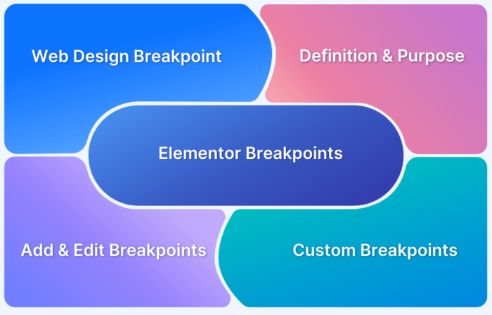
What are Elementor Breakpoints
Elementor Breakpoints helps render the website on different screen sizes without losing any of the design elements. Learn more about Elementor Breakpoints.
Learn More

