A well-optimized mobile website enhances user experience and boosts SEO rankings. However, ensuring that images load quickly and appear correctly across various devices and browsers can be challenging.
Developers must focus on choosing the right image formats, sizes, and compression techniques to maintain quality without compromising performance.
This article explores effective strategies for optimizing images for mobile, ensuring a seamless and engaging experience for all users.
Why is image size important for website performance?
Image size and website performance are directly proportional. Choosing the optimal image size for your website can reduce the website’s load time and bounce rate and ensure visitors view all the valuable, show-stopping images.
Whereas, uploading large images to a website can degrade the overall performance, reduce the load speed, and hinder the SEO results. To escape the hassles, some might want to skip using images on the website. But it’s the biggest mistake that can harm website traffic results.
Using the right images is vital to creating an aesthetically pleasing and responsive website design.
Read More: Top 15 Ways to Improve Website Performance
Nobody wants to skim through big blocks of text that contain no images in between. Images clarify, depict, and make information more understandable and accessible. Irrespective of the device, images have to render presentably and correctly to deliver the best viewing experience.
Visuals are always more appealing to the users than text content. Thus, making responsive images and placing them in webpage content is vital for better user engagement.
Also, with a better user experience, the Google rankings of a website are likely to increase. So, while developing and testing a website for mobile, you must control the size of the images to ensure the website loads faster, improves the SEO, and the website attracts and retains users.
But understanding the importance of image size is just the first step.
Read More: How to test Responsive Images
What is Mobile Image Size?
Mobile image size is the physical size and resolution of an image for a mobile device that is measured in pixels. A higher pixel size means a larger picture and a bigger file size. A lower mobile image size means a small picture and a smaller file size.
As a smartphone’s screen size is smaller than a desktop’s, it’s important to avoid larger images for a mobile device.
But what are the common image sizes you can use for mobile?
Common Image Sizes for Mobile
Image sizes greatly influence the user experience, SEO, and overall website performance.
Irrespective of the image file type, the key to a great website experience on a mobile device is the size of the images.
Here are the general mobile image size specifications for different aspects.
- Hero images – 800 by 1200 pixels
- Banner images – 320 by 480, 300 by 250, and 320 by 50 pixels
- Blog images – 640 by 320 pixels
Apart from these, you must know the common screen resolutions for mobile used by users:
- 360×800 (8.56%)
- 414×896 (6.95%)
- 360×640 (6.45%)
- 412×915 (4.77%)
- 390×844 (4.75%)
- 360×780 (4.56%)
The mobile screen resolutions can help you test your website in these resolutions to determine the correct image dimensions for mobile devices.
Also Read: Ideal screen size for responsive design
How to Determine the Right Image Dimensions for Mobile Devices?
For enhanced website performance, the images should be as large as needed to fit their “containers” based on your page layout. For example, slideshow images are wider, thumbnails are smaller, blog images are medium-sized, etc.
But to determine the right image dimensions for mobile devices, check the image on different mobile devices and browsers. If the images take time to load and have distorted dimensions, shrink and optimize them until they look the best.
Also, once the right size is determined, test the responsive design using a responsive design checker to ensure your website offers a consistent experience to your mobile users.
That said, having the right image optimization strategy in place can minimize your hassles and achieve the desired mobile image size results.
Image Optimization Strategy for Mobile
Over 70% of the web traffic is from a mobile device. So, correctly sizing your images is important to avoid poor customer experience, better SEO, and lower bounce rates.
Once an image is uploaded to a website, it fits in with the default height and width image size. You must optimize the image for mobile to ensure to bypass the troubles.
Here are the quick steps to change the default image setting using CSS to make it responsive.
1. Change the absolute units like pixels.
img {
Width : 800px;
}
2. Assign a new value to the image’s width property using relative units like a percentage.
img {
Width : 70%;
}
The new change in the dimension will make the image look high-qualityand resize itself irrespective of the screen size.
But there’s still room to enhance your mobile image optimization efforts by following multiple best practices.
Read More: CSS and media query breakpoints
Best Practices to Optimize Images for Mobile
Out of multiple mobile image optimization practices, we have selected the best to amplify your efforts:
- Choose the correct file format: The appropriate file format can have a positive impact on reducing the image size. JPEG images work well for photograph-like images, and PNGs work best for logos, textual banners, etc. WebP is a new format that offers the best image formats but has relatively poor cross-browser support.
- Ensure image compression: With the advancements in camera resolution and sizes, images have larger file sizes. But to ensure a quick and responsive user experience on mobile devices, avoid heavy, high-quality images on your website. You can compress an image to a lower quality level because it’s difficult to perceive many subtle differences in an image. Combine resizing and compression, and you will get the best results for your mobile images.
- Make images responsive: Web developers must ensure that the images are responsive and render correctly and presentably. It can ensure that the image adjusts to different screen sizes, which minimizes the hassles of adjusting image size for multiple devices and browsers. Once images have been rendered responsive, you must test your website on different real devices to check their responsiveness.
Read More: How to create a Responsive Website
How to Test Websites on Different Mobile Devices?
Using multiple devices and testing your website on different screen sizes can be overwhelming. Choosing a real device cloud can be the affordable and easiest option for checking website images’ responsiveness.
You can choose BrowserStack to access the latest real devices to check your website’s responsiveness, as it offers 3500+ real browsers and devices for on-demand, instant cross-browser testing on the cloud.
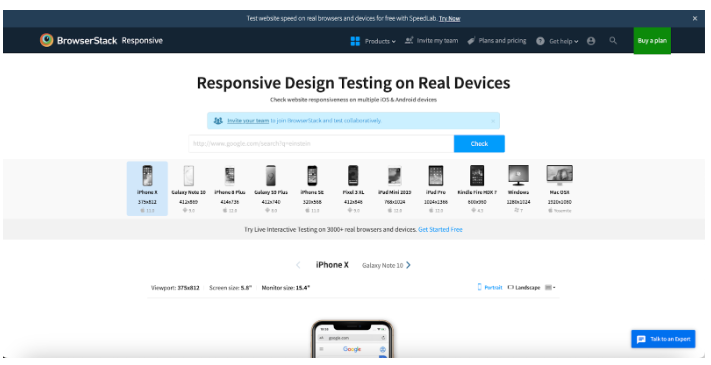
BrowserStack’s responsive design checker tool provides a simple way to verify the responsive design. You can enter the URL of your website to check its responsiveness on multiple devices, OS, and browsers within no time.
Ensure that your mobile images are responsive and the overall website design is ideal for delivering quality customer experience and improving website performance.
Once the tests are completed, and you have optimized images for mobile, you can make the website live.
Conclusion
Optimizing images for mobile and ensuring your website is responsive can deliver a consistent user experience and improve your SERP rankings.
BrowserStack can not only help you check your website’s responsiveness but also help you perform cross-browser testing on real desktop and mobile devices.
You can use BrowserStack Live testing platform to run a real-time test to reproduce, debug, resolve issues, and ship bug-free web apps on 3000+ real browsers, desktop and mobile devices.
Once you get an accurate test results, you can ensure that your users get the best user experience, irrespective of their browser-OS-device combination.
