A website is often the first place where a business connects with its audience. With users accessing websites on devices of all shapes and sizes, responsive web design (RWD) has become essential. It ensures websites adapt seamlessly to different screens, delivering a consistent user experience.
However, achieving this flexibility comes with challenges. Developers must address issues like varying screen sizes, performance optimization, and maintaining visual appeal across devices.
This article highlights the top responsive web design challenges and offers practical solutions to tackle them effectively, helping you build websites that look and perform great everywhere.
16 Responsive Design Challenges of a Website and Their Solutions
Responsive web design challenges often arise as it’s a relatively new approach. Making your website responsive is a task that’s easier said than done. In the process of doing it, you’ll be facing changes along the way. This section covers the significant challenges and how you can rectify them.
Overview
Responsive Website Design Challenges
- Navigation Issues
- Rendering on Different Devices – Desktop and Mobile
- Scalable Images lose details
- Browser Compatibility
- Page Load Time
- Consistent User Experience
- Accessibility
- Intuitive Design
- White Space
- CTA Placement
- Website Responsiveness
- Balancing Aesthetics and Usability
- Scalability
- Website Security
- Mobile-Friendliness
- Optimizing for SEO
1. Navigation Issues
Navigation menus are the map of the website. They act as compasses on where the user should go and where they will find what. Responsive navigation should scale to screen sizes and not have a different structure altogether. If the navigation menu changes according to the device your user is operating from, your users will end up getting confused. Also, it won’t be a similar brand experience you’ll be providing to your users.
How to rectify Navigation issues?
Your aim should be to work on the information architecture for the website. When you scale it to fit a particular device – it should be accessible. Your website’s data can aid you in creating a good navigation design. Also, responsive testing on multiple devices will help you increase the accessibility of your design before you launch it.
2. Rendering on Different Devices – Desktop and Mobile
You need to focus on the smaller details when creating a responsive design – right from the padding of your elements, to the margins, etc. Optimizing for devices is crucial and is important. For example: Using a 400px element might look good on your desktop, but optimizing it to fit your mobile device can look disoriented and unformatted.
How to rectify this issue?
When designing responsive websites, ensure to use percentages instead of px or a mix of both. Height objects like an icon and width can use percentages to give a uniform interaction as you scale across devices.
By using tools like BrowserStack, you can test your local responsive website on different browser versions and devices like – mobile, desktops, and smart TVs, making testing multiple times easier. It renders real-time user scenarios and shows you how your website works.
3. Scalable Images lose details
Images that are scaled lose their clarity over time. This doesn’t provide a uniform experience to your user, and the image object’s meaning gets lost. The issue is that scaling happens as the image is stretched and contracted depending on the device used and not the context.
Read More: How to make images responsive
How to rectify this issue?
The best way is to crop the image. This means that you add a new value to the image’s width and height. The image’s height will adjust according to the device being used. Additionally, using percentages for images rather than definite values like pixels helps.
4. Browser Compatibility
Latest browsers automatically adapt to the visitor’s screen size and display the right layout. Old versions of browsers like Internet Explorer do not support responsive designs. Depending upon your target demographic, you need to be wary of the browsers that are being used and work around them.
How to rectify this issue?
You can use different stylesheets while designing for older webpage versions. Else, you can install and test on old browser versions manually. But, this can be time-consuming as you have to download different versions manually. You can make use of BrowserStack Live to test your websites on different browser versions. You can sign up for Free and start testing instantly.
Test on different browser versions
5. Page Load Time
Load times increase bounce rates. You can have a perfectly designed website, but if it takes time to load, your user will exit the website.
Responsiveness can sometimes slow down the loading of your web pages as they weigh a lot and experience more traffic – from desktop websites and mobile phones. This might lead to a bad user experience.
How to rectify this issue?
The elements like images, videos, and Gifs., which require a lot of bandwidth, can be eliminated, and conditional loading can be implemented. The pages can load easier and more important elements to the user. Reducing your site’s loading stress is the most important thing for a better experience.
Additionally, CSS can show relevant elements on your web pages, and it can interact with your screen size and reorient itself to accommodate the elements you add.
Must Read: How to check website loading time
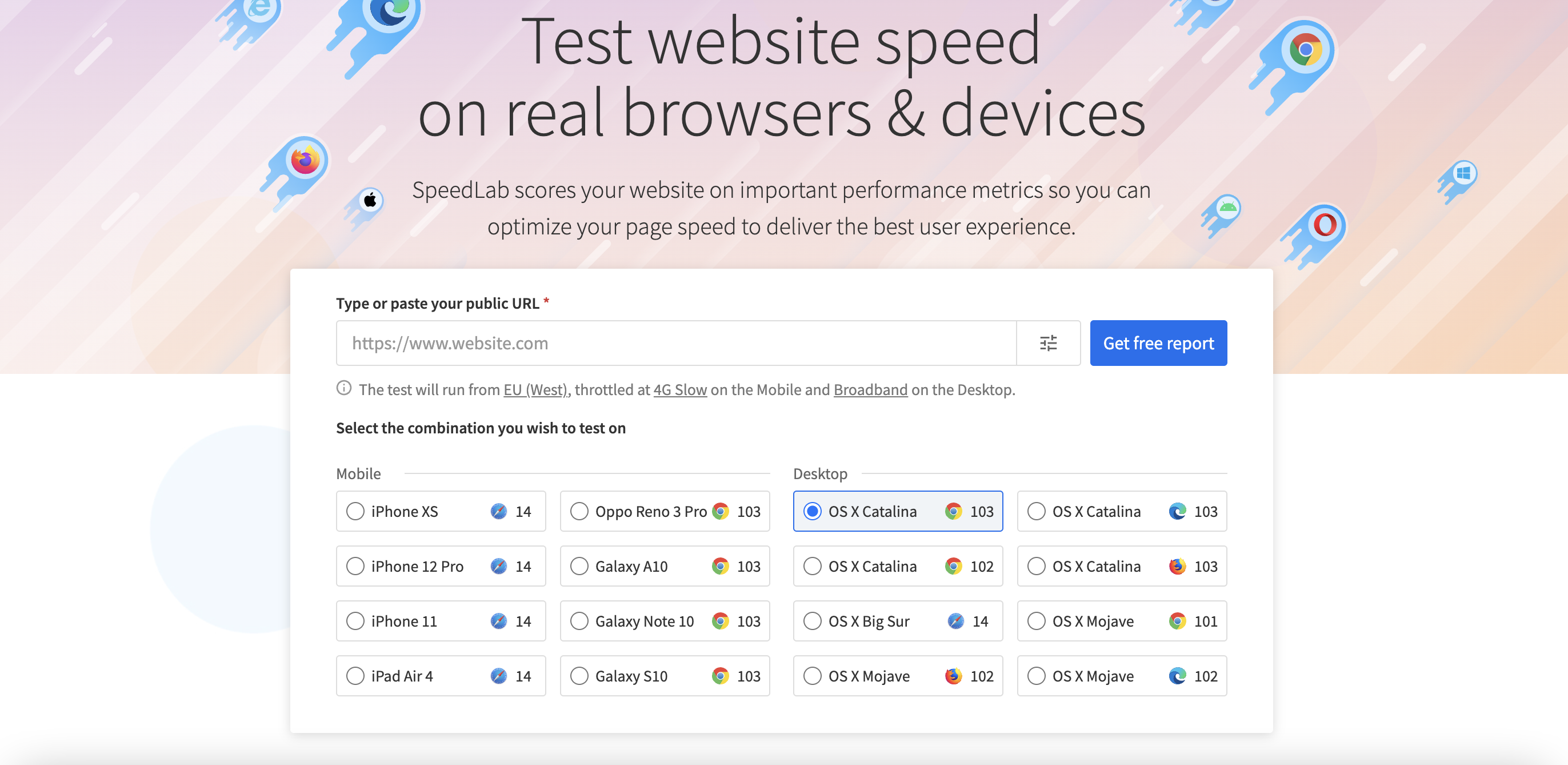
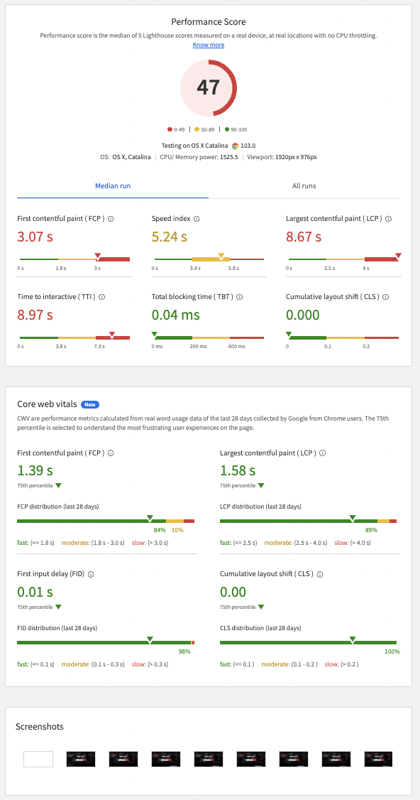
Also, performance testing determines your website’s stability, scalability, speed, and responsiveness. Testing the load helps you understand the behavior of a system under specific load values. Using tools like SpeedLab will help you understand your website’s speed.
You can just paste your URL and get a detailed report that dives into your website’s performance score, page load, and the time where the first text was indexed.
As development and testing take time when transitioning to a responsive website, using tools like BrowserStack helps ship faster. It helps you accelerate your releases by drastically reducing the feedback time. QA teams can access multiple devices at the same time, thereby reducing tester wait time. It allows testing your website in real user conditions, ensuring faster TATs and decision making.
Also Read: 11-Step Website Design Checklist
6. Consistent User Experience
Inconsistent design elements, such as different button styles, mismatched fonts, or changing layouts, can confuse users and make the site harder to use on different devices.
How to Ensure a Consistent User Experience?
Stick to a unified design system and leverage responsive frameworks like Bootstrap or Tailwind CSS. Regularly test your website on multiple devices and browsers using BrowserStack to detect inconsistencies early and fix them before the final launch.
7. Accessibility
Accessibility ensures that all users, including those with disabilities, can easily navigate and interact with your website. Missing alt text, improper contrast ratios, or inaccessible navigation can exclude parts of your audience.
How to address Accessibility challenges?
Use accessibility testing tools like BrowserStack to identify and fix barriers. Focus on following Web Content Accessibility Guidelines (WCAG) by using semantic HTML, adding ARIA labels, and ensuring smooth keyboard navigation. Enhancing accessibility not only makes your site more inclusive but can also improve your SEO rankings.
8. Intuitive Design
An intuitive design allows users to find what they need effortlessly. Overcomplicated layouts or unclear navigation can reduce usability and drive users away.
How to enhance Intuitive Design?
Focus on clear hierarchies, minimalist layouts, and familiar design patterns. Conduct usability testing to understand how users interact with your site and refine the design accordingly. A/B testing can also provide valuable insights into how to improve usability.
9. White Space
Too much or too little white space can make your website feel cluttered or overly sparse, impacting readability and user engagement.
How to optimize White Space usage?
Achieve balance by grouping related elements together and leaving enough space between them. Use grid systems to maintain layout consistency across devices.
10. CTA Placement
Call-to-action (CTA) buttons guide users toward important actions, such as making a purchase or signing up. If CTAs are poorly placed or unresponsive, it can lead to missed conversions and frustrated users.
How to improve CTA Placement?
Place CTAs in prominent locations and make sure they are easy to find on all devices. Use contrasting colors and clear, action-oriented text. Test their responsiveness and positioning across various screen sizes.
11. Website Responsiveness
Responsive design ensures your website adjusts smoothly to different screen sizes. However, issues like inconsistent layouts, broken elements, or misaligned images across devices can negatively impact user experience and harm your brand’s credibility.
How to fix Website Responsiveness issues?
Adopt a mobile-first approach during development to prioritize responsiveness. Utilize flexible grid systems and media queries to adjust layouts dynamically based on device size. Tools like BrowserStack can assist in performing cross-browser testing on various devices, ensuring that each element functions as expected across different screen sizes.
12. Balancing Aesthetics and Usability
A visually stunning website can sometimes compromise usability. Overly designed elements may confuse users and negatively affect site functionality.
How do you balance Aesthetics and Usability?
Adopt a user-first approach, prioritizing intuitive navigation and functionality over excessive visuals.
13. Scalability
As your business grows, your website must be able to handle increased traffic, more content, and added functionality without slowing down. Without proper planning, scalability issues can arise.
How to tackle Scalability challenges?
Invest in scalable frameworks and reliable hosting solutions. Design using modular components, so features can be added or updated without needing a complete overhaul. Regularly monitor performance metrics and test updates across different platforms with BrowserStack to ensure smooth scaling.
Read More: Top 20 Performance Testing Tools
14. Website Security
With responsive websites catering to a variety of devices, security risks like unencrypted data transmission and weak authentication measures can become more significant.
How to improve Website Security?
Ensure your website uses HTTPS, follow secure coding practices, and keep plugins and frameworks up to date. Conduct security audits and penetration tests to uncover vulnerabilities.
15. Mobile-Friendliness
With mobile devices accounting for a significant share of web traffic, websites that aren’t optimized for mobile can suffer from slow load times, misaligned content, or poor navigation.
How to ensure Mobile-friendliness?
Use a mobile-first design approach, focusing on fast load speeds and touch-friendly elements. Test your mobile layout and functionality across a variety of devices using BrowserStack to ensure the best possible experience for mobile users.
16. Optimizing for SEO
Responsive websites often face challenges like slow load times, duplicate content, and improper use of tags, which can harm search engine rankings.
How to improve SEO on responsive websites?
Optimize images, implement lazy loading, and ensure your metadata is properly set up. Use tools like Google PageSpeed Insights to check your site’s performance.
Advantages of a Responsive Website
The advantage of a responsive web design is to provide a seamless viewing and interactive experience for all your users across devices. Google recommends using responsive web designs for your websites going forward – given the majority of your website traffic in the future will be coming through handheld devices. By not catering to them, you’re losing a significant proportion of the people who will click that CTA or make that sale. Let’s see how website responsiveness can improve your user experience and benefit your brand.
1. Device Adaptability
Being adaptable and interactive to different screen sizes is advantageous; you’ll be ahead of your competition, and you can focus more on A/B testing to improve those conversion rates. Making the content render according to the device it is accessed from will make it easier for developers and testers.
Responsive designs can allow you to counter load times and animation-related backlogs by allowing you to pre-compress images and design according to the device requirement.
2. Reduced Cost and Maintenance and increased Rankings
Creating multiple web pages for different devices can be cumbersome to maintain. Over time, designing and developing different websites can also slowly impact your pocket. Even though this process is difficult, people still use this practice. This process is cost intensive as you have to manage human resources, cloud maintenance charges, design and development costs, etc.
Additionally, you need multiple content changes, visual designs, etc., for compatibility purposes. You can avoid all this if you just make your web pages responsive. It will automatically adjust itself according to the device it is being rendered from and allow web designers to innovate and experiment more for your brand. Responsive websites aid you in gaining more traffic across different platforms and provide a rich user experience.
Responsive webpages also rank better on Google searches, helping you with brand discoverability. Optimized websites increase user retention and decrease bounce rates, impacting your search engine ranking. With Google tying back discoverability to responsiveness, optimizing your web pages is good so you don’t get pushed to the end of the search listings.
Also Read: How to create a Responsive Website
3. No need to Redirect
User-based redirection is prone to errors that can degrade your website’s experience for the user. Having one URL for your brand’s web pages is advantageous – you don’t have to promote multiple links for devices, and your customers won’t have to navigate through different pages. Your customers can access all your brands’ assets through whichever device they want to and at their convenience.
Conclusion
Testing in multiple environments will help you provide an enhanced user experience. Proving a seamless user experience is a must for all brands. Responsive web pages ensure a hassle-free user experience. To shorten your TATs and testing times a plethora of options are available in the market. Taking the leap of making your website responsive shouldn’t be hindered by external factors like time taken and the preparation required.
BrowserStack offers a real device cloud library that enables you to access 3500+ browser types, real desktops, and mobile devices to test your website on.
