Cognitive overload in design can frustrate users, slow decision-making, and reduce overall engagement. A well-structured interface ensures clarity, helping users navigate effortlessly.
Overview
Cognitive overload in design occurs when users are overwhelmed with too much information, making it difficult to process and interact with a product effectively. To reduce cognitive overload, designers should focus on simplicity, clarity, and intuitive navigation.
Ways to Reduce Cognitive Overload in Design
Here are some practical ways to reduce cognitive overload in design:
- Employ Time-Tested Standards: Use familiar design patterns, layouts, and navigation structures to make interactions intuitive.
- Get Rid of Extraneous Steps: Streamline processes by eliminating unnecessary clicks, forms, or interactions.
- Avoid Background Patterns: Keep backgrounds clean and straightforward to enhance readability and focus.
- Visual Declutter: Remove unnecessary elements, use whitespace effectively, and highlight key content.
- Reduce the Choices: Limit options to prevent decision fatigue and make navigation effortless.
This guide explores the fundamentals of cognitive overload and strategies to reduce cognitive overload in design.
What is Cognitive Load in Design?
The human brain initiates a learning process every time someone visits a website. Every activity occupies a processing space in the brain while trying to remember the purpose of visiting the website. This effort of processing activities in the brain is called cognitive load.
In design, cognitive load refers to the mental effort users need to process and interact with an interface. When a design is cluttered or overly complex, it overwhelms users. Presenting too much information at once can cause confusion, frustration, and inefficient decision-making.
There are three types of cognitive load that impact user experience:
- Intrinsic Load: It is the natural complexity of the task or information being presented. For example, understanding complex data analysis requires more cognitive effort than browsing a simple website.
- Extraneous Load: This refers to unnecessary distractions or design complexities that complicate interactions. Cluttered layouts, inconsistent navigation, excessive animations, and intrusive pop-ups contribute to this overload.
- Germane Load: It is the mental effort required to learn and retain information effectively. A well-structured interface enhances germane load by presenting content intuitively, making it easier for users to process and remember.
Methods for reducing Cognitive Overload in Design
It sometimes gets impossible to eliminate cognitive overload. However, the act of a human brain consuming a new set of information without forgetting its purpose is called Intrinsic Cognitive Overload. The goals are still met despite processing new information.
Whereas, Extraneous Cognitive Overload tends to use mental resources to process information that might divert the brain from its goals. The sole purpose is to eliminate or minimize the Extraneous Cognitive Overload in the brain with UI designs.
1. Employ Time-Tested Standards
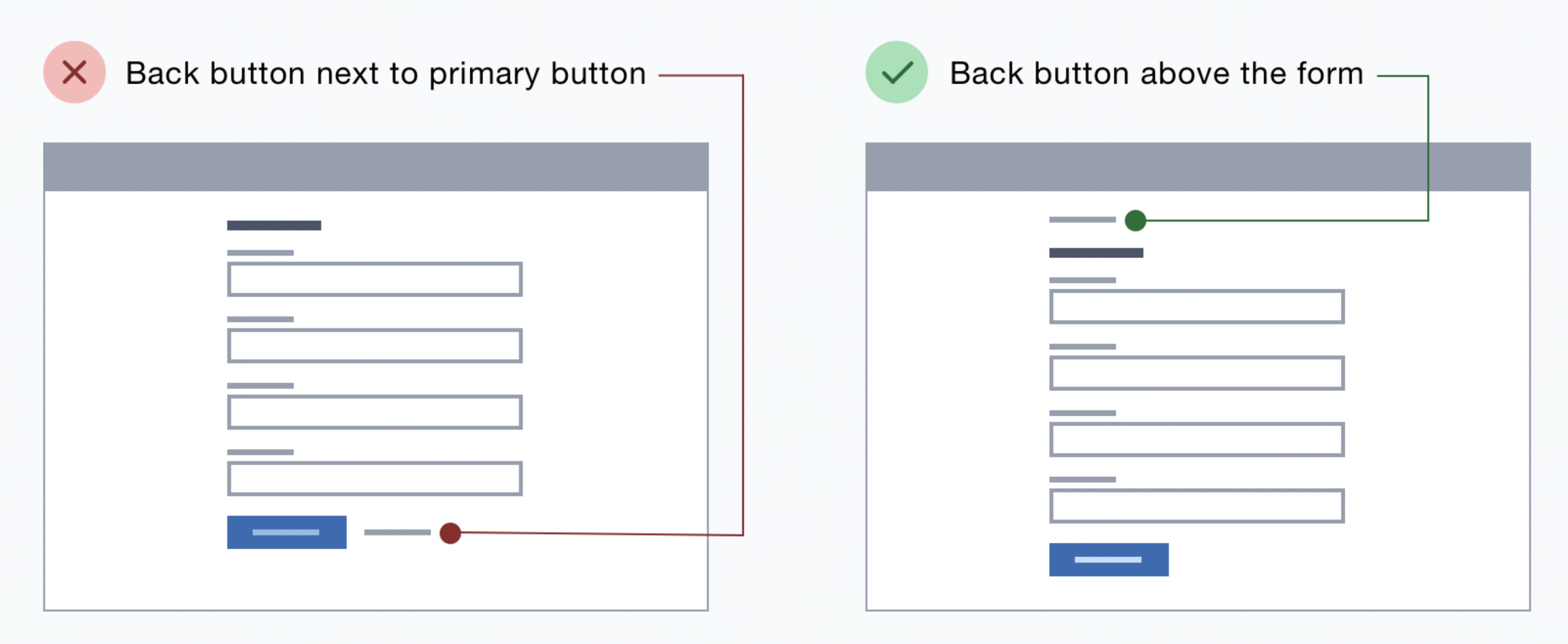
A designer might have put plenty of thought into creating a stellar website, but how well the user will connect to the features on the website makes all the difference. It is best to use time-tested patterns. For example:
- The minimize, resize, and close buttons will have regular symbols.
- The back and forward buttons should have pointing arrows.
- Placement of back, cancel buttons, etc.
Source StackExchange
Users feel abandoned if they cannot perform the primary action they’ve known for years. The best solution would be to use familiar buttons and self-explanatory texts and place buttons in a visible space.
Also Read: 11-Step Website Design Checklist
2. Get Rid of Extraneous Steps
Consider filling out a signup form on a website. The UI has to be carried out with a few simple steps rather than collecting extensive information at the beginning.
Look for elements that make the users perform additional tasks such as re-entering details, reading unnecessary content, remembering details, etc. The best alternatives could be displayed as a picture, show previously entered data again (autofill), or establish smart defaults (third party services).
Although it is impossible to eliminate all browser activities, whatever you remove liberates more cognitive capacity for crucial choices.
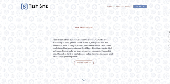
3. Avoid Background Patterns
When it comes to design, keeping it simple will fetch better outcomes. Unnecessary background patterns and usual activities from a different angle will increase cognitive overload. Instead, a simple page with default actions will help our users view what the website offers. A minimalistic website design will increase engagement, eliminate unnecessary distractions and help users focus on their goals.
Source StackExchange
Avoid creating something from scratch while building a website or adding new features. Explore designs and alternative patterns that have lasted the test of time. Or, even better, carry out user research to learn about your target audience’s actual expectations and challenges.
4. Visual Declutter
Too many representations such as images, GIFs, flashy texts, and redundant links on the webpage will increase cognitive overload.
Also Read: When to perform UX design test?
For instance, Apple’s website is the best example of a simple and clear website design that eliminates cognitive overload. The options and icons are placed clearly. The products are selectively displayed, and the User Experience is seamless. We might think keeping a website UI as simple as it looks, but a lot of hard work has been put in to capture the User’s attention without adding extra effects. The User’s purpose is fulfilled without using excessive brain power.
5. Reduce the Choices
The human brain is spoilt when given too many options. Boil down the list to only essential choices or broad choices. Create subcategories to align and clearly understand the user’s requirements.
You can combine several selections into umbrella categories assuming you’ve already eliminated pointless and repetitive options. Group similar products together; for example, if you sell gadgets, then you can group devices based on the brand. Using mega menus still offer users a wide range of alternatives, but in manageable portions, so they won’t feel overwhelmed.
Now that you have solutions to the cognitive overload problem, it is essential to keep this in mind while creating your website. Once you develop your website, you need to test it for responsiveness. Because, if the website is not responsive then all the work that you did to reduce cognitive overload will become waste.
With BrowserStack’s Responsive Checker you can test the responsiveness of your website on different devices. This means taking into account various screen sizes, device configurations, and other factors that have become a significant concern due to device fragmentation.
Benefits of Reduced Cognitive Load in Design
A well-structured, clutter-free interface allows users to process information effortlessly, leading to several key benefits:
- Improved Usability: Simplified designs help users navigate easily without confusion or frustration. Users who quickly understand how to use an interface stay longer and complete their tasks. Clear layouts and intuitive workflows create a smooth and enjoyable experience for everyone.
- Faster Decision-Making: Clear options and fewer distractions help users quickly find their needs. Removing unnecessary elements and choices prevents decision fatigue, allowing them to process information efficiently and take action without hesitation.
- Higher Engagement: A stress-free design encourages users to explore more and stay longer. Users interact more, browse additional pages, and enjoy the platform’s features when the interface feels simple and easy to use.
- Increased Conversion Rates: Simplified processes, like streamlined checkout flows, improve user retention and lead to more conversions. Removing unnecessary steps in purchasing, sign-ups, or other key actions reduces friction, making it easier for users to complete their journey without dropping off.
- Better Accessibility: A simple and well-structured design helps all users, including those with cognitive impairments. A clean interface promotes inclusivity, allowing people of all abilities to navigate and understand content easily.
- Lower Error Rates: Clear layouts and intuitive interactions reduce the likelihood of mistakes. Users who don’t have to overthink interactions make fewer errors, resulting in a smoother and frustration-free experience.
Conclusion
Keeping your design simple and easy to navigate helps users find what they need without feeling overwhelmed. When you reduce cognitive load, people can make decisions faster, engage more, and have a better overall experience. Clear layouts, fewer choices, and intuitive interactions make a big difference.
However, ensuring a seamless user experience requires thorough real-world testing. BrowserStack Live provides access to 3,500+ real devices and browsers, allowing designers and developers to test their interfaces across different environments effortlessly.
With features like interactive real-time testing, responsive design testing, and cross-browser testing, BrowserStack Live ensures that UI elements are consistent, easy to navigate, and free from design inconsistencies that could contribute to cognitive overload.
