Media queries are a powerful tool in responsive web design, enabling websites to adapt to different devices and screen sizes.
Applying specific CSS rules based on factors like width, height, and orientation ensures that content remains visually appealing and easy to navigate on smartphones, tablets, and desktops. This not only enriches user experience but also improves performance and loading times.
This article covers media queries, their importance in responsive design, different types, syntax, and best practices for effective implementation.
What is a Media Query?
A media query is a CSS technique that allows developers to apply specific styles based on the characteristics of the user’s device, such as its screen width, height, orientation, and resolution.
Designers can use media queries to create responsive layouts that adjust to different screen sizes and device capabilities, ensuring a consistent and user-friendly experience across all platforms.
Importance of Media Queries for Responsive Design
Media queries are essential for creating responsive designs. They ensure that websites look and function well on all devices and allow developers to apply different styles based on screen size, resolution, orientation, and other characteristics.
Here’s why they matter:
- Improved User Experience: Media queries adjust layouts to fit various screen sizes, ensuring content is easily readable and accessible on mobile phones, tablets, and desktops. This enriches user satisfaction and reduces bounce rates.
- Better Performance and Loading Times: Media queries help optimize loading times by loading only necessary resources, such as images and styles specific to a device. This efficiency leads to faster page speeds, crucial for user retention and SEO.
- Cost-Effective Development: Building one responsive website using media queries is more efficient than maintaining separate versions for desktop and mobile. This reduces development time and maintenance costs.
Learn More: How to check Website Loading Time
Types of Media Queries for Responsive Web Design
Different types of media queries help websites adjust to different screen sizes and devices. Here are the different types of media queries for responsive web design:
1. Width and Height Media Queries
These media queries target devices based on the width and height of their viewport. This is particularly useful for creating responsive layouts that look good on different screen sizes, such as mobile phones, tablets, and desktops.
By adjusting styles according to the screen dimensions, developers can ensure that content remains readable and functional.
Example:
@media (max-width: 768px) {

  /* Styles for devices with a maximum width of 768px */

  body {

    font-size: 14px;

  }

}
In this example, the text size is reduced for 768px wide or smaller screens, ensuring better readability on mobile devices.
2. Orientation Media Queries
Orientation media queries apply styles based on the device’s orientation—either portrait (vertical) or landscape (horizontal). This is useful for optimizing layouts for tablets and smartphones that can be rotated.
Example:
@media (orientation: landscape) {

  /* Styles for landscape orientation */

  .sidebar {

    display: block;

  }

}
Here, the sidebar is displayed only when the device is in landscape mode, making better use of the wider screen space.
3. Resolution Media Queries
These media queries target devices based on screen resolution or pixel density. They are beneficial for optimizing images and other visual elements on high-resolution displays, such as Retina screens.
Example:
@media (min-resolution: 2dppx) {

  /* Styles for devices with a minimum resolution of 2 dots per pixel */

  .logo {

    background-image: url('logo@2x.png');

  }

}
This example loads a higher-resolution logo for devices with a pixel density of 2dppx or more. This will ensure crisp and clear images.
Also Read: How to make Images Responsive with Examples
4. Media Type Queries
Media type queries specify styles for different media types, such as screens, print, or speech. This allows developers to create optimized styles for different environments.
Example:
@media print {

  /* Styles for printed documents */

  body {

    color: black;

    background: none;

  }

}
In this case, the background is removed, and text color is set to black for better print quality.
5. Feature Queries
Feature queries apply styles based on the availability of specific CSS features. This is particularly useful for ensuring compatibility with older browsers while leveraging advanced features in modern browsers.
Example:
@supports (display: grid) {

  /* Styles for browsers that support CSS Grid */

  .gallery {

    display: grid;

    grid-template-columns: repeat(3, 1fr);

  }

}
This example uses CSS Grid to arrange a gallery layout but only on browsers that support it. This ensures a graceful fallback for older browsers.
By using these different types of media queries, developers can create responsive and flexible web designs that provide an optimal user experience on any device.
Syntax for Media Queries
Media queries use a specific syntax to apply CSS rules conditionally, allowing developers to create responsive designs that adapt to different devices and screen sizes. Here’s the basic syntax:
@media [media-type] ([media-feature]) {

  /* CSS rules */

}
- @media: The at-rule used to define a media query.
- [media-type]: Optional; specifies the type of media (e.g., screen, print). If omitted, the styles apply to all media types.
- [media-feature]: A condition or expression that evaluates to true or false, determining whether the enclosed styles should be applied.
Common Media Query Breakpoints for Devices
Breakpoints are specific viewport widths at which a website’s layout changes to provide an optimal viewing experience.
While breakpoints should be based on the content and design requirements, below are some of the most common breakpoints:
Common Media Query Breakpoints for Devices:
- 320px: Mobile devices (portrait)
- 480px: Mobile devices (landscape)
- 768px: Tablets (portrait)
- 1024px: Tablets (landscape) and small desktops
- 1200px: Large desktops
How to Use Media Queries in Responsive Design
Implementing media queries involves defining CSS rules that apply only when certain conditions are met.
Here’s how to use them effectively:
1. HTML Media Queries
HTML media queries are used within <link> or <script> tags to load different stylesheets or scripts depending on the device’s characteristics. This method helps optimize loading times and deliver the most relevant resources to users.
Example 1: Loading Different Stylesheets
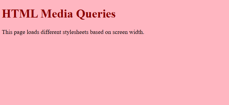
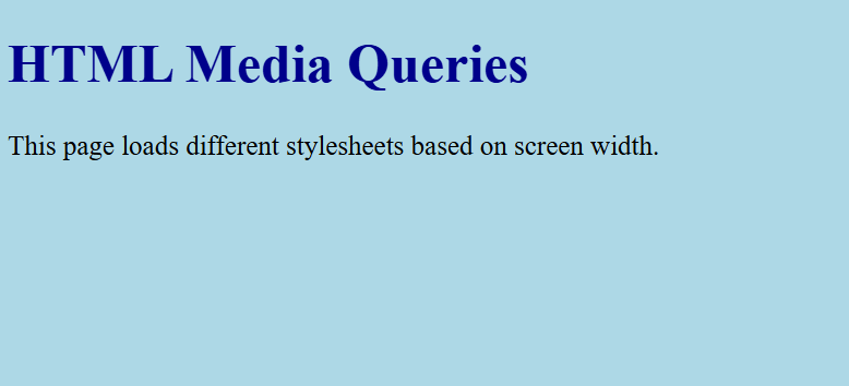
In this example, we load different CSS files based on the screen width. This approach helps deliver a mobile-friendly layout for smaller screens and a more detailed design for larger screens.
HTML:
<!DOCTYPE html>

<html lang="en">

<head>

  <meta name="viewport" content="width=device-width, initial-scale=1.0">

  <!-- Load styles for mobile screens -->

  <link rel="stylesheet" href="styles-mobile.css" media="screen and (max-width: 600px)">

  <!-- Load styles for larger screens -->

  <link rel="stylesheet" href="styles-desktop.css" media="screen and (min-width: 601px)">

  <title>HTML Media Queries Example</title>

</head>

<body>

  <h1>HTML Media Queries</h1>

  <p>This page loads different stylesheets based on screen width.</p>

</body>

</html>
styles-mobile.css:
body {

  background-color: lightpink;

  font-size: 16px;

}

h1 {

  color: darkred;

}
styles-desktop.css:
body {

  background-color: lightblue;

  font-size: 20px;

}


h1 {

  color: darkblue;

}
First Output based on screen width
Second Output based on screen width
Also Read: Bootstrap Breakpoints and Media Queries
2. CSS Media Queries
CSS media queries are written directly within CSS files or <style> tags. They allow you to dynamically modify the presentation of elements based on screen size, orientation, resolution, and more.
Example 1: Responsive Layout
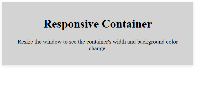
This example demonstrates how to adjust the layout of a container element as the screen width changes.
HTML:
<!DOCTYPE html>

<html lang="en">

<head>

  <meta name="viewport" content="width=device-width, initial-scale=1.0">

  <title>CSS Media Queries Example</title>

  <link rel="stylesheet" href="styles.css">

</head>

<body>

  <div class="container">

    <h1>Responsive Container</h1>

    <p>Resize the window to see the container's width and background color change.</p>

  </div>

</body>

</html>
CSS (styles.css):
/* Base styles */

.container {

  width: 100%;

  padding: 20px;

  background-color: white;

  text-align: center;

  box-shadow: 0 4px 8px rgba(0,0,0,0.1);

}


/* Styles for screens wider than 600px */

@media (min-width: 600px) {

  .container {

    width: 80%;

    background-color: lightgray;

  }

}

/* Styles for screens wider than 900px */

@media (min-width: 900px) {

  .container {

    width: 60%;

    background-color: lightblue;

  }

}
Output:
3. JavaScript Media Queries
JavaScript can also evaluate media queries and apply changes dynamically. This method is useful when triggering specific behaviors or functionalities based on device characteristics.
Example 1: Dynamic Background Color Change
Using JavaScript’s window, this example changes the background color based on the viewport width.matchMedia() method.
HTML:
<!DOCTYPE html>

<html lang="en">

<head>

  <meta name="viewport" content="width=device-width, initial-scale=1.0">

  <title>JavaScript Media Queries Example</title>

  <script src="script.js" defer></script>

</head>

<body>

  <h1>JavaScript Media Queries</h1>

  <p>Resize the window to see the background color change dynamically.</p>

</body>

</html>
JavaScript (script.js):
// Check if the viewport is at least 600px wide

const mediaQuery = window.matchMedia('(min-width: 600px)');

// Function to handle changes in viewport size

function handleViewportChange(e) {

  if (e.matches) {

    // Viewport is at least 600px wide

    document.body.style.backgroundColor = 'lightgray';

  } else {

    // Viewport is less than 600px wide

    document.body.style.backgroundColor = 'white';

  }

}

// Attach listener

mediaQuery.addListener(handleViewportChange);

// Initial check

handleViewportChange(mediaQuery);
Also Read: Advanced CSS Tutorial
Advanced Media Query Techniques for Responsive Web Design
Advanced media query techniques help developers build highly adaptable layouts that enrich user experience across different devices.
Here are some of the powerful methods for using media queries responsive designs:
1. Combining Multiple Conditions
You can use logical operators like and, or, and not to combine multiple conditions in media queries. This allows you to apply styles more precisely for specific screen sizes and orientations.
Example: Styles for Specific Width Range and Orientation
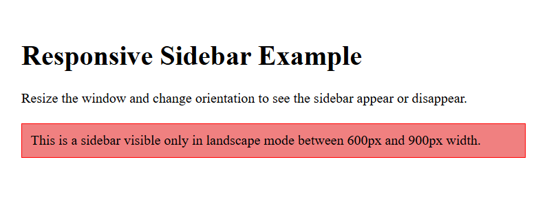
This example targets devices with widths between 600px and 900px in landscape orientation. It demonstrates how to show a sidebar only on these devices.
HTML:
<!DOCTYPE html>

<html lang="en">

<head>

  <meta name="viewport" content="width=device-width, initial-scale=1.0">

  <title>Combining Multiple Conditions</title>

  <link rel="stylesheet" href="styles.css">

</head>

<body>

  <div class="container">

    <h1>Responsive Sidebar Example</h1>

    <p>Resize the window and change orientation to see the sidebar appear or disappear.</p>

    <div class="sidebar">This is a sidebar visible only in landscape mode between 600px and 900px width.</div>

  </div>

</body>

</html>
CSS (styles.css):
/* Base styles */

.container {

  padding: 20px;

}


.sidebar {

  display: none;

  background-color: lightcoral;

  padding: 10px;

  margin-top: 20px;

  border: 1px solid red;

}


/* Show sidebar between 600px and 900px in landscape mode */

@media (min-width: 600px) and (max-width: 900px) and (orientation: landscape) {

  .sidebar {

    display: block;

  }

}
Output:
Also Read: Top Responsive CSS Frameworks
2. Retina and High-Resolution Displays
To enrich visuals on high pixel density devices like Retina displays, you can use resolution-based media queries. These queries detect devices with high DPI or pixel ratios and apply sharper graphics or high-resolution images.
Example: Retina Image Replacement
This example swaps a standard image with a high-resolution version on Retina or high DPI devices, ensuring crisp visuals.
HTML:
<!DOCTYPE html>

<html lang="en">

<head>

  <meta name="viewport" content="width=device-width, initial-scale=1.0">

  <title>Retina Image Replacement</title>

  <link rel="stylesheet" href="styles.css">

</head>

<body>

  <h1>High-Resolution Image Example</h1>

  <div class="logo"></div>

</body>

</html>
CSS (styles.css):
/* Base image */

.logo {

  width: 200px;

  height: 100px;

  background-image: url(''https://logon-int.com/wp-content/uploads/2022/12/browserstack-logo-600x315-1.png');

  background-size: contain;

  background-repeat: no-repeat;

}

/* Retina or high DPI displays */

@media (-webkit-min-device-pixel-ratio: 2), (min-resolution: 192dpi) {

  .logo {

    background-image: url('logo@2x.png');

  }

}
Output:
3. Dark Mode Support
With dark mode becoming increasingly popular, you can use media queries to detect users’ preferred color scheme. This automatically adjusts your site’s color palette, enhancing user comfort and engagement.
Example: Dark Mode Toggle
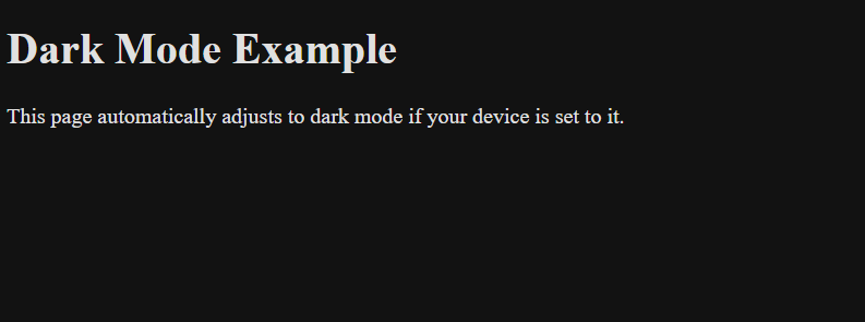
This example changes the background and text color to fit dark mode preferences.
HTML:
<!DOCTYPE html>

<html lang="en">

<head>

  <meta name="viewport" content="width=device-width, initial-scale=1.0">

  <title>Dark Mode Support</title>

  <link rel="stylesheet" href="styles.css">

</head>

<body>

  <h1>Dark Mode Example</h1>

  <p>This page automatically adjusts to dark mode if your device is set to it.</p>

</body>

</html>
CSS (styles.css):
/* Light mode styles */

body {

  background-color: white;

  color: black;

}


/* Dark mode styles */

@media (prefers-color-scheme: dark) {

  body {

    background-color: #121212;

    color: #e0e0e0;

  }

}
Output:
Using these strategies, you can create dynamic and adaptive layouts catering to a wide range of devices and user preferences.
Importance of Testing Media Queries on Real Devices
Testing media queries on real devices is essential to guarantee a seamless user experience across different screen sizes.
BrowserStack’s Real Device Cloud helps detect layout inconsistencies that emulators may miss, such as overlapping elements or cut-off text, while ensuring smooth functionality for gestures like tapping and swiping. It allows performance assessment under real-world conditions to accurately evaluate page load speed and responsiveness.
Benefits of BrowserStack Live:
- Access Real Devices and Browsers: Test across a vast range of real devices and browser versions.
- Accurate Display Testing: Identify layout issues like overlapping elements and text cut-offs that emulators may miss.
- Touch & Gesture Testing: Ensure smooth interactions for gestures like tapping, swiping, and scrolling.
- Performance Evaluation: Assess real-world load times and responsiveness across different devices.
- Real-time Debugging Tools: Debug instantly with developer tools for faster issue resolution.
- Testing on Dev & Staging Environments: Verify responsiveness with secure local testing before deployment.
- Multi-Device Parallel Testing: Run tests on multiple devices simultaneously to speed up workflows.
- Local Testing with Zero Setup: Test websites behind firewalls or in development with ease.
Common Mistakes When Using Media Queries
Media queries help make websites look good on all devices, but some common mistakes can mess up the design. Here are four mistakes to watch out for:
- Using Too Many Media Queries: Adding too many breakpoints makes your CSS complicated and hard to manage. It’s better to start with a mobile-first design and add breakpoints only when needed to improve the layout.
- Inconsistent Breakpoints: The design may look uneven on different screens if you use different breakpoints for different parts of your site. To avoid this, stick to a set of standard breakpoints for your entire project.
- Targeting Specific Devices: Designing for specific devices (like a particular phone model) is a bad idea because new devices with different screen sizes always come out. Instead, use flexible breakpoints, like min-width and max-width, to adapt the design to any screen size.
- Ignoring Orientation and Resolution: Not considering device orientation (portrait or landscape) and screen resolution can lead to poor user experiences. Use media features like orientation and resolution to ensure your design looks good on all devices.
Best Practices for Using Media Queries in Responsive Design
In addition to avoiding the challenges discussed above, it’s essential to follow best practices for media queries. Here are some effective strategies to get the most out of media queries responsive design.
- Start with Mobile First: Begin by designing for the smallest screen size, like mobile phones. Then, add media queries for larger screens, such as tablets and desktops. This keeps your site simple and fast on mobile devices and avoids unnecessary CSS overrides.
- Use Flexible Units: Instead of using fixed sizes like pixels, use flexible units like em, rem, or percentages. These adjust better to different screen sizes, making your design more adaptable and user-friendly.
- Keep Breakpoints Simple: Don’t use too many breakpoints. Stick to the most common screen sizes, like 600px for mobile, 900px for tablets, and 1200px for desktops. This keeps your CSS easy to manage.
- Organize Media Queries: Group related styles within the same media query. This keeps your CSS clean and easier to read. It also helps your website load faster by avoiding repeated styles.
- Test on Real Devices: Always check your site’s appearance on actual devices. This ensures a consistent experience for all users. Tools like BrowserStack help you test media queries responsive across different devices and browsers.
Conclusion
Learning to use media queries effectively is essential for building responsive websites that look great on any screen size, whether it’s a phone, tablet, or computer. By implementing the best practices covered in this guide, you can ensure a smooth and engaging user experience.
With tools like BrowserStack, you can easily check your website’s performance across different screen resolutions, ultimately delivering a flawless and responsive web experience.
