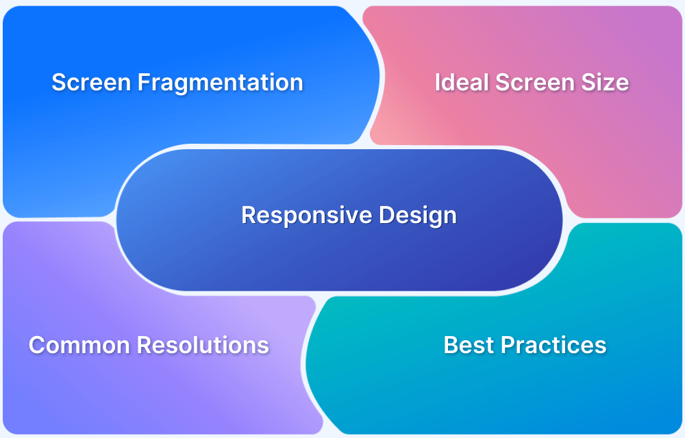
Responsive design adapts layouts to various screen sizes and prevents content from breaking or becoming unreadable. It improves readability, usability, and navigation without requiring separate designs for each device. Consider common screen resolutions when developing your website so it adapts to every screen size.
Overview
Common Screen Resolutions
The most widely used screen resolutions vary by device type and influence how content is displayed.
Desktop
- 1920×1080
- 1536×864
- 1366×768
Mobile
- 360×800
- 390×844
- 393×873
Tablet
- 768×1024
- 810×1080
- 820×1180
This article explains the ideal screen size and resolution for responsive web design and highlights the best practices for implementing it.
What is Responsive Design?
Responsive web design is a design strategy that creates websites that work well for mobile, tablet, and desktop devices. Websites without responsive design risk alienating a significant number of users.
- Responsive design entails designing a website so that a web app provides a good UX across various devices.
- Mobile Responsive design includes scaling the web page components and content according to every device’s common screen resolutions.

How to find the Ideal Screen Size for Responsive Design?
Finding the ideal screen size for responsive design involves understanding user behavior, device trends, and industry standards.
1. Check Your Audience’s Devices
Use tools like Google Analytics to check which devices your website visitors use. It provides device categories (mobile, tablet, desktop) and additional details like brand, model, and browser. Use the insights to identify the top five most commonly used screen sizes. However, regularly analyze the data to ensure the design adapts to shifting usage patterns.
2. Follow Industry Trends
Industry trends reflect commonly used screen sizes across different device categories. These trends emerge based on market demand and device popularity, which makes them a reliable reference for designing responsive interfaces.
Designing with these sizes ensures a smooth experience across a broad range of devices.
- Mobile: 360px, 390px
- Tablets: 768px, 810px
- Desktops/Laptops: 1920px, 1366px
3. Use Real-World Testing
Research helps identify common screen sizes, but real-world testing ensures your app looks and functions smoothly across different devices. Use a real device cloud platform like BrowserStack that provides access to over 3,500 real Android and iOS devices. For each device, you can check:
- Screen size: Helps determine key dimensions to focus on
- Viewport: Shows the actual visible area for web content
- Resolution: Useful for understanding display quality and density
- Popularity: Highlights how frequently the device is used for testing in BrowserStack and its market share.

Since testing on every device is not practical, focus on widely used screen sizes to ensure better coverage while avoiding unnecessary overlap.
Common Screen Resolutions for Mobile in 2025
Mobile devices come in various sizes, but a few resolutions dominate the market. Focus on these to ensure better compatibility across most smartphones.
- 360×800 (10.56%)
- 390×844 (6.72%)
- 393×873 (5.49%)
- 412×915 (4.2%)
- 375×812 (3.87%)
- 393×852 (3.83%)

Common Screen Resolutions for Desktop in 2025
Desktop screens vary in size and resolution, but these screen resolutions are widely used.
- 1920×1080 (24.27%)
- 1536×864 (11.13%)
- 1366×768 (10.85%)
- 1280×720 (5.82%)
- 1440×900 (4.18%)
- 2560×1440 (3.29%)

Also Read: Breakpoints for Responsive Web Design
Common Screen Resolutions for Tablet in 2025
Tablets bridge the gap between mobile and desktop, with resolutions differing by brand and model. Optimizing for the most common ones helps maintain usability across devices.
- 768×1024 (17.59%)
- 810×1080 (10.53%)
- 820×1180 (8.33%)
- 800×1280 (7.53%)
- 1280×800 (6.47%)
- 601×962 (3.57%)

5 Best Practices for Implementing Responsive Design
It becomes a lot easier to design a website for multiple screen sizes with the following guidelines:
1. Know Your Breakpoints
In responsive design, a breakpoint is the “point” at which a website’s content and design will adapt in a certain way to provide the best possible user experience. To make a website responsive, designers must add a breakpoint when the content looks misaligned. Depending on the number of devices the site is being aligned to, multiple breakpoints must be set to ensure responsiveness. Refer to this article on responsive breakpoints to learn about them and their effectiveness.
2. Create Fluid Designs
Fluid design refers to a design layout that can shift (expand and contract) to fit the device viewport it is running on. A fixed design layout will undesirably distort on every viewport that they are not aligned to. Work on design layouts by using % units as well as max-widths to ensure that the layout fits mobile device viewports without becoming too wide on desktop device viewports.
3. Decrease Friction
The design must be easy to use on multiple devices. Responsive design doesn’t just include what a website looks like and how it performs in terms of accessibility and usability. Focus particularly on small-screen friction because web elements have less space to render as screen sizes decrease and become more likely to scramble and distort.
4. Design Mobile-First
Since friction is more likely on smaller screens, design with a mobile-first approach. It is harder to narrow a desktop layout for a mobile viewport, while doing the reverse is easier. When designing mobile-first, the designer includes what is necessary for providing the optimal user experience.
5. More Functionality, Less Typing
Typing is harder on mobile devices than on desktop devices. So it makes sense to minimize the need for typing on mobile versions of websites. Replace typing with consciously leveraging device functions such as GPS, QR code reading, biometric ID, etc. Make it easier for users to share, email, or call relevant numbers by placing links that launch the necessary functions. Remember that the best responsive design involves simplifying and eliminating inconvenient mobile interactions.
While a responsive design may seem difficult to execute, the information in this article seeks to simplify this process for developers and designers. By doing what has been outlined above, it becomes much easier to create websites that please its audience, irrespective of the device they use to access that website.
Responsive Design Testing on Real Browsers and Devices
Testing on real devices ensures that a website looks and functions correctly across different screen sizes, operating systems, and browsers. Simulators and emulators help, but they do not always replicate real-world performance issues like hardware limitations, touch responsiveness, or browser inconsistencies.
An easy way to perform real-device testing is by using BrowserStack Responsive Design Checker. Instead of manually testing on individual devices with different viewports, enter the website URL into the checker to see how it appears on various modern devices at frequently used resolutions. You can also check how the website looks in portrait and landscape modes.
Here are some more ways BrowserStack can help with responsive design testing.
- Broad Range of Real Devices: Allows you to test on over 3,500 Android and iOS real devices to ensure accurate results across multiple screen sizes and operating systems.
- Resolution Selection: The Resolution Prompt displays available screen resolutions, allowing testers to switch resolutions instantly during a Live session.
- Comprehensive Testing Support: Supports both manual and automated responsive testing using real browsers and devices to catch inconsistencies effectively.
- Font Magnification Checks: Ensures text scales up to 200% without breaking layout or functionality and enhances accessibility for users with visual impairments.
- Dynamic Content Testing: Percy stabilizes dynamic elements like animations to reduce false positives and ensure accurate test results.
Conclusion
An ideal screen size for responsive design depends on the target audience and device usage trends. Designing for a range of breakpoints, including mobile (360px, 390px), tablets (768px, 810px), and desktops (1366px, 1920px), ensures a seamless experience across various devices.
However, make sure to test on real devices to validate responsiveness, as emulators and simulators cannot fully replicate real-world conditions. BrowserStack provides access to over 3,500 real Android and iOS devices and allows teams to test across multiple screen sizes and operating systems for accurate and reliable results.


