How to use CSS rgba() function correctly?
May 12, 2023
Using CSS, you can specify the color and the degree of transparency by using the RGBA color value. The RGBA color is an enhancement of the original RGB color space. Red Green Blue Alpha is what the abbreviation stands for.
The RGB color model defines a color through its red, green, and blue elements. If you want a true blue color, you should use no other colors but blue. On the other hand, fuchsia is achieved by combining red and blue at ratios of one hundred percent each and zero percent green.
- What is RGBA() Function?
- The Power of the rgba() Color Function in CSS
- Understanding the CSS rgba() Function
- RGBA vs RGB
- Use Cases of rgba() Function
- How does RGBA () function work?
- Example of RGBA function
- Guidelines for using CSS rgba() Function
- Best Practices for Using CSS rgba() Function
- Testing and Debugging
What is RGBA() Function?
Using the rgba() function, rgba values may be used with any CSS property that takes a color.
The format of the CSS RGBA Value:
- rgba(R,G,B,A) -integer-
The syntax for an RGBA value in the functional notation is ‘rgba(‘ followed by a comma-separated list of three numerical values (three integer values), followed by an <alphavalue>.
- rgba(R,G,B,A) -percentage-
The syntax of an RGBA value in the functional notation is ‘rgba(‘ followed by a comma-separated list of three numerical values (three percentage values), followed by an <alphavalue>.
The function rgba() provides a set of values that may be used to change an element’s color, including its background color, image color, box color, and so on. The CSS syntax to produce a color using RGBA values is as follows:
rgba(red, green, blue, alpha)
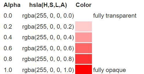
Here, each parameter—red, green, blue, and alpha—defines the strength of the colors. By setting all color parameters to “255” and alpha to “0”, you can use this formula to display white rgba. Typically, alpha values vary from 0.0 to 1.0, where 1.0 means completely opaque and 0.0 means completely transparent.

<!DOCTYPE html>
<html lang="en">
<head>
<meta charset="UTF-8">
<meta name="viewport" content="width=device-width, initial-scale=1.0">
<title>Color Functionality with rgba</title>
<style>
.colorBox1 {
background-color: rgba(2, 154, 1, 0.6);
text-align: center;
}

.colorBox2 {
background-color: rgba(1, 254, 1, 0.6);
text-align: center;
}

.colorBox3 {
background-color: rgba(134, 151, 151, 0.6);
text-align: center;
}

.headerText {
font-size: 42px;
font-weight: bold;
color: darkgreen;
text-align: center;
}

h1 {
text-align: center;
}
</style>
</head>
-
<body>
<div class="headerText">WebColor Explorer</div>
<h1>Exploring rgba() Function</h1>
<p class="colorBox1">Emerald</p>
<p class="colorBox2">Mint</p>
<p class="colorBox3">Grey Shade</p>
</body>
</html>
The Power of the rgba() Color Function in CSS
The ability to set the opacity on a color varies somewhat from using the CSS opacity attribute to changing the opacity on an element. Let’s examine a concrete illustration.
Here, an H1 with contrasting foreground and background colors is shown on a page with a patterned background.
h1 {
color: rgb(0, 0, 0);
background-color: rgb(255, 255, 255);
}
The opacity of an element and its children may be changed using the CSS opacity attribute.
<!DOCTYPE html>
<html lang="en">
<head>
<meta charset="UTF-8">
<meta name="viewport" content="width=device-width, initial-scale=1.0">
<title>Opacity Example</title>
<style>
.transparent-box {
background-color: lightblue;
padding: 20px;
opacity: 0.7; /* Setting the opacity */
}

.transparent-box p {
color: darkblue;
font-size: 18px;
}
</style>
</head>
<body>
<div class="transparent-box">
<p>This is a transparent box.</p>
<p>Even this text is slightly transparent because it is a child of the transparent box.</p>
</div>
</body>
</html>
The advantage of CSS RGBA color is that you may modify the opacity of the individual colors rather than the whole element.
So you can just set the background’s opacity:
<!DOCTYPE html>
<html lang="en">
<head>
<meta charset="UTF-8">
<meta name="viewport" content="width=device-width, initial-scale=1.0">
<title>RGBA Color Example</title>
<style>
.semi-transparent-background {
background-color: rgba(0, 128, 255, 0.5); /* Blue background with 50% opacity */
padding: 20px;
color: #000000; /* Black text color */
}
</style>
</head>
<body>
<div class="semi-transparent-background">
<p>This box has a semi-transparent background color.</p>
<p>The text, however, remains fully opaque.</p>
</div>
</body>
</html>
Alternatively, you could keep your background solid and just adjust the text’s opacity:
h1 {
color: rgb(0, 0, 0);
background-color: rgba(255, 255, 255, 0.5);
}

Hex codes cannot be used to provide opacity, thus you use rgba() as follows:
color: rgba(255, 255, 255, 0.5);
The first three values are red, green, and blue, much as rgb(). These range from 0 to 255 or from 0% to 100%. The opacity level, which ranges from 0 (totally transparent) to 1 (entirely opaque), is the fourth value.
This may be used for foregrounds and backgrounds, borders, outlines, and other things just as you would use a color in CSS.
Gradients
The background may also be added as a solid color, and the gradient color stops can then be added using a pseudo-element with rgba() colors.
<!DOCTYPE html>
<html lang="en">
<head>
<meta charset="UTF-8">
<meta name="viewport" content="width=device-width, initial-scale=1.0">
<title>Modified Gradient Example</title>
<style>
.myDiv {
position: relative;
background-color: teal;
padding: 20px;
color: white;
}

.myDiv::after {
content: "";
display: block;
position: absolute;
left: 5px;
top: 5px;
width: calc(100% - 10px);
height: calc(100% - 10px);
background: linear-gradient(to bottom, rgba(255, 0, 0, 0.1), rgba(0, 0, 255, 0.6));
z-index: -1;
}
</style>
</head>
<body>
<div class="myDiv">
<p>This div has a modified gradient background.</p>
<p>The text is fully opaque.</p>
</div>
</body>
</html>
Changing the background color this way will also allow you to animate the gradients.
Also Read: Top Responsive CSS Frameworks
Understanding the CSS rgba() Function
Definition and Syntax
The CSS rgba() function defines colors using the RGBA model. RGBA color values are an extension of RGB color values, which include an alpha channel to indicate color transparency.
rgba( red, green, blue, alpha )
Parameters
The function has four parameters, which are as follows:
- The parameter “red” defines the red color’s intensity. The value is an integer ranging from 0 to 255 or a percentage ranging from 0% to 100%.
- The green parameter specifies the green color’s intensity. The value is an integer ranging from 0 to 255 or a percentage ranging from 0% to 100%.
- The blue parameter determines the level of blue color intensity. The value is an integer ranging from 0 to 255 or a percentage ranging from 0% to 100%.
- The alpha parameter specifies opacity and ranges from 0.0 (fully transparent) to 1.0 (fully opaque).
RGBA vs RGB
RGB Color Scheme: The three-channel scheme includes red, green, and blue information. The CSS RGB color format may be set by using:
rgb(red, green, blue)
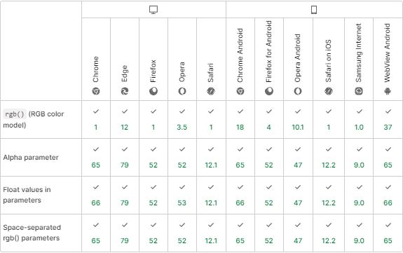
Each argument in the rgb() method specifies a color’s intensity in the 0 to 255. The greatest value of that color being used is 255, whereas the number 0 indicates that no color of that kind is being used at all. Many different browsers support the CSS function rgb().
RGBA Color Scheme: The RGBA color format expands the RGB color model with an additional alpha channel determining the color’s opacity. CSS allows for the specification of the RGBA color standard using:
rgba(red, green, blue, alpha)
The alpha value is a decimal number ranging from 0 to 1, where 0 denotes complete transparency and 1 full opacity. The older browser may not fully support the CSS rgba() function.
Use Cases of rgba() Function
- RGBA is an abbreviation for red, green, and blue alpha.
- While it is commonly referred to as a color space, it is a three-channel RGB color model plus an additional alpha channel.
- Alpha defines how opaque each pixel is and enables an image to be blended over others using alpha compositing, with transparent sections and anti-aliasing of the edges of opaque regions.
Example:
<!DOCTYPE html>
<html lang="en">
<head>
<meta charset="UTF-8">
<meta name="viewport" content="width=device-width, initial-scale=1.0">
<style>
header {
background-color: hsl(10, 100%, 50%);
}
section {
background-color: rgb(0, 128, 255);
color: rgb(255, 255, 255);
}
article {
background-color: rgba(255, 100, 100, 0.8);
}
</style>
</head>
<body>
<header>Crimson Background</header>
<section>Azure Background</section>
<article>Web Testing Demo!</article>
</body>
</html>
How does RGBA () function work?
- The RGB color model defines only red, green, or blue colors.
- You will go with 100% blue and 0% red and green for pure blue. However, you shall use 100% red, 100% blue, and 0% green for fuchsia.
- And if you want to make black, you may use basic color theory, which stipulates that the absence of any color is black.
As a result, you will go with 0% red, green, and blue. So RGB is like combining watercolors to get a particular tone.
- RGBA in CSS3 is similar to Photoshop’s Layers feature.
- In addition to the basic blue, fuchsia, or black colors, RGBA also enables you to add a certain amount of transparency.
- Consider adding that transparency to your design as a new element. But let’s be clear: CSS already has an opacity attribute.
- The element as a whole and everything included inside it may be readily specified in terms of opacity.
RGBA, on the other hand, enables you to go beyond that; rather than controlling the opacity of the whole element, you may do it for specific colors. Depending on your needs, you may change the transparency or opacity of the background, foreground, or both.
#text1 {background-color:rgba(255, 50, 50, 0.5);} /* slightly different red with different opacity */
#text2 {background-color:rgba(50, 255, 50, 0.5);} /* slightly different green with different opacity */
#text3 {background-color:rgba(50, 50, 255, 0.5);} /* slightly different blue with different opacity */
 Example of RGBA function
RGBA color is remarkable because it allows you to make visually striking designs without resorting to graphics. That results in shorter load times and less weight and simpler, quicker-to-manage websites.
Unlike photos, CSS values may be modified dynamically in response to user input or JavaScript.
box {
color: rgba(255, 255, 255, 0.7);
background-color: rgba(120, 200, 80, 0.2);
}
box:hover, box:active {
color: rgba(255, 255, 255, 0.9);
background-color: rgba(120, 200, 80, 0.5);
}
The overlay items and the page behind may transition smoothly if the border colors are transparent.
section {
color: rgb(10, 10, 10);
background-color: rgb(245, 245, 245);
border: 8px dashed rgba(255, 255, 255, 0.5);
transition: border 0.5s ease-in-out;
}
section:hover {
border: 8px dashed rgba(255, 255, 255, 0.8);
}
Guidelines for using CSS rgba() Function
1. Choosing the Right Opacity Value
The Cascading Style Sheets (CSS) property set allows several website layout designs, color and font adjustments, image effects, and more. Choosing the most aesthetically attractive color schemes is crucial when creating a website.
- Background elements on one page may be seen using a transparent color, a particular and rare CSS attribute.
- Transparent colors may be applied to any element. W
- hen adjusting the level of transparency on an element, the two most important and perplexing properties for web designers are opacity and rgba().
Through CSS, the opacity property may specify the degree of transparency for a given element. The acceptable range for the opacity value is 0 to 1.
For instance, you must set the opacity value to 0.3 to obtain 30% transparency for the specific element.
See how opacity is applied in the text-containing, black-colored div class in the example below:
.text-container {
background-color: rgb(10, 10, 10);
opacity: 0.5;
border: 8px double #3d31fd;
}
Examples of using Opacity with rgba() Function
For that specific element mentioned above, you must set the alpha value to 0.3 to get a 30% transparency. Check out the rgba() example, which sets the RGB value to 0 (black), and the alpha value to 0.3.
.alpha-bg {
background-color: rgba(5, 5, 5, 0.3);
border: 8px dashed #3c30ee;
}
Although rgba and opacity are used to control an element’s transparency, they function differently due to a few simple but significant differences.
The main distinction is that opacity also applies to its sub-elements. Rgba(), on the other hand, merely applies the transparency of the color to that specific element.
2. Choosing the Right Color
Understanding the Hue, Saturation, and Lightness (HSL) Model
Hue, Saturation, and Lightness, or HSL, is one of the primary methods to express the RGB color values. Hue, Saturation, and Brightness, or HSB, is a commonly used acronym that means roughly the same thing.
- What comes to mind when you think of color is the hue. The term “color wheel” refers to a color wheel that moves from red to yellow, lime to aqua to blue to magenta and back to red. It is measured in degrees of the color wheel. Due to this, the hue color wheel has red at 0° and then 360° of red. Always, hue refers to the primary color.
- The degree of hue purity is known as saturation. When a color is fully saturated, the original base hue is used. Saturation is expressed as a percentage number between 0% and 100%. Black will always be at 0% saturation.
- The quantity of white or black blended into a color determines its lightness (or brightness). A percentage value between 0% and 100% is computed for it. Furthermore, 0% lightness will always be black.
Examples of Using HSL Model with rgba() Function
If you’re familiar with CSS, you’re probably also familiar with named colors, hexadecimal colors, and RGB values. They are all symbols for colors and their function in CSS. Black, white, red, green, and so on are all examples of named colors with predetermined meanings. Named colors have a distinct disadvantage: they cannot be modified to provide a wider palette.
The hexadecimal system lets you choose colors without worrying about matching RGB values. However, the model isn’t very adaptable when changing colors. RGB and HSL are useful for this purpose.
Hue-Saturation-Lightness (HSL) is an additional method of expressing colors in CSS. The following HSL value may describe the purple color:
hsl(30, 100%, 50%)
The first parameter defines Hue, the value of the real pure color (Red, Yellow, Green, Blue, Magenta, etc.) as displayed on a color wheel. The range of the numbers is from 0 to 360 degrees. Here, red is represented by 0 and 360 degrees, green by 120 degrees, and blue by 240 degrees.
In HSL, the Saturation and Lightness values of color may be adjusted independently.
3. Browser Compatibility
Compatibility Issues with rgba() Function
The State of CSS Survey 2022 reports that browser incompatibilities remain problematic for web and browser development communities. Most web application developers surveyed reported dealing with browser compatibility difficulties caused by cascading style sheets.
Specifically, Internet Explorer (IE) was singled out as the most incompatible browser, with almost all respondents pointing the finger at IE as the root of the issue. It’s important to fix Browser Compatibility Issues in CSS using RGBA and choose the best device-browser matrix.
The Opacity property of CSS is often used in web design since it dramatically improves the quality of a website; nonetheless, it is important to be aware of any potential compatibility concerns you may have while using this feature.
Additionally, using CSS techniques your code may be tested in real-time across many browsers and operating systems using BrowserStack Live. This lets you ensure your web app performs as expected across all browsers by simulating real user conditions.
Best Practices for Using CSS rgba() Function
Organizing CSS Code
When creating a new website or webpage, functions are often used. That’s why it’s crucial to become proficient in as many areas of development as possible. When you replace tedious, long-winded coding with abstract functions, your code becomes more efficient.
The rgba() method is widely used and may be found on almost every website. It seems to serve an essential purpose as well. Therefore, you must learn about this function by examining its syntax and definition.
element{
color:rgba(red,blue,green,alpha);
}
<!DOCTYPE html>

<html lang="en">

<head>
<meta charset="UTF-8">
<meta name="viewport" content="width=device-width, initial-scale=1.0">
<style>
div {
background-color: rgba(25, 245, 5, 0.9);
font-size: 48px;
color: rgba(230, 10, 10, 0.9);
padding: 15px;
border-radius: 8px;
}
</style>
</head>

<body>
<div>Hello, I am World.</div>
</body>

</html>
The text and background color in the above example are controlled by the rgba() strategy.
You will be blown away by how well it works when you use this feature. You’ll have access to hundreds of colors and shades with this feature. You may add appeal and style to your website or web page using these colors.
Using Preprocessors
Writing CSS can be monotonous; simple chores like looking up hex color values or closing tags may take time. Thus, a preprocessor is used in this situation. A CSS preprocessor is a programming language that extends CSS before compiling it into standard CSS.
With various features to change and control colors, Sass offers much help when dealing with colors. Converting a hexadecimal color, or variable, into an RGBa value is one of Sass’s more well-liked color features.
color: rgba(#9ad74f, .35)
$limeGreen: #9ad74f
color: rgba($limeGreen, .35)
Compiled CSS:
color: rgba(154, 215, 79, .35);
Testing and Debugging
A full-fledged test environment is required to test and debug a website on the preferred OS-device-browser combination. However, it is not always practical for businesses to set up an on-site device lab due to the high cost. Hence opting cloud-based testing to fix bugs on their websites is preferred.
BrowserStack is a cloud-based testing platform that equips users or teams with the resources necessary to test websites on 3000+ actual browsers and devices immediately. It facilitates testing web and mobile applications on actual hardware (Mobile and Desktop).
To start testing, just input the website’s URL and choose the relevant operating system, mobile device, and web browser. A user may, for instance, preview a webpage on a real Samsung S20 while using the Chrome and Android operating systems.
FAQ
What is RGB and RGBA in CSS?
An RGB color value represents the red, green, and blue light sources. A color value that is RGBA is an extension of RGB that includes an Alpha channel (opacity).
What is the RGBA in CSS?
The red, green, blue, and alpha channels are represented by a comma-separated list of four values that make up the RGBA value.


 Example of RGBA function


