Running Cypress tests on mobile browsers ensures your web application delivers a consistent experience across all devices.
Overview
The Importance of Mobile Web Browser Testing
With most users accessing websites via smartphones, mobile browser testing is essential for responsive design and functionality. It helps identify layout issues, touch interaction problems, and performance inconsistencies early in the development cycle.
Testing Websites on Mobile Browsers with Cypress
- Use Cypress viewport commands to simulate mobile screen sizes
- Customize test cases for touch and responsive behaviors
- Leverage browser dev tools for device emulation
- Integrate BrowserStack or similar cloud platforms for real device testing
- Validate UI elements and performance across multiple mobile environments
This article explains how to effectively set up and run Cypress tests on mobile browsers, including best practices and real device testing with cloud platforms.
The Importance of Mobile Web Browser Testing
Consistent performance across all screen sizes is critical for users engaging across mobile, tablet, and desktop devices.
Mobile web browser testing ensures your responsive design works as intended, regardless of device or resolution.
Why Mobile Browser Testing Matters:
- Validates Responsive Design: Confirms that layout and UI elements adapt correctly to different screen sizes using responsive CSS.
- Ensures Functional Consistency: Checks that core features like navigation, forms, and buttons work seamlessly across mobile browsers.
- Simulates Real User Conditions: Helps identify issues specific to mobile environments, such as touch interactions, limited screen space, or slower network speeds.
- Supports Viewport Testing: This verifies how the site behaves when rendered in various viewports by adjusting screen dimensions and element visibility.
- Optimizes Testing Through Automation: Automating repetitive tasks and enabling fast feedback through parallel test execution saves time and reduces manual effort.
Testing Websites on Mobile Browsers with Cypress
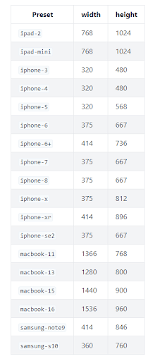
Cypress provides a viewport command to set the size of the screen; the viewport varies from device to device. For example. the iPad 2 has a viewport of 768X1024 while the iPhone 3 has a viewport of 320X 480.
The viewport command in cypress accepts the height and width of the device in question. The syntax is:
cy.viewport(height, width)
Example: cy.viewport(768, 1024)
This is how testers can manually set the viewport in Cypress.
Cypress also provides a predefined set of devices and viewports. To use any of them, directly pass the device name instead of passing height and width.
Example: cy.viewport(‘iphone-6’)
Below is the list of available predefined device viewports on Cypress.
Source: cypress
Testing Mobile Viewports in Cypress (With Example)
Cypress makes it easy to simulate mobile environments using the cy.viewport() command, which sets the screen size to match real devices like smartphones and tablets.
This allows you to test responsive behavior, navigation toggles, layout shifts, and other mobile-specific features directly in the browser.
The following example shows how to verify that a navigation menu adjusts correctly on smaller screens, such as an iPhone 5:
describe('Nav Menus', () => {

  context('iphone-5 resolution', () => {

    beforeEach(() => {

      cy.viewport('iphone-5') // Simulates iPhone 5 screen size

    })


    it('displays mobile menu on click', () => {

      cy.get('nav .desktop-menu').should('not.be.visible') // Desktop menu should be hidden

      cy.get('nav .mobile-menu')

        .should('be.visible') // Mobile menu should be visible

        .find('i.hamburger')

        .click() // Simulates user clicking the hamburger menu

      cy.get('ul.slideout-menu').should('be.visible') // Mobile menu expands

    })

  })

})
What This Test Demonstrates:
- cy.viewport(‘iphone-5’) sets the screen resolution to that of an iPhone 5 (320×568).
- It confirms that desktop-specific elements (.desktop-menu) are hidden on smaller viewports.
- It verifies the mobile navigation menu appears and functions properly.
- The test simulates a user tapping the hamburger icon to open a slideout menu.
This approach helps catch bugs that only appear under mobile conditions, such as layout breakage, hidden buttons, or overlapping content.
Enhancing Mobile Behavior Testing
To simulate advanced mobile interactions such as swipe gestures, touch events, or mobile storage access, you can extend Cypress using third-party tools and plugins:
- Ionic Framework + Cypress: Helps simulate mobile-specific behaviors like swipe left/right, back-button handling, and access to app storage. Ideal for testing hybrid or PWA apps.
- Plugins like cypress-real-events: Adds support for realistic user interactions like touch, scroll, or hover, mimicking how users actually interact on mobile.
- Custom Viewport Sizes: Besides presets like iphone-5, you can define custom resolutions to simulate newer devices:
cy.viewport(390, 844) // iPhone 14 Pro
Cypress Testing on Real Devices with BrowserStack
Local Cypress tests help during development but don’t reflect how users experience your app on real mobile devices. Factors like touch behavior, rendering quirks, and performance vary across devices and browsers.
BrowserStack Automate bridges this gap by allowing Cypress tests to run on real Android and iOS devices on their real device cloud.
Key Benefits:
- Real-World Accuracy: Test on actual mobile hardware with real browsers for precise results.
- Easy Integration: Use the BrowserStack Cypress CLI and a simple config file to start testing.
- Faster Feedback: Run tests in parallel across devices to speed up CI/CD pipelines.
- Debug with Context: Access video logs, screenshots, and network data for every test run.
Common Challenges in Cypress Mobile Browser Testing (With Solutions)
Here are some common challenges in Cypress Mobile Browser testing with their solutions:
- Viewport doesn’t replicate true mobile behavior: Use plugins like cypress-real-events for better interaction fidelity or run tests on real mobile devices using BrowserStack.
- No native support for gestures: Integrate with libraries like hammer.js or use the Ionic framework to simulate mobile gestures during testing.
- Performance doesn’t match real devices: To catch device-specific performance problems, execute your Cypress tests on real iOS and Android devices via BrowserStack.
- Layout inconsistencies across screen sizes: Test using a variety of cy.viewport() presets (e.g., iPhone, iPad) and use visual regression tools like cypress-image-snapshot.
- Incomplete simulation of mobile hardware or native features like GPS and camera. For such features, use a hybrid approach, Cypress for browser-based validation and Appium for native device testing.
Also Read: Building Responsive Layouts with CSS
Best Practices for Cypress Mobile Browser Testing
Below are some key practices that you should follow for Cypress Mobile Browser testing:
- Use predefined and custom viewports to mimic real mobile screens and test responsiveness thoroughly.
- Validate mobile navigation patterns such as hamburger menus, slide-outs, and bottom tabs early in the test suite.
- Write modular, isolated tests to pinpoint UI issues across breakpoints easily.
- Add visual testing tools like Percy or cypress-image-snapshot to catch layout regressions across screen sizes.
- Run tests on real devices using platforms like BrowserStack to ensure compatibility across mobile browsers and operating systems.
- Test orientation changes using cy.viewport() to simulate both portrait and landscape modes.
Conclusion
Cypress offers a fast and developer-friendly way to test mobile browser behavior, especially for responsive designs.
While it has limitations in simulating full mobile environments, its integration with real device clouds like BrowserStack and its plugin support make it a valuable tool in any mobile testing strategy.
By combining Cypress with best practices and real-device testing, teams can ensure reliable performance across all user touchpoints.
Useful Resources for Cypress
Understanding Cypress
- Cross Browser Testing with Cypress : Tutorial
- Run Cypress tests in parallel without Dashboard: Tutorial
- Handling Test Failures in Cypress A Comprehensive Guide
- Cypress Test Runner: Tutorial
- Handling Touch and Mouse events using Cypress
- Cypress Automation Tutorial
- CSS Selectors in Cypress
- Performance Testing with Cypress: A detailed Guide
- Cypress Best Practices for Test Automation
- Test React Native Apps with Cypress
- Cypress E2E Angular Testing: Advanced Tutorial
- Cypress Locators : How to find HTML elements
- Maximizing Web Security with Cypress: A Step-by-Step Guide
- Conditional Testing in Cypress: Tutorial
- Cypress Web Testing Framework: Getting Started
- Cypress Disable Test: How to use Skip and Only in Cypress
- What’s new in Cypress 10? How it will change your current testing requirements
Use Cases
- How to Record Cypress Tests? (Detailed Guide)
- How to run your first Visual Test with Cypress
- How to Fill and Submit Forms in Cypress
- How to Automate Localization Testing using Cypress
- How to run Cypress Tests in Chrome and Edge
- How to use Cypress App Actions?
- How to Run Cypress Tests for your Create-React-App Application
- How to Run Cypress Tests in Parallel
- How to handle Click Events in Cypress
- How to Test React using Cypress
- How to Perform Visual Testing for Components in Cypress
- How to run UI tests in Cypress
- How to test redirect with Cypress
- How to Perform Screenshot Testing in Cypress
- How to write Test Case in Cypress: (with testing example)
Tool Comparisons


