Did you know? 57% of internet users say they won’t recommend a business with a poorly designed website on mobile. This isn’t surprising since, in the second quarter of 2022, mobile devices generated 53.42% of global website traffic.
Optimizing websites for mobile devices requires the implementation of responsive design. This is why most web developers now find themselves wondering how to make websites responsive in almost every project they handle.
What is Responsive Design?
Responsive web design refers to a design strategy that creates websites that work well for mobile, tablet, and desktop devices. Websites without responsive design risk alienating a significant number of users.
Additionally, Google looks at “mobile-friendliness” as a parameter for ranking. To quote the Google Webmaster Central Blog,
“Starting April 21 (2015), we will be expanding our use of mobile-friendliness as a ranking signal. This change will affect mobile searches in all languages worldwide and will have a significant impact in our search results. Consequently, users will find it easier to get relevant, high-quality search results that are optimized for their devices.”
Google Search Central also advises,
“Mobile is changing the world. Today, everyone has smartphones with them, constantly communicating and looking for information. In many countries, the number of smartphones has surpassed the number of personal computers; having a mobile-friendly website has become a critical part of having an online presence.
If you haven’t made your website mobile-friendly, you should. The majority of users coming to your site are likely to be using a mobile device.”
Additionally, 53.8% of web designers state that “not being responsive on all devices” is a major reason for a website to be redesigned. Naturally, website developers and designers put great emphasis on creating responsive websites in the first place. This article will explore some methods by which they can accomplish this, and test websites for adequate levels of responsiveness.
Why do you need a Responsive Website?
In today’s digital landscape, having a responsive website is essential. With users accessing websites from various devices—smartphones, tablets, and desktops—a responsive design ensures:
- Improved User Experience: Offers easy navigation and readable content on all devices.
- Increased Mobile Traffic: Captures users on smartphones and tablets, which account for more than half of web traffic.
- Better SEO Performance: Meets Google’s mobile-friendly requirements, boosting rankings in search results.
- Faster Load Times: Ensures quicker performance, keeping users engaged and reducing bounce rates.
- Cost-Effective: Reduces the need for separate mobile and desktop sites, saving time and maintenance costs.
- Future-Proof: Adapts to new devices as technology evolves, ensuring long-term accessibility.
Bonus: Effortlessly convert Rem to Px and Px to Rem for responsive web design with our free tools.
Different Frameworks for a Responsive Website
Following are some of the popular frameworks for Responsive Website:
1. Bootstrap
A popular open-source framework that offers a wide range of responsive components and grid systems for fast web development.
2. Foundation
A highly customizable front-end framework known for its flexible grid system and powerful mobile-first approach.
3. Bulma
A modern CSS framework based on Flexbox, known for its simplicity and clean, responsive design.
4. Materialize
Built on Google’s Material Design principles, this framework provides a responsive layout with a focus on sleek, minimalistic design.
5. Tailwind CSS
A utility-first framework that allows developers to create responsive designs by applying low-level, customizable CSS classes directly in HTML.
Read More: Top Responsive CSS Frameworks
Different Elements of a Responsive Design
Here are the different elements used to create a responsive design:
1. Viewport
The viewport is the visible area of a web page on a device. Setting a viewport ensures the website is responsive and adjusts its layout based on the screen size.
Example (HTML):
<meta name="viewport" content="width=device-width, initial-scale=1.0">
This code ensures the page scales correctly on various devices by setting the width to match the screen size.
2. Media Queries
Media queries allow developers to apply specific CSS styles based on the device’s characteristics, like screen width, height, or resolution. They are essential for responsive designs, enabling different styles for different devices.
Example (CSS):
@media (max-width: 768px) {

    body {

        background-color: lightgray;

    } }
This applies a gray background to devices with a screen width of 768px or smaller, commonly targeting tablets.
Read More: A complete guide to CSS Media Query
3. Responsive Images
Responsive images adapt to different screen sizes by using attributes like srcset to specify different image resolutions for various devices.
Example (HTML):
<img src="image.jpg" srcset="image-400w.jpg 400w, image-800w.jpg 800w" sizes="(max-width: 600px) 400px, 800px" alt="Responsive image">
This ensures smaller images are loaded on mobile devices, improving load times and performance.
Read More: How to test Responsive Images
4. CSS Breakpoints
Breakpoints define the points at which a website’s layout changes, typically based on screen width. These are used in conjunction with media queries to adjust the design for different devices.
Example:
@media (min-width: 576px) { /* Styles for small devices (phones) */ }

@media (min-width: 768px) { /* Styles for medium devices (tablets) */ }

@media (min-width: 992px) { /* Styles for large devices (desktops) */ }
These breakpoints trigger different CSS rules for different screen sizes.
5. Elementor Breakpoints
Elementor, a popular WordPress page builder, includes custom breakpoints to build responsive designs. You can adjust layouts for mobile, tablet, and desktop views directly in the visual editor.
Default breakpoints:
- Desktop: 1025px and up
- Tablet: 768px to 1024px
- Mobile: 767px and below
You can customize these breakpoints for more flexibility in design.
Read More: What are Elementor Breakpoints
6. Bootstrap Mobile Responsive
Bootstrap is a front-end framework that automatically makes web designs responsive by using a flexible grid system. Its mobile-first approach ensures that layouts work well on small screens first, then adjust for larger screens.
Example (HTML):
<div class="container-fluid">

    <div class="row">

        <div class="col-sm-12 col-md-6">Content here</div>

        <div class="col-sm-12 col-md-6">Content here</div>

    </div>

</div>
This creates a two-column layout that collapses into one column on small screens.
7. Bootstrap Breakpoints
Bootstrap uses predefined breakpoints to make the grid responsive. These breakpoints are based on screen width and allow developers to design layouts that adapt to different devices.
Default Bootstrap breakpoints:
- Extra small: <576px (mobile)
- Small: ≥576px (small devices)
- Medium: ≥768px (tablets)
- Large: ≥992px (desktops)
- Extra large: ≥1200px (larger desktops)
Example (CSS):
@media (min-width: 768px) {

    .example {

        display: block;

    }

}
This ensures that the .example class only applies to screens larger than 768px, typically tablets and up.
Read More: Bootstrap Breakpoints and Media Queries
How to Create a Responsive Website
Here are different ways to create a responsive website.
1. Set Appropriate Responsive Breakpoints
In responsive design, a breakpoint is the “point” at which a website’s content and design will adapt in a certain way in order to provide the best possible user experience.
Every website is accessed via devices with different screen sizes and resolutions. The software has to render perfectly across each screen size. Content or images cannot be distorted, cut out, or obscured.
To allow this, developers have to use responsive breakpoints, sometimes called CSS breakpoints or media query breakpoints. These are points defined in the code. Website content responds to these points and adjusts itself to the screen size to display the accurate layout.
Free Responsive Design Checker
With CSS breakpoints in place, the website content will align itself with screen size and displays itself in a way that pleases the eye and facilitates visual consumption.
Read More: What are CSS and Media Query Breakpoints?
Use breakpoints for the most commonly used device resolutions used across mobile, desktop, and tablet. These would be:
- 1920×1080 (9.61%)
- 1366×768 (7.87%)
- 360×640 (4.36%)
- 414×896 (4.34%)
- 1536×864 (4.11%)
2. Start with a Fluid Grid
Previously, websites were based on pixel measurements. Now, however, they are built on what is called a fluid grid.
Basically, a fluid grid positions and sets web elements on a site in proportion to the screen size it is displayed on. Instead of making things in a single, specific size set in pixels, elements on a fluid grid will respond and resize to fit the size of the screen.
A fluid grid is divided into columns; heights and widths are scaled, not set to fixed dimensions. The proportions of text and elements depend on the screen size.
- Formulating the rules of a fluid grid is done by working on the website’s source code.
A fluid grid also helps with keeping a site visually consistent across multiple devices. It also offers closer control over alignments and enables faster design-related decision-making.
3. Take touchscreens into consideration
When wondering how to make a website responsive, think of touchscreens. Most mobile devices (phones and tablets) are now equipped with touchscreens. Some laptops are also catching up, offering touchscreen along with the keyboard functions.
Naturally, a responsive website will have to calibrate itself for being accessed via touchscreens. For example, let’s say there is a drop-down menu on the homepage.
- On desktop view, each menu item must be large enough so that it can be pressed with a fingertip of a touchscreen.
- On mobile screens, smaller elements like buttons should also be easier to detect and select.
To do so, use images, CTAs or optimize these elements to render properly on multiple screens.
Responsive Image
Use modern image tag attributes to make images responsive to multiple device and screen resolutions. Study the example below:
<style>
img {
max-width: 100%;
}
</style>

<picture>
<source type="image/webp" srcset="https://my-image.com/my-image-100.webp 1x, https://my-image.com/my-image-200.webp 2x">
<source type="image/png" srcset="https://my-image.com/my-image-100.png 1x, https://my-image.com/my-image-200.png 2x">
<img alt="my image" src="https://my-image.com/my-image-200.png" loading="lazy" width="100" height="100">
</picture>
Code breakdown:
- Setting max-width allows the image to adjust its size based on its container width.
- picture, source, and img tags are combined so that only one image is rendered, and that it fits best on the user’s device.
- source is used to reference a WebP image that can be used by browsers supporting it. A second source tag references a PNG file of the same image for browsers without WebP support.WebP is an image format with advanced compression for web-based images.
- srcset notifies the browser about which image should be displayed, depending on the particular device’s screen resolution.
- loading=”lazy” attribute / value pair: Implements native lazy loading.
Responsive Video
An effective way to create responsiveness in videos is using aspect ratio. The code below explains this:
<style>
.videoWrapper {
position: relative;
padding-bottom: 56.25%; /* 16:9 */
height: 0;
}

.videoWrapper iframe {
position: absolute;
top: 0;
left: 0;
width: 100%;
height: 100%;
}
</style>

<div class="videoWrapper">
<!-- Copy & Pasted from YouTube -->
<iframe width="560" height="349" src="http://www.youtube.com/embed/n_dZNLr2cME?rel=0&hd=1" frameborder="0" allowfullscreen></iframe>
</div>
The code above embeds a YouTube video as an iframe and a div container with videoWrapper class.
Code Breakdown:
- position: relative is placed on the container element so that child elements use absolution positioning relative to it.
- height: 0 is combined with padding-bottom: 56.25% implements dynamic behavior with a 16:9 aspect ratio.
- position: absolute, top: 0 and left: 0 is set on the iframe in order to make web elements place itself relative to their parent.
- width and height of 100% make the child, iframe element 100% of its parent, videoWrapper which establishes the aspect ratio layout.
4. Define Typography
Generally, web developers define font sizes with pixels. These work on static websites, but responsive websites need a responsive font. Font size must change with respect to parent container width. This is necessary to make typography adjust to screen size and be easily readable on multiple devices.
In the CSS3 specification, look for the unit named rems. It is similar to the em unit but acts relative to the HTML element. Because of this, the code must reset the HTML font-size:
html { font-size:100%; }Now define the responsive font sizes:
@media (min-width: 640px) { body {font-size:1rem;} }
@media (min-width:960px) { body {font-size:1.2rem;} }
@media (min-width:1100px) { body {font-size:1.5rem;} }
5. Use a pre-designed theme or layout to save time
If developers and designers are wondering how to build a responsive website on an exceptionally tight deadline, they can opt for using a theme or pre-designed layout with built-in responsive properties. WordPress provides multiple options in this regard (both free and paid). All designers have to do, after picking a theme, is to decide on colour, branding, and text.
Do you know how to speed up a WordPress site?
6. Test Responsiveness on Real Devices
When researching how to make a website mobile responsive, something that often gets overlooked is the necessity of testing on real devices. Developers can tweak the code all they want, but its functionality has to be verified in real user conditions.
When defining and implementing responsive design, it is important to check how the website appears on a range of devices. As far as possible, test responsive design on real devices, so as to verify what the design will look like exactly to end-users.
Read More: Top 15 Responsive Design Testing tools
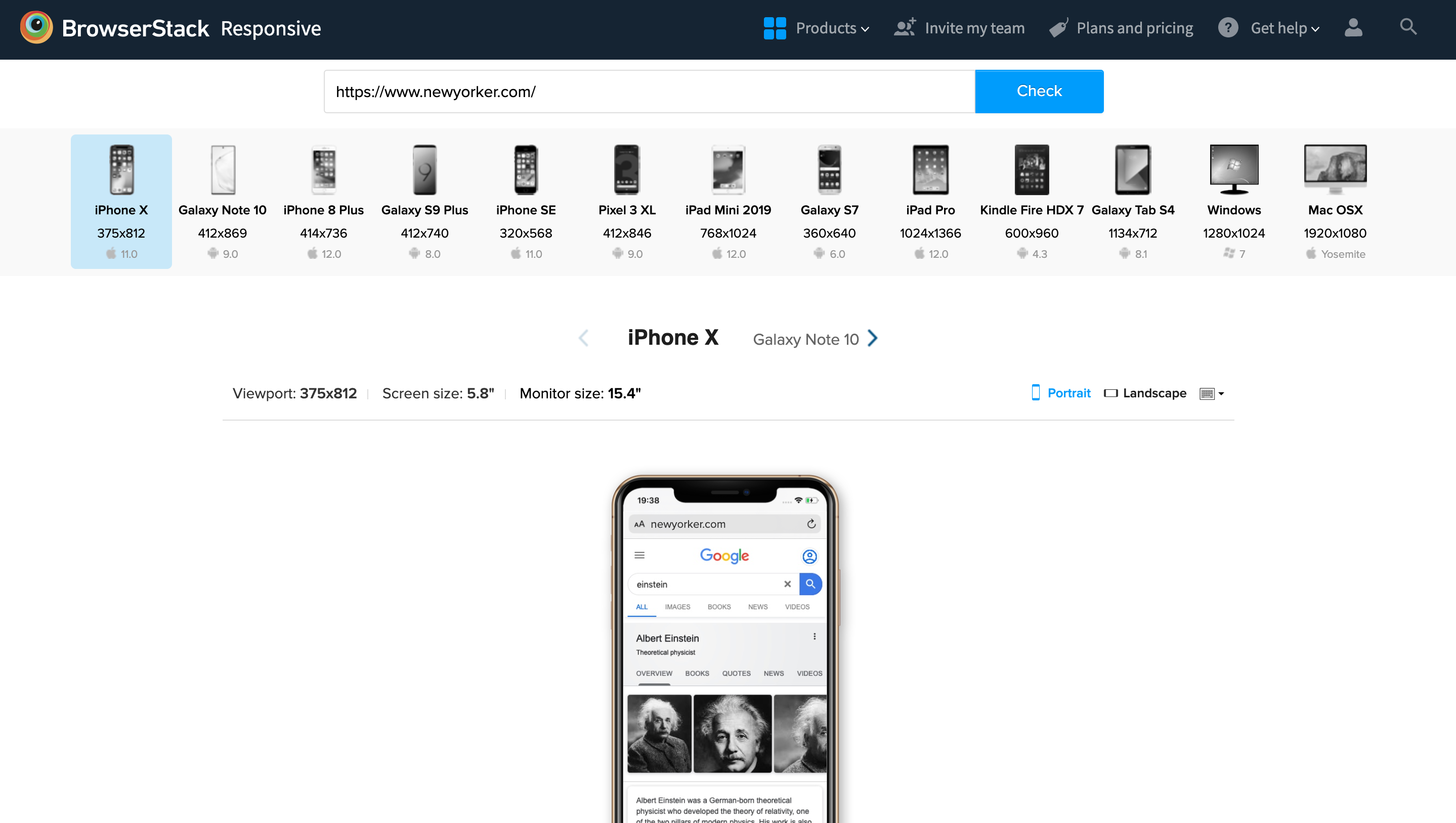
Once coded, put the website through a responsive design checker. BrowserStack offers a number of the latest real devices on which to check how a website looks, and if it is responsive enough.
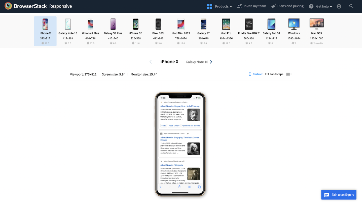
Simply enter the website URL, and the tool will show how the site looks on multiple devices (iPhone 11, iPhone 8 Plus, Galaxy Note 20, Galaxy S9 Plus, and more).
Additionally, BrowserStack also offers a real device cloud of 3500+ real browsers and devices. Simply sign up for free, select a device-browser-OS combination, navigate to the website and check how it renders on that device resolution.
Read More: Top 15 Responsive Design Testing tools
How to Test Responsive Websites on Real Browsers and Devices?
Test your responsive websites (hosted locally or publically) on real mobile devices using the BrowserStack Responsive Tool. This tool aids in the user’s testing of responsive web design and every website should ideally be tested using a responsive tester tool.
- It checks whether a website is being shown correctly across a variety of platforms, including desktop and mobile.
- To guarantee that a website offers the best user experience across the widest range of devices, BrowserStack Responsive Tool uses a wide range of screen sizes, device setups, and other elements that have grown to be quite important due to device fragmentation.
Steps to perform Responsive Test using BrowserStack Responsive Tool:
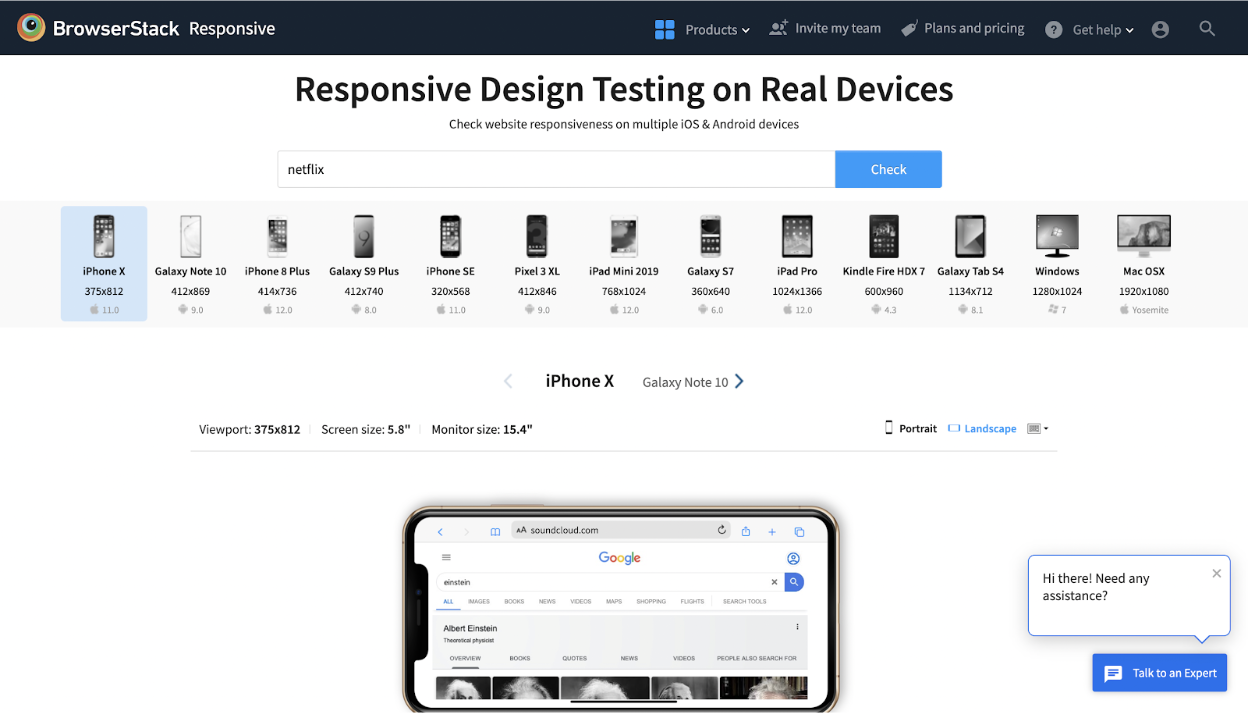
Step 1: The first step is to launch the BrowserStack Responsive Checker Tool and type the URL of the website under test.
Step 2: To check responsiveness, click Check.
Step 3: The user can check how the site appears on a certain device after choosing it.
How to run Responsive Tests on Real browsers and devices?
Running responsive tests on real browsers and devices is essential for ensuring your website provides an optimal user experience across various platforms. Here’s a step-by-step guide to effectively conduct these tests:
1. Choose the Right Testing Tool
Select a responsive testing tool that provides access to a variety of real devices and browsers. Tools like BrowserStack Live are excellent options that allow you to test your website in real-time.
2. Set Up Your Testing Environment
- Sign Up: Create an account on the chosen testing platform.
- Select Browsers and Devices: Choose the specific browsers and devices you want to test. Most tools offer a wide range of options, including smartphones, tablets, and desktops across different operating systems.
3. Access Your Website
Enter your website URL in the testing tool. This will load your site on the selected device and browser, allowing you to view how it renders in real-time.
4. Conduct Visual Testing
- Check Layout and Design: Inspect how your website’s layout adapts to different screen sizes. Look for issues such as overlapping elements, cut-off text, or distorted images.
- Responsive Navigation: Test the navigation menus to ensure they function properly and are easily accessible on smaller screens.
5. Test Functionalities
- Interactivity: Click on buttons, fill out forms, and navigate through the site to confirm that all interactive elements work as intended.
- Loading Speed: Measure loading times on different devices to identify any performance issues that could impact user experience.
6. Utilize Developer Tools
Use the built-in developer tools of the browser (right-clicking and selecting “Inspect”) to test responsiveness:
- Device Mode: Toggle the device toolbar to simulate various screen sizes and resolutions.
- Emulate Touch Events: Test touch interactions on mobile devices to ensure responsiveness.
7. Review Performance Metrics
Assess metrics such as loading speed, responsiveness, and interactivity using performance testing features provided by the tool.
8. Document Findings
Take screenshots and notes of any issues encountered during testing. Documenting findings will aid in communication with your development team and help prioritize fixes.
9. Iterate and Retest
After making necessary adjustments based on your findings, retest the site on the same devices and browsers to ensure that all issues have been resolved and the site performs as expected.
10. Conduct Regular Tests
Make responsive testing a routine part of your development process, especially after significant updates or changes to your website, to maintain a high-quality user experience across all devices.
Best Practices to create a Responsive Website
Some of the best practices include:
- Use a Fluid Grid Layout: Design your website using a fluid grid that adapts proportionally to any screen size, ensuring consistent layouts across devices.
- Implement Media Queries: Apply media queries in CSS to customize styles for different screen sizes, making your design responsive and user-friendly on all devices.
- Optimize Images: Use responsive image techniques like srcset to load appropriately sized images for each device, enhancing load times and performance.
- Adopt Mobile-First Design: Start with a design optimized for mobile devices and progressively enhance it for larger screens, ensuring a seamless experience on all devices.
- Flexible Typography: Use scalable units like em or rem for font sizes, allowing text to adjust naturally to different screen sizes, improving readability.
- Simplify Navigation: Keep navigation easy for mobile users with dropdowns or hamburger menus, making it more intuitive and accessible on smaller screens.
- Test on Multiple Devices: Regularly test your site on various devices and screen sizes using tools like BrowserStack to catch any layout or performance issues.
- Minimize HTTP Requests: Reduce the number of HTTP requests by optimizing and combining CSS and JavaScript files, which improves website speed and performance.
Why run Responsive Website Tests on Real Devices?
Testing a responsive website on real devices is crucial for several reasons:
- Accurate User Experience: Real devices provide a true representation of how users will interact with your website, including touch gestures, screen sizes, and pixel densities, which simulators often fail to replicate accurately.
- Performance Insights: Running tests on actual devices allows you to gauge load times, responsiveness, and performance under real-world conditions, giving you insights into potential bottlenecks.
- Cross-Browser Compatibility: Different browsers can render websites differently. Testing on real devices ensures that your website performs consistently across various browsers and versions.
- Detect Device-Specific Issues: Certain bugs and issues may only occur on specific devices or operating systems. Testing on real devices helps you identify and resolve these issues before launch.
- User Accessibility: Ensuring your website is accessible on real devices means you can evaluate features like touch targets, font readability, and navigation, which are vital for user experience.
BrowserStack Responsive Tool and Live
To streamline your responsive testing, consider using BrowserStack Responsive and BrowserStack Live.
- BrowserStack Responsive: This tool enables you to test the responsiveness of your website across a wide range of real devices and screen sizes instantly. You can visualize how your site looks on different devices without the need for extensive setups or physical devices, making it easy to identify and address layout issues.
- BrowserStack Live: With BrowserStack Live, you gain access to a comprehensive cloud-based platform where you can manually test your website on over 3,500+ real browsers and devices. This ensures that you can replicate real user scenarios, check for cross-browser compatibility, and validate performance metrics in real-time.
Conclusion
On the other hand, you could sign up for free on BrowserStack’s real device cloud. Get instant, on-demand access to 3500+ real browsers and devices. Check how your site’s responsive design renders on the latest devices and browsers so that you leave nothing to chance. Minimize the chances of a visually distorted site by increasing device coverage with ease and efficiency.
Following the steps detailed above will answer questions about how to make your website responsive. The amount of effort that goes into establishing responsiveness is directly proportional to the experience of the end-user. Keep in mind that users expect any website to be perfectly complementary with every single device they own – desktop, tablet, or mobile. If a website’s responsive design does not align with a certain device resolution (especially a commonly used device), the site is at risk of missing out on a segment of its target audience. Avoid this by investing time and research into studying how to make a web page responsive at the beginning of a project.


