How Mobile Screen Size, Resolution and PPI Screen can Affect Test Coverage
By Sanghita Ganguly, Community Contributor - November 1, 2022
When it comes to mobile testing coverage, then the QA team needs to keep a host of things in mind, and one of them is the display of the device. In this regard, one needs to keep the screen size, resolution, and Pixel per inch (PPI) density in mind.
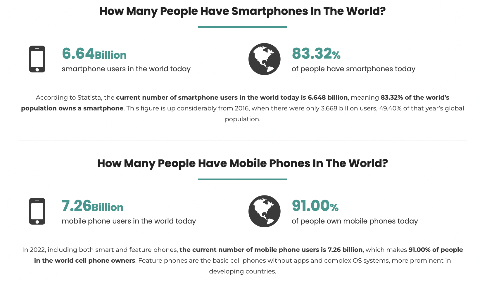
Now, this is applicable to all apps, and it is emerging as a crucial point as smartphones are evolving, and their screens are getting bigger. About 6.64 billion people are using smartphones worldwide, and every device can have a unique size, resolution, and PPI screen.
So if you’re also curious to know about these parameters and how to test mobile coverages, then keep reading this guide. This guide helps you understand everything that you need to know when it comes to screen size coverage – right from screen size, and resolution, to PPI screen to how these parameters can affect mobile testing.
What are Screen Size, Screen Resolution, and PPI
- Screen Size: The screen size or the display size is the size of your mobile screen. In modern smartphones, it can vary from 4.7 inches to 9.7 inches.
- Screen Resolution: A mobile screen uses a lot of pixels to display videos and images. These pixels are arranged vertically and horizontally. The number of these pixels defines the screen resolution and is often denoted as no.of pixels horizontally x no. of pixels vertically. The mobile screen resolution includes 480×800, 640×1136, 720×1280, 750×1334, 1080×1920 and 1440×2560.
- Screen Density: Screen density or pixel density is the measure of pixels in a given physical area of the device. Here’s the list of some screen densities of devices:
- LDPI (low) ~ 120dpi
- MDPI (medium) ~ 160dpi
- HDPI (high) ~ 240dpi
- XHDPI (extra high) ~ 320dpi
- XXHDPI (extra extra high) ~ 480dpi
- XXXHDPI (extra extra extra high) ~ 640dpi
Now, every brand uses different specifications while creating displays for their devices. So, while designing apps, developers need access to a tool that can enable them to test their apps and get a comprehensive result of test coverage screen size, its resolution, and PPI. Testers generally choose to test on virtual testing platforms or real device cloud. Most QA prefers testing on real device cloud, due to the accuracy of the results.
Read this detailed guide on Testing on Emulators vs Simulators vs Real Devices
Test Coverage
Test Coverage is a technique used by QA testers to determine how much percentage of applications is tested and how many tests need to be covered. Here’s the formula to calculate the percentage of test coverage:
Test coverage = lines of code covered by tests / total lines of code ×100
It’s used to calculate the percentage of testing done. For example, if there are 10,000 total lines of code out of 5,000 lines tested, it’s 50% completed.
Also Read: How do you ensure maximum test coverage?
Test Coverage Techniques
Test Coverage Techniques help QA testers track the testing progress and identify areas that require testing. Here are some popular test coverage techniques are:
- Product coverage
- Risk coverage
- Requirements coverage
- Compatibility coverage
- Product coverage: In product coverage, testers can understand how much product is tested and how much needs to be covered. So that QA testers can make a checklist, increase/decrease the testing requirements, and use test automation tools like BrowserStack to test the website in simple steps.
- Risk coverage: Risk coverage helps QA testers to estimate the risk in application testing. It’s mainly categorized into four zones – Must Test, Should Test, Won’t Test, and Could Test. While testing an application, if any of these signs show, testers can make the changes accordingly and take testing further.
- Requirements coverage: It’s an important test coverage metric to test whether the application meets the user’s requirements and functionalities.
- Compatibility coverage: Compatibility is one of the major issues that every tester needs to consider in their testing process. Testers must ensure that the application is compatible with different devices and browsers.
BrowserStack offers a combination of 3,000+ devices, browsers, and operating systems. You can seamlessly access and test any device + OS combination in a matter of just a few seconds.
How do Screen resolution, Screen size & PPI affect the Test Coverage?
In today’s world when every brand’s smartphone and devices have its unique specifications including screen size, resolution & PPI then it’s important for developers to build and test the application according to each device’s specifications for better accessibility otherwise the application will not support or function on all devices equally due to these factors.
Tip: Try BrowserStack’s Responsive Checker to check the responsiveness of your website across different Android and iOS devices
How to Compute PPI Screen?
Step 1 – Calculate the Dp Value
To calculate the PPI Screen of a device, here’s the formula:
Calculate the device screen resolution square root –> for iPhone 6, it would be 750×1334.
So the result will be a 1,530 Dp value.
Step 2 – Match the Screen size to the Dp Value
Now, it’s time to match the screen size to the above Dp value to find PPI.
An iPhone 6 device with a 4.7inch screen size will result in 326 PPI.
Why do Screen Size and PPI matter?
Different types of phones are available with different screen sizes and screen resolutions. So companies must build their applications to suit all these device screen sizes & their PPI.
Now, there’s a clear difference between HTC & iPhone screen size, resolution, and PPI, and developers need to consider these ratios while building the application for a mobile device. So that application will be optimized for a specific device and easily accessible without any interface issues.
In simple words, knowing the screen size, resolution, and PPI screen for every device is important in building a user-friendly, supportive, and easily accessible application for each device. To understand this even better, let us look into the device and browser matrix.
- Device Matrix: A Device Matrix is a list of supported mobile devices with OS versions and specifications like screen size, resolution & PPI that a developer uses in application development. So that developers can build an application that supports all these listed mobile devices per their OS versions and their specifications.
- Browser Matrix: Similarly, the Browser matrix is a list of different browsers (for mobile/desktop) versions, OS, and device types that developers use to build a supportive website as per the given list of browsers. It’s important for developers to keep the list of browsers (mobile/desktop) and their specifications so that it is easier to build the website according to their browser screen size, PPI and resolution and support more easily.
Tip: BrowserStack’s SpeedLab allows QA testers to test their website speed on real cloud devices & browsers and get a detailed report after the test for analysis & improvements.
Here is a list of some mobile devices, their screen sizes, resolutions and PPI details for your reference.
Device | Screen Size | Screen Resolution | PPI |
| Samsung Galaxy S20 | 6.2” | 1440X3220 | 563 |
| iPhone 13 pro | 6.1” | 1170X2532 | 460 |
| iPhone 13 Pro Max | 6.7” | 1284X2778 | 458 |
| Samsung Galaxy M52 | 6.7” | 1080X2400 | 393 |
| Motorola Moto G71 5G | 6.4” | 1080X2400 | 411 |
| Redmi Note 11 | 6.43” | 1080X2400 | 409 |
| Samsung Galaxy S22 | 6.1” | 1080X2340 | 425 |
| Google Pixel 6 | 6.4” | 1080X2400 | 411 |
| OnePlus 9 | 6.5” | 1080×2400 | 402 |
| Oppo Reno 6 | 6.4” | 1080×2400 | 409 |
Every mobile has a different screen size, resolution, and PPI. So businesses need to ensure that their application and websites work seamlessly on different screen sizes and resolutions. This is possible only if the QA team tests their app on all/most used screen sizes and resolutions.
But maintaining an internal device lab is quite costly. It comes with extremely high setup and maintenance charges. And, even if one was to bear all the costs, one must also consider the number of units necessary. As having a single unit for a particular device can increase tester wait time and developer feedback time.
One way to overcome this is to use a real device cloud. BrowserStack allows you to test your app/website seamlessly on 3000+ real devices hosted on a cloud Platform.
With BrowserStack, you get access to
- Thousands of Real cloud devices with different OS (Android & iOS) to test the mobile application on different parameters.
- Local Testing which allows testers to test the Native, Hybrid & Mobile app on a dedicated testing environment.
- Debug apps by using logs, browser consoles, network logs, crash logs, screenshots, etc.
With the user-friendly BrowserStack App Live you can test your application on thousands of real cloud devices in just one click. It will give you access to thousands of real cloud devices to test mobile coverage on different parameters and generate a detailed report.
Additionally, with BrowserStack you can collaborate with your team members when conducting tests. Browserstack Enterprise is your one-stop solution irrespective of your team size.
To sum up, hopefully, this write-up has shed enough light on the test mobile coverage for PPI density, and you have gained ample insight into its importance. Moreover, with BrowserStack, now carry out this process in just a few clicks.
 Source


