With users accessing websites on a variety of devices like smartphones, tablets, and desktops, responsive web design is essential for delivering a consistent user experience.
Overview
Importance of CSS Responsive Web Design
- Enhances user experience by adapting layouts to various screen sizes.
- Improves website accessibility across different devices.
- Boosts SEO rankings as search engines prioritize mobile-friendly sites.
- Reduces development time and maintenance by using a single codebase.
Key Techniques for CSS Responsive Web Design
- CSS Media Queries: Allow styles to adapt based on device characteristics like width and orientation.
- Flexible Grid: Creates layouts that adjust proportionally to different screen sizes.
- The Viewport Meta Tag: Controls how a webpage is displayed on mobile devices.
- Bootstrap Responsive Web Design: Utilizes pre-built responsive classes and a grid system for efficiency.
- CSS Grid for Responsive Web Design: Offers a powerful layout system for creating complex, responsive designs.
- Responsive Typography: Ensures text scales appropriately for readability on all devices.
- Responsive Images: Optimizes image sizes for faster loading and better display across devices.
This article explores key CSS techniques to help you create responsive web designs that function effectively across all devices.
What is a Responsive Structure?
A responsive web application structure refers to a state in which it automatically adjusts itself to different viewports. It provides the optimal viewing experience in all screen resolutions, sizes, and devices.
It ensures that the website’s content and aesthetics are functional and readable across all devices, including mobile, tablets, and desktops, of all screen sizes and resolutions.
What is Mobile-first Responsive Design
Mobile-first responsive design is a strategy where websites are designed for small devices like smartphones first, then adapted for larger screens.
This approach prioritizes essential functionalities and adds complex features as screen size increases without affecting responsiveness.
It also aligns with Google’s SEO guidelines, as responsive websites rank higher in search results.
Importance of CSS Responsive Web Design
A responsive web design appeals to a greater audience, thus increasing the user retention rate on a webpage and user trust. It is a reliable design.
Here’s why CSS Responsive Web Design is essential:
- User Experience: Consistent design creates a good user experience across all devices. It enhances the website’s readability and structure regardless of the device size and resolution.
- Higher Traffic on Mobile Devices: Various analytics related to using devices to access the Internet suggest that more mobile users access the Internet than desktop users, thus displaying a sheer dominance of mobile phones. A responsive design is useful in leveraging a higher number of mobile users.
- Ranks higher in Search Results: Google mentions in the SEO guidelines that a website with better responsiveness has a higher chance of ranking higher in the search results than the same website with lower responsiveness.
Also Read: Top Responsive CSS Frameworks
Key Techniques for CSS Responsive Web Design
There are several techniques to achieve responsive web design using CSS. Here are a few ways to do so:
CSS Media Queries
Media Queries are one of the most effective ways to make a website responsive. They allow you to apply CSS rules conditionally based on different viewports.
Syntax:
@media (condition) {

    /* Styles to apply when the condition is met */

}
Example:
/* Default styles for mobile */

body {

    font-size: 14px;

}

/* Apply styles for tablets and larger screens */

@media (min-width: 768px) {

    body {

        font-size: 16px;

    }

}

/* Apply styles for desktops and larger screens */

@media (min-width: 1024px) {

    body {

        font-size: 18px;

    }

}
Flexible Grid
As the name suggests, a flexible grid is dynamic and leverages proportional values, such as percentages, for layout elements instead of fixed units. This allows for dynamic resizing of elements based on screen sizes.
Example:
.container {

    display: flex;

    flex-wrap: wrap;

}

.item {

    flex: 1 1 50%; /* Take 50% width of the container */

    box-sizing: border-box;

    padding: 10px;

}

@media (min-width: 768px) {

    .item {

        flex: 1 1 25%; /* Take 25% width on larger screens */

    }

}
The viewport meta tag
This tag ensures how the website looks on mobile phones and it scales the website accordingly.
<meta name="viewport" content="width=device-width, initial-scale=1.0">
Here, width=device-width sets the viewport’s width to be equivalent to the device’s screen width, and initial-scale=1.0 ensures the page is displayed at the device’s default size.
Learn More: Top Responsive CSS Frameworks
Bootstrap responsive web design
Bootstrap is a third-party CSS framework that contains preset CSS elements with built-in responsive components and grid systems.
It includes CSS-based templates for typography, forms, buttons, tables, navigation, modals, image carousels, and more.
Use the following syntax in the HTML file to import Bootstrap on your project.
<link rel="stylesheet" href="https://maxcdn.bootstrapcdn.com/bootstrap/3.4.1/css/bootstrap.min.css">
Example:
<div class="container">

    <div class="row">

        <div class="col-sm-6 col-md-4">Column 1</div>

        <div class="col-sm-6 col-md-4">Column 2</div>

        <div class="col-sm-6 col-md-4">Column 3</div>

    </div>

</div>
Bootstrap eases the front-end development process to a larger extent by saving a lot of effort in scripting responsive elements.
Read More: Bootstrap Breakpoints and Media Queries
CSS Grid for Responsive Web Design
The Grid layout module in CSS offers a grid-based layout system, allowing developers to create a layout consisting of rows and columns easily. This allows developers to gain better control over complex designs.
In the CSS file, set the display property of a container to grid. All the elements inside the parent element (grid container) will automatically be grid items.
<div class="container">

    <div>1</div>

    <div>2</div>

    <div>3</div>

    <div>4</div>

    <div>5</div>

    <div>6</div>

    <div>7</div>

  </div>
.container {

    display: grid;

    grid-template-columns: 2fr 3fr 1fr;

    grid-template-rows: 1fr 2fr 3fr;

    }

    * {box-sizing: border-box;}
Responsive Typography
All the typed content on your website should also behave as a responsive design, thus automatically adjusting itself to different screen sizes.
To do so, one should use units like em, rem, or vw (viewport width) instead of static units such as px, in, etc.
body {

    font-size: 4vw; /* Scales with viewport width */

}

@media (min-width: 768px) {

    body {

        font-size: 16px; /* Fixed size for larger screens */

    }

}
Also Read: How to test Responsive Images
Responsive Images
The best method for creating responsive images is to use the CSS object-fit property. This property provides the most control when customizing the CSS for responsiveness.
- contain: It resizes the image to make it fully visible, keeping the original aspect ratio intact.
- cover: It resizes the image to cover the entire container, keeping the original aspect ratio constant.
- fill: The image will be filled in the given area, even if it means breaking the image’s original aspect ratio.
- none: The image will remain as it is and fill the given area.
img {

    width: 100%;

    height: 400px;

    object-fit: cover;

    object-position: bottom;

  }
How to Create Responsive Designs with CSS
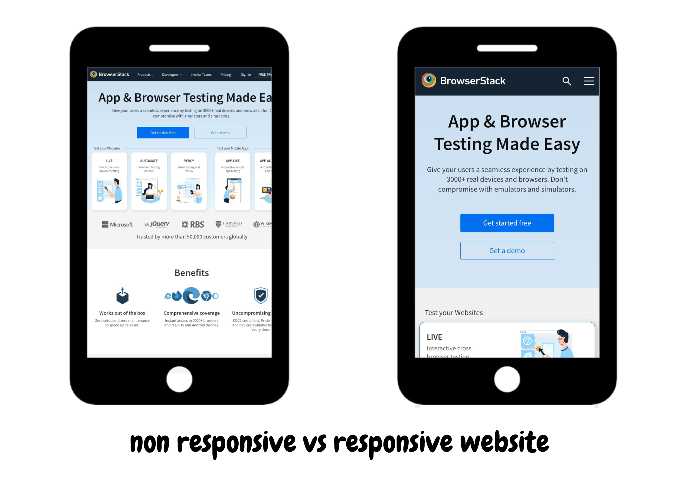
Here is a practical example of how to create a responsive website. It showcases a basic website with a responsive design and compares it to a non-responsive version.
1. Create an HTML file
<!DOCTYPE html>

<html lang="en">

<head>

  <meta charset="UTF-8">

  <meta name="viewport" content="width=device-width, initial-scale=1.0">

  <title>Responsive Navbar</title>

  <link rel="stylesheet" href="styles.css">

</head>

<body>

  <nav class="navbar">

    <div class="logo">MyLogo</div>

    <div class="menu-icon" id="menu-icon">

      <span></span>

      <span></span>

      <span></span>

    </div>

    <ul class="nav-links" id="nav-links">

      <li><a href="#">Home</a></li>

      <li><a href="#">About</a></li>

      <li><a href="#">Services</a></li>

      <li><a href="#">Contact</a></li>

    </ul>

  </nav>

  <h1>Website Content</h1>

  <script>

    const menuIcon = document.getElementById('menu-icon');

    const navLinks = document.getElementById('nav-links');


    menuIcon.addEventListener('click', () => {

      navLinks.classList.toggle('active');

      menuIcon.classList.toggle('toggle');

    });

  </script>

</body>

</html>
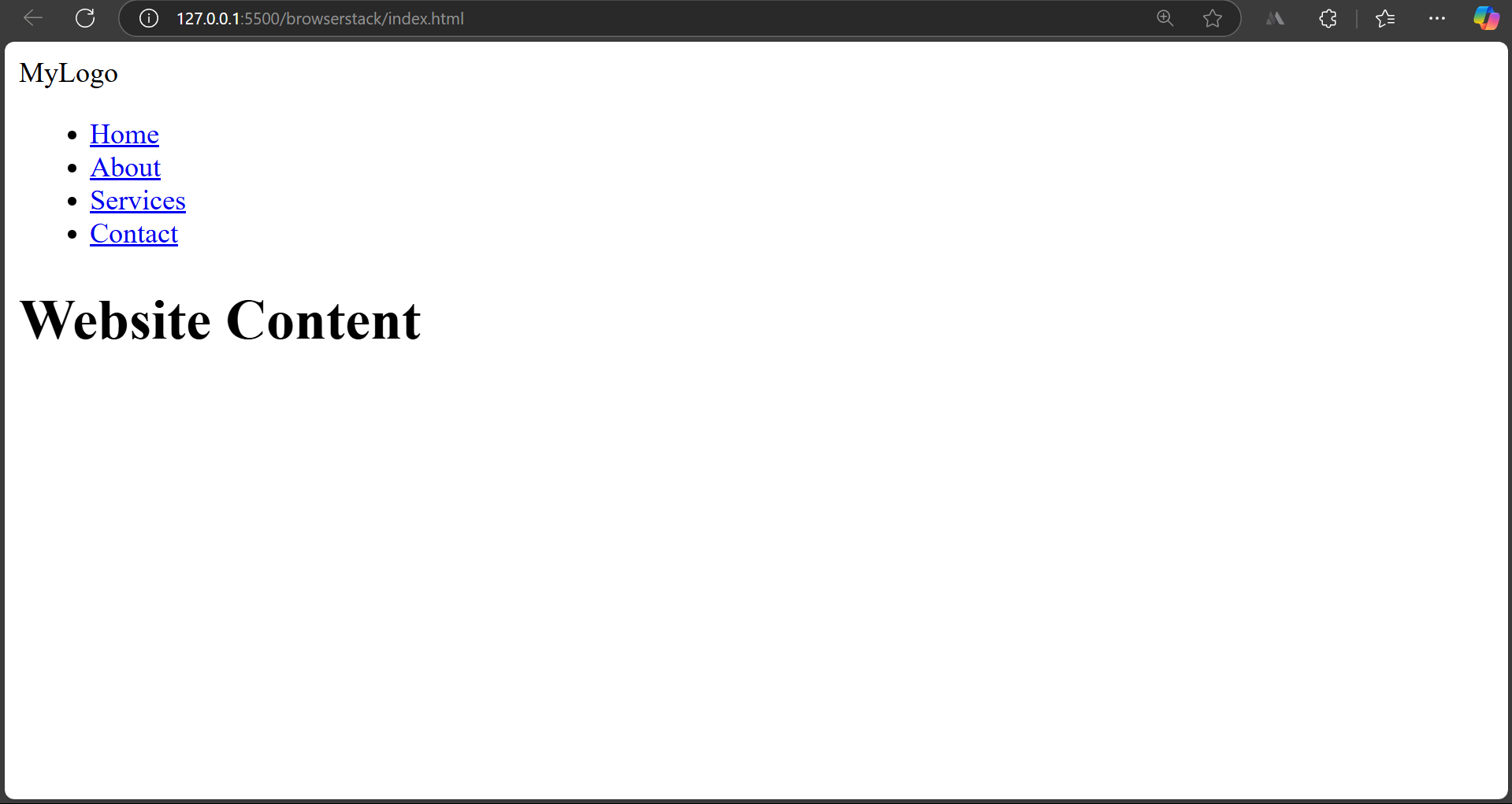
After writing the HTML script, the website will look like this.
2. Create a CSS file
/* General Reset */

* {

    margin: 0;

    padding: 0;

    box-sizing: border-box;

  }


  body {

    font-family: Arial, sans-serif;

    line-height: 1.6;

  }


  .navbar {

    display: flex;

    justify-content: space-between;

    align-items: center;

    padding: 10px 20px;

    background-color: #333;

    color: #fff;

  }


  .logo {

    font-size: 1.5em;

    font-weight: bold;

  }


  .nav-links {

    list-style: none;

    display: flex;

    gap: 20px;

  }


  .nav-links li a {

    color: white;

    text-decoration: none;

    font-size: 1.1em;

    transition: color 0.3s;

  }


  .nav-links li a:hover {

    color: #00bcd4;

  }


  /* Burger Icon */

  .menu-icon {

    display: none;

    flex-direction: column;

    cursor: pointer;

    gap: 5px;

  }


  .menu-icon span {

    width: 25px;

    height: 3px;

    background-color: white;

    transition: transform 0.3s, opacity 0.3s;

  }

  h1{

    text-align: center;

    margin-top: 20%;

    justify-content: center;

    opacity: 50%;

  }
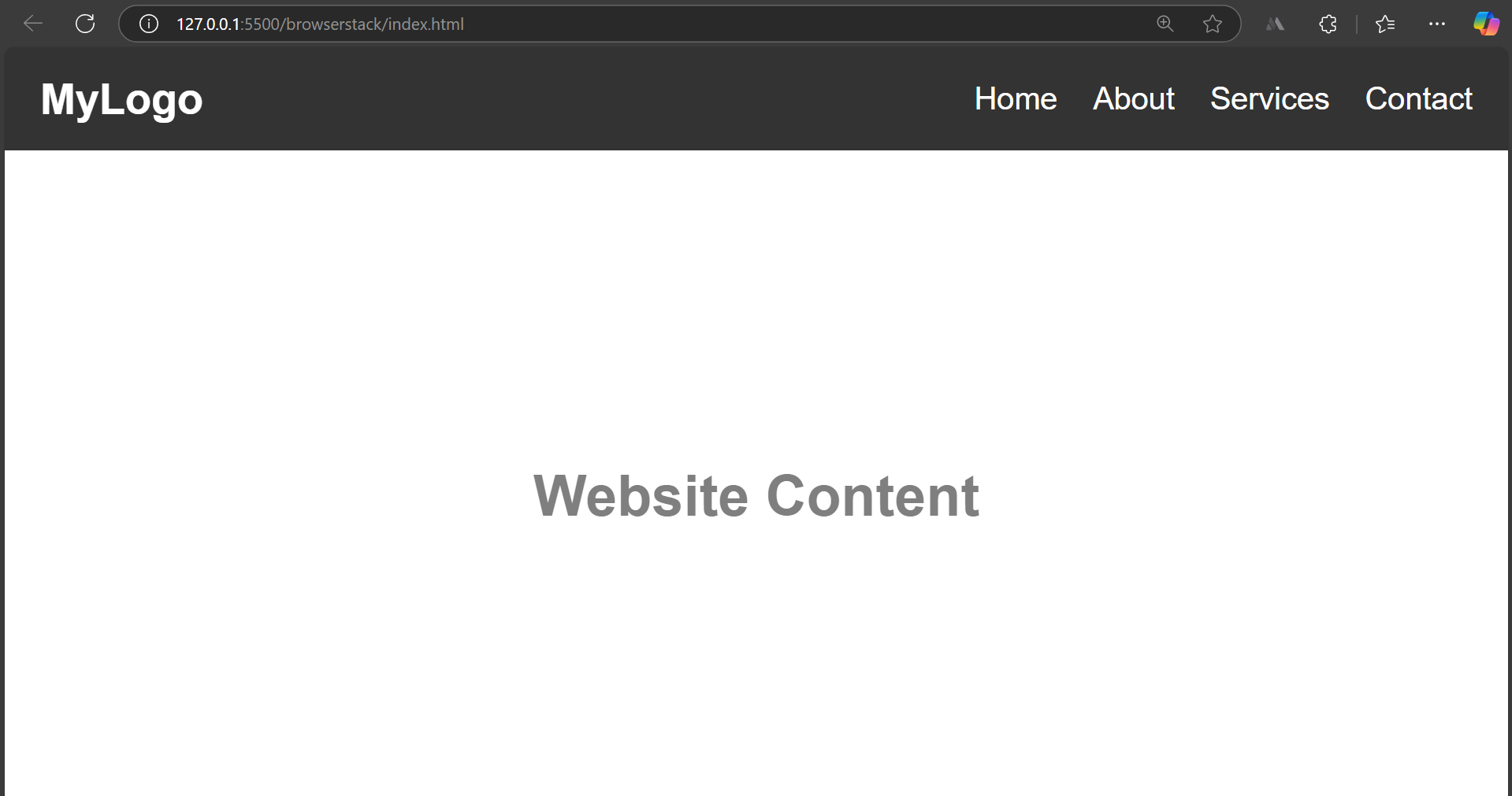
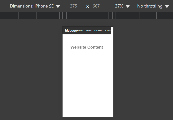
After writing the CSS, the website will look like the following on the desktop.
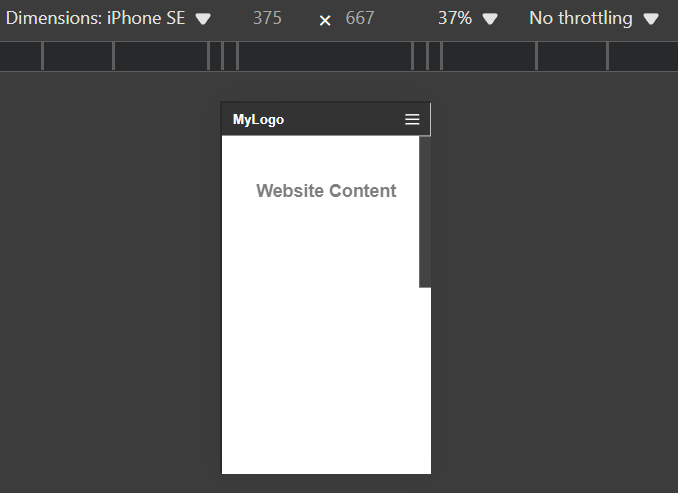
However, on the mobile device, it will look as.
3. Apply the media queries
  /* Responsive Styles */

  @media (max-width: 768px) {

    .menu-icon {

      display: flex;

    }


    .nav-links {

      flex-direction: column;

      position: absolute;

      top: 60px;

      right: 20px;

      background-color: #444;

      width: 200px;

      transform: translateX(100%);

      transition: transform 0.3s ease-in-out;

      text-align: center;

      padding: 10px 0;

    }


    .nav-links.active {

      transform: translateX(0);

    }


    .nav-links li {

      margin: 10px 0;

    }

}
After using the media queries, it is clear that the website is responsive and gives consistent and readable results on different dimensions.
Read More: How to test Responsive Images
Testing Your CSS Responsive Design with BrowserStack
Testing images’ responsiveness on real devices is essential to ensure they render correctly on devices with varying resolutions and screen sizes.
With BrowserStack Live, you can harness several key benefits:
- Real-World Testing: Experience your website as actual users do, ensuring accurate rendering on various devices.
- Accelerated Debugging: Quickly identify and fix issues, saving time during development.
- Enhanced User Experience: Optimize images for fast loading and flawless display across all platforms.
- Seamless Integration: Easily incorporate testing into your existing workflow, maintaining efficiency and productivity.
- Comprehensive Coverage: Access a vast array of real devices and browsers, ensuring your site is robust and universally compatible.
Challenges of Responsive Designs with CSS
Responsive designs are the surefire way to cover a broader range of devices. However, several challenges may arise while scripting responsive designs in CSS.
- If the website contains real-time data, dynamic data may break the UI. To prevent this, one must thoroughly test the website under different scenarios.
- It is important to check browser compatibility with different CSS rules before scripting based on your target users. If you use deprecated CSS rules, you may face negative consequences.
- It sometimes becomes challenging to create the right balance while using CSS units like em, rem, or vw as different viewports demand different dimensions so that it gives consistent results.
Best Practices for Responsive Designs with CSS
To increase the efficiency of writing responsive scripts for your website, here are a few best practices for responsive designs with CSS.
- A mobile-first design is a good approach to scripting your project. It ensures the core components are available on all devices, and you can start building upon them.
- Instead of static or fixed values, one must always use relative units such as em, rem, %, vw, and vh to define heights, widths, padding, margins, etc.,
- Media queries efficiently design a responsive website; however, one must avoid overusing them as they often break the UI.
- While designing the responsiveness of the website, one must consistently keep testing. This allows you to spot real-world issues early on in the development cycle.
Conclusion
As internet access through mobile phones grows, creating responsive designs for broader website coverage is becoming essential. Responsive designs give consistent results across all device resolutions.
The key parameters while creating a responsive website include CSS Media Queries, Flexible Grid, the viewport meta tag, Bootstrap responsive web design, CSS Grid for Responsive Web design, Responsive Typography, and Responsive Images. Once you have focused on these techniques, the website will automatically be responsive enough to be rolled out in the market.
However, testing your product before presenting it to real-world users is very important. BrowserStack Responsive tests your website’s functionality on numerous real devices, thus ensuring the website is responsive, consistent, and working as intended by the developer.
