Web applications or websites represent businesses virtually and are at the forefront of driving conversions and revenue. Providing a flawless user experience is essential for success.
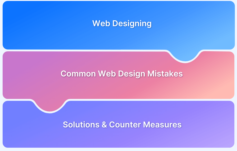
Overview
A well-designed website is important for user engagement, conversions, and SEO. However, common design mistakes can lead to high bounce rates and lost opportunities.
Common Web Design Mistakes
Here are common mistakes one should avoid in designing a user-friendly website:
- Avoiding a Mobile-First Design: Most users browse on mobiles, and a site that isn’t mobile-friendly struggles to keep them engaged.
- Cluttered Site Navigation: Confusing menus frustrate users and increase drop-off rates.
- Slow Loading Web Pages: Slow sites hurt SEO and drive visitors away. Optimize speed for better retention.
- Incorrect CTA Placement: Poorly placed CTAs reduce conversions; position them strategically for impact.
- Un-optimized Images: Large, uncompressed images slow down loading times; always optimize for the web.
- Irrelevant Pop-up Implementation: Excessive or poorly timed pop-ups annoy users and disrupt the experience.
- Illegible Font Sizes: Hard-to-read text diminishes user engagement and accessibility.
- Chunks of Text: Large, unstructured text blocks overwhelm readers; use proper formatting and spacing.
- Ignoring a Security-First Approach: Ignoring security in web design risks data breaches. Implement SSL, secure authentication, and encryption from the beginning.
- Lack of Accessibility Compliance: Ignoring accessibility standards excludes users with disabilities and affects usability.
This article highlights common web design mistakes that can impact user experience and provides tips on how to avoid them.
Web Design Mistakes everyone must Avoid
Here are ten web design mistakes to avoid for a seamless and user-friendly website:
1. Avoiding a Mobile-First Design
Mobile-first design is an effective web development strategy that creates websites for smaller screens, like smartphones, before adapting them for larger devices. Mobile devices drive 60% of global internet traffic, so ensuring a seamless mobile experience is essential.
Websites that aren’t designed with a mobile-first approach often suffer from slow loading times, poor navigation, and readability issues. This can frustrate users, increase bounce rates, and lead to lower conversions.
Additionally, Google’s mobile-first indexing prioritizes a website’s mobile version for rankings. This means a site that isn’t mobile-optimized will perform poorly in Google search results.
You can address this issue by using BrowserStack’s Responsive Design Testing. Developers and testers can use this tool to check the website’s overall mobile friendliness and optimize it for different devices.

2. Cluttered Site Navigation
A home page web design must be neat, intuitive, and easy to navigate. Often users come across home pages that offer too many links, making it difficult to find what they need.
Cluttered website navigation is one of the biggest web design mistakes to avoid. Users are bound to be confused with many items on a single page. Naturally, users will find it difficult to navigate to the desired page and might bounce. Additionally, the page is not visually appealing. Such landing pages result in very few conversions and hurt the ROI.
Web designers must limit their homepage (and other pages) to offer a reasonable number of options, menu items, and images. This will make websites appear neat and credible.
3. Slow Loading Web Pages
Mobile users expect websites to load at lightning speeds. High-speed internet combined with daily social media, emails, and search engines created this expectation. Modern design thinking philosophies endorse that if a user visits a website and it takes too long to load, there are high chances that a user will immediately bounce.
- Subconsciously, no user likes to wait more than 2-3 seconds
- A 1-second delay in page response can result in a 7% reduction in conversions.
- A slow-loading website is not only one of the top web design mistakes but also an SEO and CRO blunder.
- Google crawls your website slower, hence slowing your online presence on search results.
- According to Google Search Central, blocked JavaScript, CSS, unplayable content, mobile-only 404s, and faulty redirects need to be solved ASAP when optimizing your website design.
Increasing website speed is necessary for brands and online businesses looking to leverage their website for any ROI-generating activities.
Want to check where your website stands?
Use SpeedLab – a free tool from BrowserStack runs a website speed test across multiple real browsers, devices, and operating systems. The report will show not just how fast (or slow) the website is but how it fares in terms of site speed metrics across multiple real desktops and mobile devices, as well as multiple browser versions.

It also offers actionable recommendations and insights to help you improve website performance effectively.

SpeedLab generates accurate results, making it easier for product designers to bring efficacy into the web design and development cycle.
Try BrowserStack Speedlab for Free
4. Incorrect CTA Placement
Call To Action (aka CTA) or CTAs are integral to any landing page. They guide users to take appropriate actions and play a vital role in transforming leads to valuable conversions.
In some cases, businesses observe very few conversions despite putting all the effort into creating content-design synergy. This primarily happens due to incorrect CTA placement. One must ensure that CTAs are not placed at the very bottom of the page unless the flow of the page demands it. Instead, the CTAs must be placed smartly to prompt user action wherever needed.
Web designers must also ensure that the CTAs stand out on small screen sizes, as there are high chances of buttons being scaled down along with the website. In such cases, users might fail to notice the CTA at the bottom. Ensuring they’re optimized in terms of text, color, and positioning.
Follow-Up Read: How To Test Website in Different Screen Sizes
5. Un-optimized Images
In creating aesthetically pleasing websites, developers often use high-resolution images, which can adversely affect the website’s loading time.
- Any ideal way to address this issue is to optimize images by compressing them or resizing them.
- Use tools like Adobe Photoshop to compress image file sizes significantly, whereas WordPress admins can use plugins like WP Smush for image compression.
Pro-Tip: It is not enough to check if a website is loading fast on a single browser or versions of one browser. Testers must ensure that their website images and videos load as intended across multiple browsers – the latest and legacy versions.
Use BrowserStack’s real device cloud to check your website design and image placement on 3500+ real browsers and devices. Sign up for free, choose the browser-device-OS combination required, and start testing to solve those common web design mistakes.

Try Cross Browser Testing for Free
6. Irrelevant Pop-up Implementation
When implemented wisely, pop-ups can generate significant leads or newsletter subscribers. On the contrary, if there are irrelevant pop-ups obstructing viewers from consuming the primary content, particularly on mobiles, it won’t be looked upon kindly by Google and by your irate website visitors.
Deal with this situation by placing pop-ups in a way that doesn’t end up annoying visitors.
- Implement a pop-up to appear only if a user has scrolled down 70% of the web page.
- Experiment by displaying a floating banner pop-up that makes a user run a trial of your product.
- Match the design of the popup with the overall website design or landing page.
- Design CTA buttons on the pop-up banner to be clear and actionable.
- Choose the right fonts, color contrast, and spacing to streamline your conversion rates.
7. Illegible Font Sizes
Using small or hard-to-read fonts makes your website difficult to navigate. Visitors are more likely to leave if they have to zoom in or squint to read the content.
Poor contrast between text and background also makes it difficult for users, especially those with visual impairments, to engage with your site.
Avoid this by using a minimum font size of 16px for body text. It helps to ensure a strong contrast between text and background. Stick to clear, readable font styles and test legibility across devices. Prioritizing readability improves user experience and keeps visitors on your site longer.
8. Chunks of Text
Another common web design mistake is using long, unstructured paragraphs on the website. This can overwhelm readers and make content difficult to read.
Users typically skim rather than read everything, so large text blocks often lead to frustration and higher bounce rates. To prevent this:
Break text into smaller paragraphs, use bullet points, and include subheadings for easy navigation.
Highlight key points with bold text and incorporate visuals like icons or infographics to enhance understanding.
A well-structured layout keeps users engaged and improves readability.
Read More: How to reduce Cognitive Overload in Design
9. Ignoring a Security-First Approach
Though website security largely depends on technical architecture, it is closely tied to web design and user experience. Failing to incorporate security elements into your website’s design can put users at risk and damage credibility.
For example, failing to highlight security indicators like HTTPS padlocks or trust badges can make users hesitant to share sensitive information.
To prevent this, use HTTPS with SSL certificates to encrypt data and display a security padlock in the address bar. Design login pages with multi-factor authentication (MFA) and ensure error messages don’t reveal sensitive information.
Prioritizing security at the design stage helps prevent critical web design mistakes that expose users to risks.
Read More: How to test HTTPS Websites from Local Host
10. Lack of Accessibility Compliance
Overlooking accessibility means excluding a significant portion of users, including those with disabilities. Many websites fail to provide alt text for images, keyboard-friendly navigation, and proper color contrast, making it difficult for people using assistive technologies to interact with the site.
You can prevent this by following WCAG (Web Content Accessibility Guidelines). It includes various factors like using clear headings and designing buttons with meaningful labels instead of generic terms like “Click Here.”
Ensure your website meets WCAG standards with BrowserStack Accessibility to create an inclusive user experience. It lets you test accessibility across real browsers and devices, helping you identify and fix issues that may affect users with disabilities.
Conclusion
Now, it’s understandable that experimenting with web designs and conversion rate optimization (CRO) activities can hamper or shake up the overall functionality and usability of the website. This is where web design and visual comparison testing need to have a solid handshake that will eventually defeat any web design mistake to show up in production.
The future of visual testing is bright as many enterprises, and brand entities seem keen to adopt it as a scalable and practical approach to frontend testing from a visual standpoint.
Once you have these six common web design mistakes sorted out, check out the following presentation by Joscha Feth, Tech Lead of the Developer Platform Group at Canva. Joscha talks about the magic of visual regression testing and shares tips on avoiding common pitfalls.
Developing a website that appears aesthetically pleasing is very important. Simultaneously it’s also critical to ensure that the site is sufficiently optimized to deliver a flawless user experience.
There’s always a scope for enhancement. Avoiding the mistakes above will help developers and individual website owners to build credible and interactive websites that deliver a delightful user experience.


