Accessibility allows users, including those with visual impairments or cognitive disabilities, to understand and engage with content effectively.
Typography is an important aspect of web accessibility, as the appearance and structure of text impact readability, especially for users with visual or cognitive impairments. Choosing an accessible font reduces eye strain and improves clarity, making the digital text easier to read and improving the overall user experience.
This article discusses the features of accessible fonts, the importance of typography in web accessibility, and the main determinants of font accessibility.
What Are Accessible Fonts?
Accessible fonts are designed to enhance readability for individuals with visual impairments, dyslexia, or cognitive disabilities. They prioritize clarity, simplicity, and distinguishable character design to create an optimal reading experience for all users.
Examples of Accessible Fonts
When selecting a font for your website or mobile app, consider the following widely recognized accessible fonts:
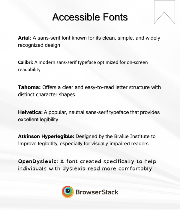
- Arial: A sans-serif font known for its clean, simple, and widely recognized design
- Calibri: A modern sans-serif typeface optimized for on-screen readability, which is ideal for web accessibility
- Tahoma: Offers a clear and easy-to-read letter structure with distinct character shapes
- Helvetica: A popular, neutral sans-serif typeface that provides excellent legibility
- Atkinson Hyperlegible: Designed by the Braille Institute to improve legibility, especially for visually impaired readers
- OpenDyslexic: A font created specifically to help individuals with dyslexia read more comfortably
Read More: Strategies to Optimize Visual Testing
Characteristics of Accessible Fonts
Accessible fonts have elements that enhance their readability:
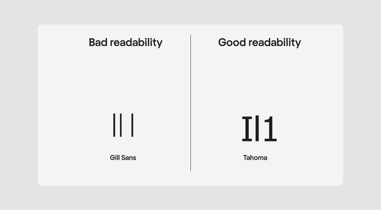
- Clear and Legible Letterforms: Each character should be distinct and not easily confused with another. For example, the uppercase letter ‘I,’ the lowercase letter ‘l,’ and the number ‘1’ can look very similar, so they should be designed to make each one easily recognizable.
- Simple and Familiar Shapes: Fonts with overly decorative or cursive elements can hinder readability.
- Consistent Letter Proportions: The design should maintain uniform proportions to prevent irregular spacing or difficult-to-read text.
- Adequate Letter & Word Spacing: Proper spacing between characters and words helps users with visual impairments or dyslexia distinguish text easily.
- Sufficient x-Height: Fonts with a larger x-height (height of lowercase letters in relation to uppercase letters) are easier to read, especially in smaller sizes.
- High Contrast Compatibility: Fonts must still remain readable when viewed in low-contrast environments. The WCAGs (Web Content Accessibility Guidelines) advises that normal text has a contrast ratio of at least 4.5:1.
- Responsive Scaling: Text should be readable at various screen sizes and resolutions without distortion.
Role of Typography, Typefaces, and Fonts in Web Accessibility
Typography plays a significant role in making digital content accessible. It involves choosing the right typeface, font, spacing, and contrast to create an inclusive reading experience.
- Typefaces are collections of characters that share a common design. Examples include Arial, Times New Roman, and Verdana
- Fonts refer to the specific style and weight variations within a typeface, such as Arial Bold or Arial Italic
Read More: Variable Fonts Vs Static Fonts
Typography Elements That Impact Accessibility
Here are some elements that affect accessibility.
- Font Selection: Choosing sans-serif fonts like Arial, Verdana, or Helvetica improves readability, as they do not have decorative strokes (serifs) that can blur small text
- Text Alignment: Left-aligned text is preferable over justified text since uneven spacing in justified text can create gaps that make reading difficult
- Line Length: Text should have an optimal line length of 50–75 characters per line to avoid excessive eye movement
- Contrast Ratio: Sufficient contrast between text and background enhances readability for users with visual impairments
Read More: Browser Compatibility for Variable Fonts
Why Are Fonts Important for Web Accessibility?
Font choice directly impacts how users perceive and process digital text. Choosing accessible fonts can:
- Improve reading speed and comprehension for all users
- Help people with dyslexia, low vision, or cognitive disabilities read more comfortably
- Reduce eye strain, especially in prolonged reading situations
- Enhance user engagement and retention by making websites more inclusive
Many organizations now follow WCAG guidelines to ensure their digital content is accessible to users with disabilities. In fact, accessible fonts are an important consideration in website accessibility checklists.
What Makes Fonts Accessible?
Several factors influence the accessibility of a font:
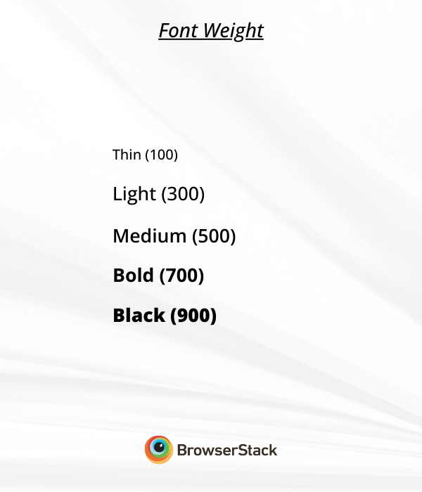
- Font Weight: Font weight determines how bold or light the text appears. Using a medium-weight (400–600) font is ideal for accessibility. Fonts that are too thin (100–200) can be difficult to read, while overly bold fonts (900+) may cause visual clutter.
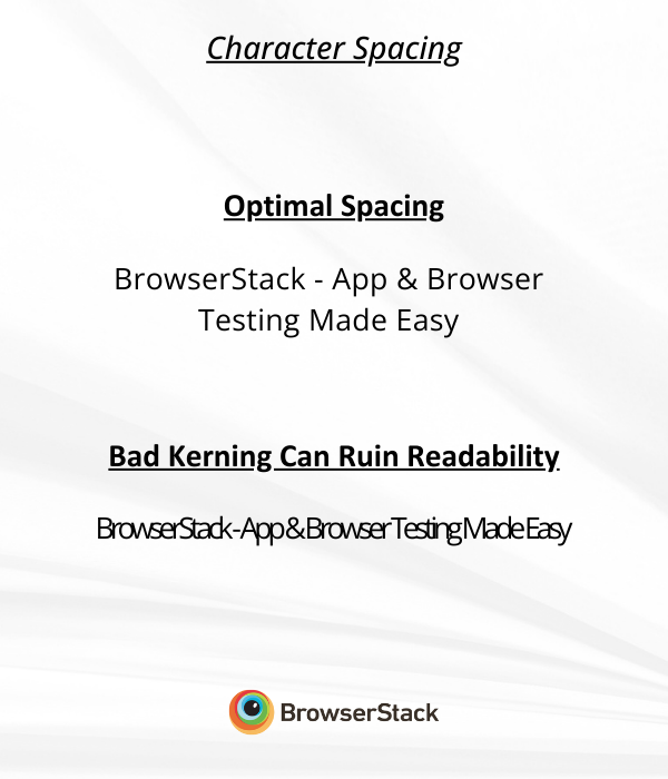
- Character Spacing: Proper kerning (letter spacing) ensures that characters do not appear too close together or overlap, which can reduce legibility. The ideal spacing is around 0.12em to 0.16em.
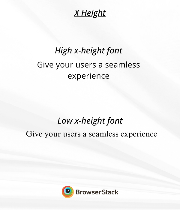
- X-Height: It is the vertical height of lowercase letters. Fonts with a larger x-height improve readability, especially for small text sizes. A font with a higher x-height (e.g., Open Sans) is easier to read than one with a smaller x-height (e.g., Times New Roman).
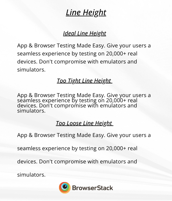
- Line Height: Line height (or leading) controls the spacing between lines of text. The ideal line height for body text is 1.5x to 2x the font size to prevent crowded text.
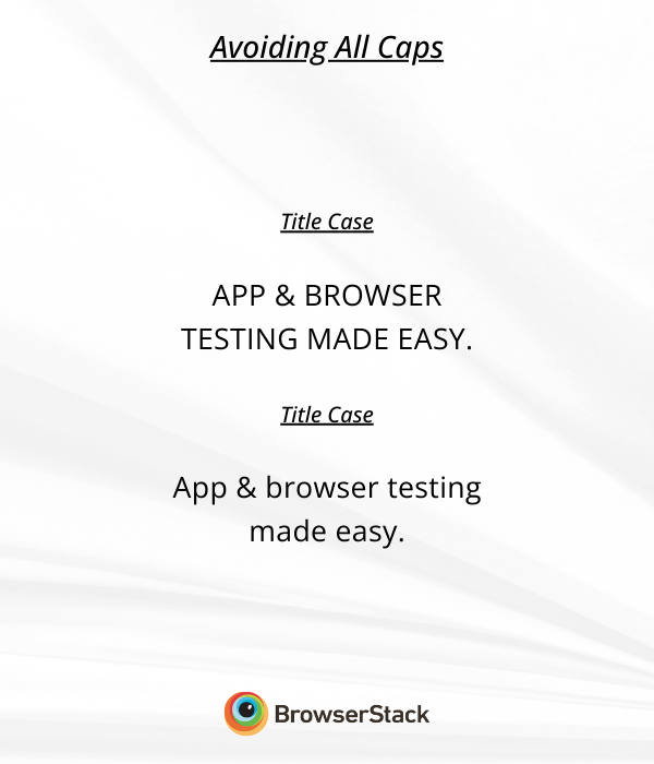
- Avoiding All Caps: Using uppercase (ALL CAPS) text can decrease readability because uniform letter height makes words homoglyphs, like O and 0, harder to distinguish. Instead, use title case or sentence case for better legibility.
Read More: Must-have Chrome extensions for WCAG Testing
How to Choose Accessible Fonts?
Selecting the right accessible fonts involves considering multiple factors that enhance readability and ensure an inclusive user experience. Below are key considerations when choosing a font for accessibility:
1. Legibility and Readability
Legibility refers to how easily individual characters can be distinguished from one another. Fonts with clear letterforms, adequate spacing, and distinguishable glyphs are more legible.
Readability pertains to how easily text as a whole can be read. Factors like font size, line height, and contrast influence readability.
Here are some best practices to follow.
- Avoid cursive, script, or decorative fonts that may be hard to decipher
- Opt for sans-serif fonts like Arial, Verdana, and Tahoma for digital content
- Ensure proper letter and line spacing to prevent text crowding
Read More: Website User Experience (UI/UX) Checklist
2. Color and Contrast
Color contrast ensures that text remains visible against its background.
WCAG (Web Content Accessibility Guidelines) recommends:
- A minimum contrast ratio of 4.5:1 for normal text
- A 3:1 contrast ratio for large text (18pt and above)
Follow these best practices when deciding Color and Contrast:
- Use high-contrast combinations (e.g., black text on a white background)
- Avoid low-contrast text, such as light gray on a white background
- Provide users with dark mode options to adjust text visibility
3. Text Size and Spacing
Adjusting font size and spacing enhances readability, especially for users with low vision or cognitive disabilities.
Below are some key considerations for text size and spacing:
- Font Size: A minimum of 16px is recommended for body text
- Line Height: Set line spacing between 1.5x and 2x the font size
- Letter Spacing (Tracking): Maintain a spacing of 0.12em to 0.16em for improved readability
Below is a table that highlights the differences between poor and good accessibility.
| Spacing Element | Poor Accessibility | Good Accessibility |
|---|---|---|
| Font Size | 12px (Too Small) | 16px+ (Optimal) |
| Line Height | 1.2x (Crowded) | 1.5x–2x (Comfortable) |
| Letter Spacing | 0.05em (Tight) | 0.12em–0.16em (Readable) |
Read More: How to reduce Cognitive Overload in Design
4. Improving Readability for Dyslexic Users
Individuals with dyslexia often struggle with standard fonts due to similar-looking characters and inconsistent spacing. Some fonts are designed specifically to aid dyslexic readers.
Here are some of the best dyslexia-friendly fonts.
- OpenDyslexic – Features weighted bottoms to help distinguish characters
- Lexend – Designed to improve reading fluency with controlled spacing
- Arial and Verdana – Widely used due to clear letter shapes
Additionally, you should focus on these elements to further Help Dyslexic readers.
- Consistent Letterforms: Avoid fonts where letters like ‘b’ and ‘d’ are mirror images
- Avoid Italics: Italicized text can be challenging for dyslexic users to read
- Increase Line and Word Spacing: Improves readability and reduces visual stress
Font Accessibility Standards
To ensure compliance, web designers and developers must follow accessibility standards such as ADA and WCAG guidelines.
1. ADA Compliance
The Americans with Disabilities Act (ADA) mandates digital accessibility for businesses to ensure that websites do not discriminate against individuals with disabilities.
Below are some ADA-compliant font guidelines.
- Use legible sans-serif fonts for better readability
- Maintain adequate text contrast for visibility
- Ensure scalability so users can resize text without loss of clarity
Follow-Up Read: Quick Website Accessibility Testing Checklist
2. WCAG Compliance
The Web Content Accessibility Guidelines (WCAG) establish global standards for digital accessibility.
Below are some WCAG 2.1 font accessibility requirements:
- Maintain a contrast ratio of at least 4.5:1
- Support resizable text without assistive technology
- Avoid text embedded in images unless necessary
- Ensure font weight, letter spacing, and line height promote readability.
Examples of Accessible Fonts and Fonts to Avoid
Here are some fonts that you should consider and should avoid.
Recommended Accessible Fonts:
The below fonts offer better readability and accessibility
- Arial
- Verdana
- Helvetica
- Calibri
- Atkinson Hyperlegible
- Tahoma
- OpenDyslexic
- Roboto
- Montserrat
- Lato
- Source Sans Pro
- Nunito
Fonts to Avoid:
It’s best to avoid these fonts as they affect accessibility
- Times New Roman
- Comic Sans
- Papyrus
- Brush Script
- Impact
Why Should You Test Your Website for Accessibility on BrowserStack?
Ensuring your website meets accessibility standards requires real-world testing on multiple devices and platforms. BrowserStack provides a comprehensive accessibility testing tool to help identify and resolve issues on actual devices.
Key Benefits of BrowserStack Accessibility Testing:
- Real device testing for accurate font rendering: Test on actual mobile and desktop devices to check how fonts appear under real-world conditions.
- Font magnification validation: Ensure text scales up to 200% without losing readability or functionality, supporting users with visual impairments.
- Readable text and layout adaptation: Verify that text adapts to system-wide font settings, avoids truncation, and remains accessible without requiring excessive scrolling.
- Automated and assisted accessibility testing: Use a Workflow Analyzer, Screen Readers, and Assisted Tests to detect font-related accessibility issues.
- Robust compliance and reporting: Identify accessibility violations based on WCAG, ADA, and Section 508 standards, generate detailed reports with issue breakdowns, and export compliance data for audits or VPAT documentation.
- Spectra rule engine: Reduce manual effort with advanced rules covering focus indicators, component consistency, and color contrast while ensuring overall text accessibility.
Conclusion
Choosing accessible fonts is essential for creating inclusive digital content. Opt for sans-serif fonts like Arial, Verdana, and Atkinson Hyperlegible and ensure proper text contrast, spacing, and size for better readability. Additionally, avoid overly decorative, cursive, or all-caps fonts
Use test accessibility tools like BrowserStack to check how accessible the fonts are across devices and browser combinations. BrowserStack also lets you test your website for WCAG and ADA compliance to meet accessibility standards for all users.
Frequently Asked Questions
1. On What Type of Content Should Accessible Fonts Be Used?
Accessible fonts should be implemented across all digital and print materials to enhance readability and inclusivity. Some key areas where accessible fonts should be prioritized include:
- Websites and Blogs: Ensuring all text on web pages is easily readable benefits users with visual and cognitive impairments.
- Mobile Applications: Font choices in apps should support clear text presentation and scaling for different screen sizes.
- PDFs and Digital Documents: Text should be properly spaced and formatted for compatibility with screen readers and other assistive technologies.
- Presentations and Reports: Business documents and slideshows should use legible fonts to ensure accessibility in professional settings.
- Marketing and Advertising Materials: Brochures, email campaigns, and social media graphics should be clear and high-contrast.
- E-books and Online Courses: Learning materials should use scalable and readable fonts to support diverse user needs.
2. What Is the Best Font Size for Web Accessibility?
The recommended font size varies based on the type of content and the display medium. General guidelines for web accessibility include:
- Body Text (Paragraphs): A minimum size of 16px (1rem) is recommended for standard readability.
- Headings (H1, H2, H3): Headings should be 1.5x to 2x larger than the body text to create a clear content hierarchy.
- Buttons and Labels: Text within buttons and form fields should be at least 14px for easy visibility.
- Mobile Accessibility: Font sizes should adjust dynamically based on screen dimensions for improved legibility.
- Scalability: In compliance with WCAG guidelines, users should be able to zoom up to 200% without losing content or functionality.
