In fast moving web projects, the design review is an important part of the cycle. This is the place where the design team takes a look at a beta version of the product. And then they document everything that is not inline with the brand or design intent of the project. This can happen at the end of the release. But it is more effective when it happens at the end of each development sprint.
Aurélie Radom suggests,
“carry out this exercise live with the developers so that the designers can challenge the integration, and sometimes improve the design during the project”
The ‘Design Review’ Between Designers and Developers by Aurélie Radom1
Yet, not every team can get buy-in for a direct meeting. This means that as a designer one might be relegated to using something like Jira. And you are stuck with this to document all the things that don’t quite line up.
Jira is a project management and software development tracking tool. It is quite popular in enterprise and agile software development projects.
In this situation you review on your phone, computer. You document issues by taking some screenshots or videos of what you find. Later you enter all these things into Jira doing your best to explain what the issue is. But there is a problem. These screenshots paired with quick descriptions often don’t provide enough context. This will make it difficult for developers to see what the problem is or may not understand how to fix it.
“As a rule, people don’t like to puzzle over how to do things”
Don’t Make Me Think, 2nd Edition by Steve Krug2
This leads to more and more communication. Worst case is that something could be fixed in a way that is not intended. Developers are not known for being detail oriented when it comes to visuals. So how can we help them out?
Recently, I have discovered a very efficient workflow for handling a design review. This allows one to document these things, especially if your team is using Jira. It consists of using BrowserStack and Jira using the BrowserStack Jira Integration.

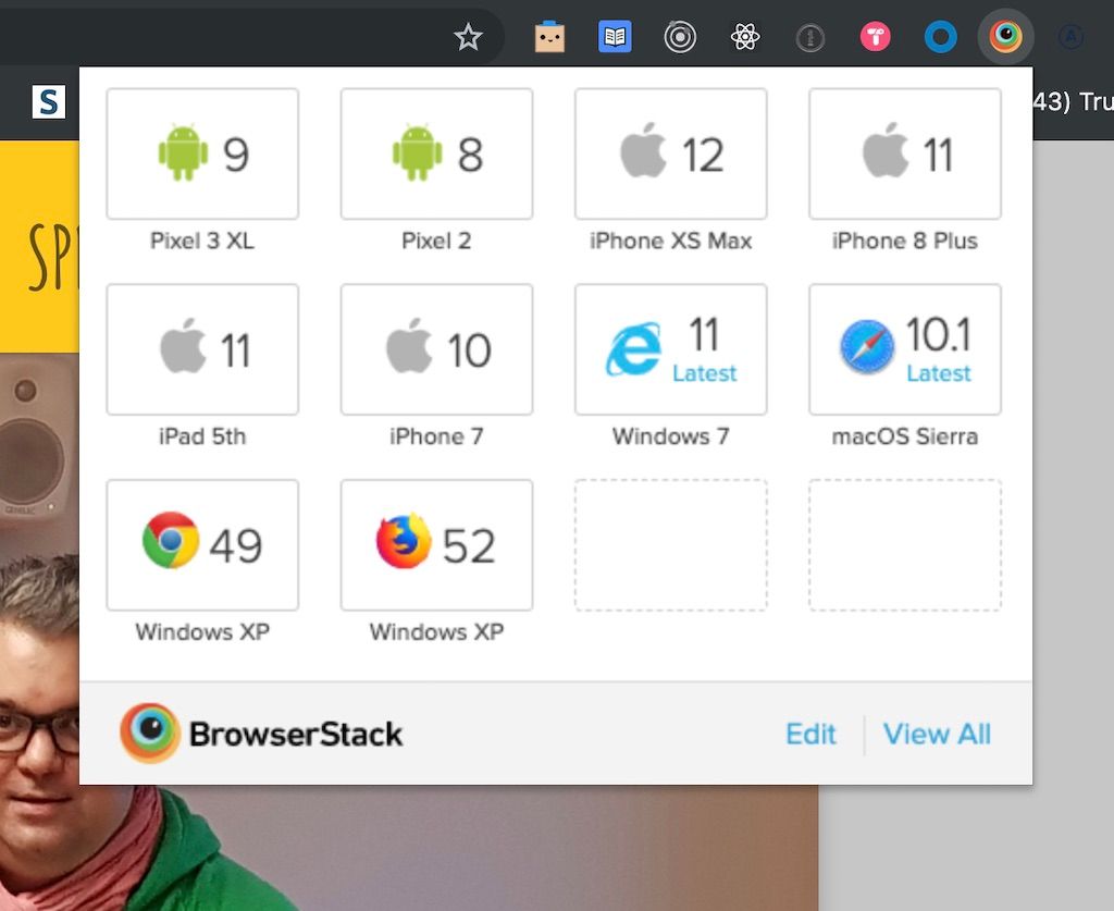
BrowserStack is a paid service that lets you test websites and apps. This includes local development servers. And provides access to many web browsers, operating systems and devices. It is like having a dedicated device library that you can call up and at any time.
Benefits of this workflow
Over a more fragmented process, here are some really valuable benefits to you. And especially the engineers you work with.
- You can quickly review in different web browsers that are not the typical ones used by the team. Pro-top you are expected to support them.
- You get a consistent way to review and document as an individual and as a team.
- You get a consistent way to quickly annotate the issues in the most efficient and minimal way.
- Developers will understand the visual errors with less communication. This is due to increasing the consistency of the annotations.
- It is faster, especially when documenting many issues
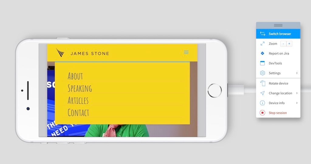
- You can review mobile and desktop on any computer.
- Very important: it saves the operating system, browser name and version to the image added. This will greatly speed the time to replicate the same issue.
- Developers can use the same system to get the same results. No more, “it’s working on my machine.”
Setting up the integration
Setting up the integration should take about 3 minutes.
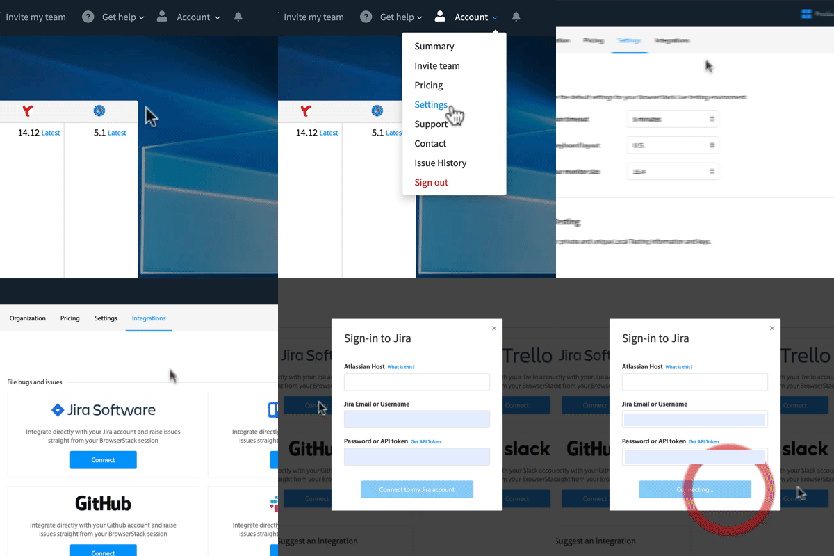
Step 1: Go to BrowerStack and then to Settings.
Step 2: Then click on Integrations.
Step 3: Add The Jira integration.
Step 4: Connect it to your team’s Jira account.

You won’t see anything different yet. But when you click on the report a bug icon you will be presented with an option for report a bug using Jira. Be sure to checkout the official docs for more details.
How to conduct the review (either solo or with your team)
First it is worth considering what are the goals of the design review. Aurélie Radom suggests that goal is a
“Review of the developed project which helps to verify that all graphic and technical components display and function properly. This takes into consideration all devices currently on the market, using the most recent OS versions.”
The ‘Design Review’ Between Designers and Developers by Aurélie Radom3
I would expand on this to say that you should have access to the most common devices used on your app. As well as the oldest versions work as minimum requirements to use your website or app.
Your development team should be able to help you out with compiling that list.
The process
Step 1: Use a browser you don’t always use in development. If you use chrome mac, pick windows firefox. If you have an iOS phone, use an android one.
Step 2: Review the feature through the “happy path.” Click through the expected process in the simplest fashion. This is likely how it thought about by the developer.
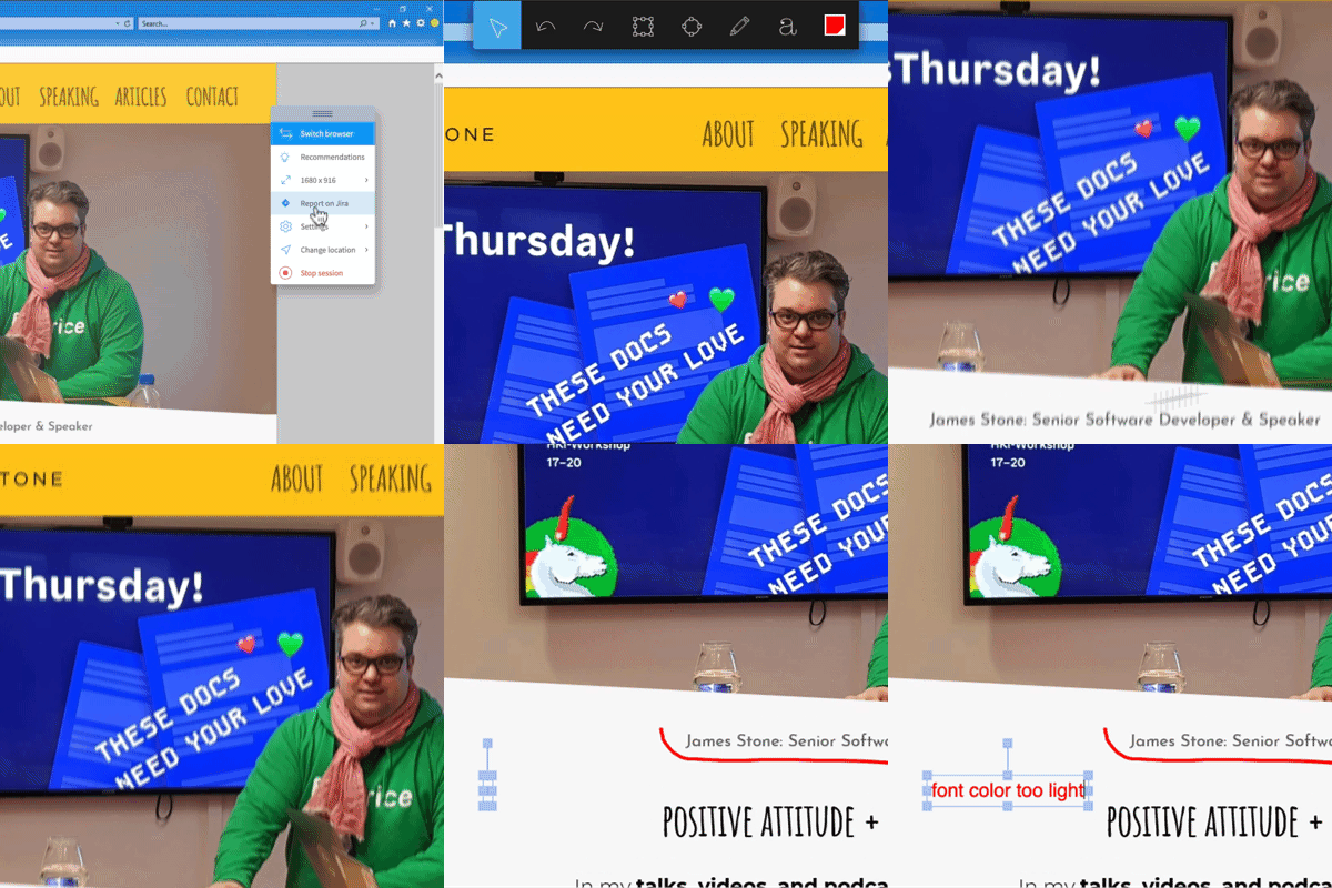
Step 3: When you find a visual error, immediately click on report bug. If you are tracking to a specific Task, then just search for that one and quickly annotate where the error is. I had trouble typing in the number of the bug or task, so you might want to remember some details of the title.
The most efficient way is to just grab the free form drawing tool and highlight simply where the error is. If you need more context, grab the text tool and write a few words of what is wrong.

Wrong font size, more space, wrong color, or missing information. One of these might provide enough context to make it super clear.
Or if you are reporting as sub tasks or bugs to fix, create a new one. The process is pretty much the same.
Step 4: Repeat step 3 but try some unconventional ways to use your app, some suggestions below.
Creative ways to stress test your design
This is by no means exhaustive, but to give you some ideas of how you might put your design through the paces. And with the addition of a tool like BrowserStack. Doing some of the following might shake out some harder to detect visual or UX issues with the interface.
- Use a very small screen (1024×768) on desktop.
- Create the most crazy edge case possible with your feature
- fill the screen (can you scroll everywhere and it is still usable).
- Rotate the device for mobile.

- Try a tablet.
- Delete things and go through in every way imaginable.
- Try to break things, think of how you could cause the interface to not work correctly.
- Delete all of the text.
- Use the keyboard only.
- Click forward and back on the browser.
In conclusion
To wrap things up, the design review can be a valuable to both the designer and the developer. It allows one to see how close to the original design intent and user experience you got. If you are already using Jira and BrowserStack in your process, then using the this integration can make things go smoother. If you are not using BrowserStack, it is worth considering it. Imagine the speed in which you are able to not only identify cross-browser bugs, but also have your engineers replicate and correct them.
It is not your responsibility to turn developers into designers. But remember they will develop in design literacy. Your interactions and comments about how they interpret your designs do have impact.
“If you want to learn to create great design yourself, if you want to gain design literacy, there simply is no way to do so with lists of rules. Instead, I want to provide you with a new set of eyes through which you can see the world anew.”
Design for Hackers by David Kadavy4
Be an awesome teammate and help your developers learn to see your project with new eyes.
This article was originally posted on Futurice.com
1, 3 The ‘Design Review’ Between Designers and Developers by Aurélie Radom
2 Don’t Make Me Think: A Common Sense Approach to Web Usability, 2nd Edition by Steve Krug
4 Design for Hackers: Reverse Engineering Beauty by David Kadavy
